3 Dead Excuses For Badly Designed Landing Pages
Landing pages almost have a tradition of bad design. After all, it’s easy enough to slap a headline, a few bullets of text, and an image next to a form and — voilà! — you have a landing page, right? “Landing pages” have proliferated as a check-the-box feature: sure, we do landing pages. The problem […]
Landing pages almost have a tradition of bad design. After all, it’s easy enough to slap a headline, a few bullets of text, and an image next to a form and — voilà! — you have a landing page, right? “Landing pages” have proliferated as a check-the-box feature: sure, we do landing pages.
The problem is that most of these are bad landing pages.
By “bad,” I mean three things: (1) they look amateurish, lifeless or downright ugly; (2) they fail to provide holistically compelling content; and (3) they aren’t very effective in winning over customers. Correlation is not necessarily causation, but it’s hard not to infer a relationship between these things.
For instance, take this example I recently showed in a session discussing the new Google Instant Preview for Ads:
Make you want to click? Didn’t think so.
But why are these pages so bad? And why are there so many of them?
One problem is that designers continue to be underutilized in conversion optimization. Part of that is the legacy of optimization, originally more of an analytical discipline than a design-oriented one.
Part of it is that search marketing — which has been a leading domain for the practice of landing page optimization — has non-visual roots in keywords and text ads. Search marketers tend to be more proficient at Excel than Photoshop.
But mostly, it’s because good design takes more time or money. And, unfortunately, it’s all too easy to confound cost with ROI. Just because something costs less up front, doesn’t mean it delivers a better payoff. But the wrong organizational structure or incentives can camouflage that truth.
Scratch The Google-Minimalist-Aesthetic Excuse
One excuse for eschewing design talent that propagated through landing page talks for years went like this: “Google follows a minimalist visual aesthetic, Google is the most successful Internet company on the planet, therefore we should have minimalist landing pages.” If Google can get away with mostly simple text on a plain white page, then so can we. “Minimalist visual aesthetic” often became code for “no graphic design at all.”
Of course, that was always a false equivalency — Google’s user experience was designed (quite intently) for searching. It is a neutral, frictionless gateway to a plethora of possible destinations — cleverly crafted to be supported by advertising while not actually looking like it is supported by advertising.
In contrast, a landing page is a single, specific destination, tasked with the Promethean challenge of engaging a skeptical respondent with that company’s particular offering, in that particular context, relative to all the other competitors just a back button and a click away.
As I discussed in Compelling Landing Page Design Is Not Formulaic, good visual presentations have tremendous capacity to communicate a company’s unique value proposition in that situation, in ways that mere words cannot.
Those are two very different missions.
But with the grand unveiling of Google+, even this mistaken justification for avoiding design effort has been shaken.
Google+ delivers an incredibly rich user experience. As TechCrunch reporter MG Siegler wrote, “It looks great — Circles in particular — it was almost as if it wasn’t a Google product!” The Google executives he interviewed proudly responded that it’s because Andy Hertzfeld, one of the original designers of the Macintosh, was given free reign to “flex his creative muscles” within Google. Apparently Larry Page (historically opposed to lavish designs) personally signed off on this bold new direction.
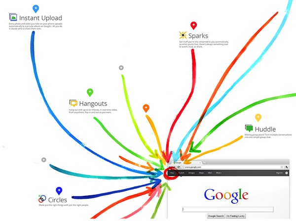
For a dose of Google’s new design wizardry, check out the Google+ demo page:
Now that’s a high-design landing page. Minimalist visual aesthetic it is not. It’s engaging, creative, and ripe with compelling content. As it should be, as the point of Google+ is to move the search giant beyond being a gateway to other sites into more of a destination in its own right.
Google has made clear that this fresh take on design will permeate all their services. Witness the sexy black bar at the top of the Google homepage:
Yes, I just used “sexy” and “Google homepage” in the same sentence. So from now on, the answer to “What would Google do?” is: embrace the contributions of great designers.
Scratch The It-Pays-To-Be-Cheap Excuse
Don’t get me wrong, I’m all for saving money. Budgets are tight, and there are numerous competing demands for your resources, whether you’re a one-person shop or a Fortune 500 juggernaut. And design investments definitely don’t come for free.
You should vigorously optimize your spend. But you should optimize it for the outcome: what are the maximized results that can be achieved with minimized investments. It’s dangerous to drop the first half of that equation and optimize solely for cost reduction without weighing the impact on performance. (“Penny wise and pound foolish.”)
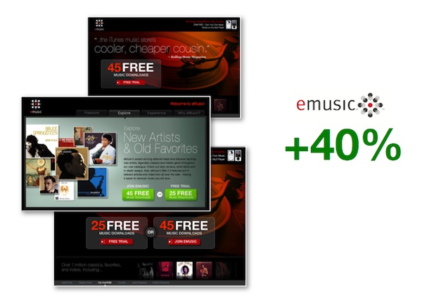
So for years, I’ve advocated investing more time and money in landing page design — one of the reasons I prefer to think of the mission more broadly as post-click marketing. Usually, my key exhibits are real-world cases where design-driven makeovers of landing pages have delivered major increases in conversion rates, such as this example:
In the interest of full disclosure — since my company sells software and services for such post-click marketing, these anecdotal examples are sometimes interpreted as a sales pitch specific to my firm. But we don’t have any proprietary lock on design skills. I’m the first to say that anyone can do this — good design principles can be adopted by any company that values having them.
Need more objective evidence?
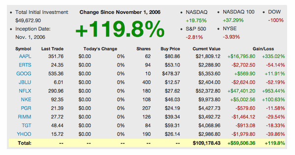
Lance Loveday, the CEO of Closed Loop Marketing alerted me to the UX Fund, an investment experiment by the design firm Teehan+Lax. They took $50,000 and invested it in a portfolio of public companies that have demonstrated strong commitments to design and user experience:
The results show that 5 years later, this portfolio has grown by 123.39% — far outpacing the NASDAQ and the NYSE. In other words, at the market level, it pays to be design-driven.
Scratch The CMO-Doesn’t-Get-It Excuse
The final excuse that’s held some marketers back is that the CMO doesn’t care about landing pages. They’re too tactical, in-the-weeds. So why invest in making them amazing, when you could, say, launch a high-profile, social media command center instead?
It’s true: any one landing page — or any one ad or email leading to it — is in the weeds. And you probably should have some kind of social media command center.
But these things are all connected to a bigger picture. Increasingly, that bigger picture has converged around two key CMO-level missions: (1) accountability for metric-driven marketing performance and (2) brand development and competitive differentiation through customer experience (CX) management.
CMO.com recently published 10 Great Expectations: What CEOs Want From Their CMOs that emphasizes these two missions. And so it goes from the CEO to the CMO to you. (With more or fewer layers in between, depending on your job title.)
Landing pages (or, more broadly, post-click marketing experiences) address these missions in the top-of-the-funnel (ToFu) and middle-of-the-funnel (MoFu) interactions across display, email, search and social marketing.
What happens after a respondent clicks? That is often the first critical touchpoint for customer experience. If you can’t impress and intrigue your audience after the click, why should they think you’ll do better after the sale?
Directly tied to these experiences, conversion rates for primary actions (e.g., leads, purchases, subscriptions) and secondary actions (e.g., social conversions via Facebook, Twitter, and Google+) are the quintessential metrics for marketing performance measurement.
It’s with these metrics that the value of design can be quantitatively proven in your own business. Before you champion a company-wide stampede to poach designers from Apple, start with a few modest post-click experiences. No need to make new hires out of the gate — work with a freelance designer to brainstorm better ways of presenting your value proposition to those click-throughs. A/B test these new ideas as challengers to your current landing pages.
When you report to the CMO, you can skip the landing page optimization jargon and talk to what really matters: how you’re improving customer experiences with better design and the metrics you have in place to prove it.
Yes, any one experience is in the weeds. But the collection of all the experiences you deliver to prospects and customers — and the operational capabilities you put in place to deliver them effectively — is at the very top of the C-suite’s priorities.
Opinions expressed in this article are those of the guest author and not necessarily Search Engine Land. Staff authors are listed here.
Related stories
New on Search Engine Land


