5 Website Tips To Decrease User Frustration
If you ever need a topic to discuss at a social gathering, just ask everyone, “What do you find the most frustrating about using websites?” There are so many common complaints and issues raised by everyday Internet users and yet so many websites are still driving us crazy. Websites contain oversights. It happens to even […]
If you ever need a topic to discuss at a social gathering, just ask everyone, “What do you find the most frustrating about using websites?” There are so many common complaints and issues raised by everyday Internet users and yet so many websites are still driving us crazy.
Websites contain oversights. It happens to even the most esteemed companies and organizations who have an online presence. It happens to small businesses with small staffs and brand new websites. It happens by professional web developers and those still learning.
Typically, navigation is the area where most end users become confused and lost on a website. Knowing this, more designers are studying information architecture, taxonomies and how to better organize and structure a site so that the navigation scheme is strong and logical.
What Are The Biggest Issues Causing User Frustration?
Two recent trends for communicating site structure via navigation quickly are in the examples below.
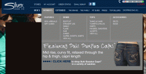
Drop down category structure navigation

Example of fat footer
While fat footers appear to be on the decline, AJAX and CSS have made creating header navigation interesting by showing, in a quick glance, category structure along with a promotional item. The beauty of this combination is not only in offering choices to browse, but also the additional chance to provide a call to action prompt to an item being marketed.
In addition to not understanding where things are or how to get there, the second type of user frustration is not having their needs met whenever they have one. Consider that every web page visitor has a goal or two in mind once they arrive from a search or link from somewhere.
Once they figure out where to begin a task that will help them achieve that goal, their one big hope is that your content is designed to help them along the way. It’s amazing how many websites fall down on the job of simply answering questions or providing important information at the precise moment it’s needed to complete a task.
This isn’t just a mistake made by new website designers. It’s more common than you may think.
The other day, I followed a recommendation to become a new member of a prestigious marketing organization. Amazingly, I couldn’t find any information on how much their membership fee is. I did locate, however, some indication that a fee would be waived for a limited time. The content didn’t label or point to what that waived fee was for, so I took a chance and began the long sign up process.
After they asked for everything about me and my company (invasive questions and one that wanted to know how many “millions” I make in revenue), I arrived to the end of the task to learn that the fee was far more than I could afford. The waived fee was for a mere small publication item that wasn’t available unless I joined. Along the way, I also noticed that at no time did their sign up process tell me what type of payment methods they accepted.
Not providing user instructions or answering questions during an important task such as a purchase process not only creates frustration but also increases abandonment rates. Simply adding a page title helps users understand where they’ve landed and yet some websites still don’t use them.
How To Best Help Your Users
To ease some common frustration complaints, try the following ideas:
- Put accepted payment methods on the product page along with its description. Most ecommerce sites remember to put credit card and PayPal icons in their footer, but some don’t like to because they’re not attractive. Even if you do put them in your footer, do remember to indicate a simple “MC/Visa/AMEX/PayPal accepted” statement on the product page itself.
- Never make invasive questions a requirement to completing a form without first disclosing why its vital information you need. The same thing goes for requiring phone numbers. Why must you have it and is there an alternative contact choice? Related: Sometimes web users hear of a promotion or see a reference to something that’s unclear but sounds “kind of interesting”. Not knowing all the details in advance, they enter bogus data into a form until they see exactly what they could be getting. If they’re not satisfied, they abandon the task right there. If they like the offer, they’ll go back and re-enter their accurate information.If your analysis shows high interest followed by sudden abandonment, study your task process, promotional offer, content and instructions to make repairs.
- Mystery and intrigue belong in a good movie or book, not your website. Therefore, if you conduct business locally or globally, make this obvious right away. If you provide a toll-free phone number for customer contact or call-in orders, put it your header in a larger font size as well as in the footer. If call hours are specific, don’t hide that information on the Contact page. Place hours or your company’s time zone next to the phone number.
- Here’s one of my favorites. Be logical where you place social marketing icons for plug-ins that share information or link to Twitter or Facebook. Some sites put “Share this” on every page of their website. It’s unclear if they want the entire site shared or a single product or the content from the page. Related: Offer a reason why your site visitors might be interested in your Twitter or Facebook activities.
- Please make error messages that are pleasant, not in red text and in all caps and offer solutions for the user error. Highlight where the error occurred to avoid user guessing. Better yet, offer examples for how you want form field data formatted and add user instructions wherever it makes sense to increase their confidence and trust in your company or motives.
Emotional web design is usually referred to as a nice way to achieve better conversions by creating an emotional human connection with your site visitors.
Unfortunately, and especially where Internet software applications are used for things like online reservations, sales lead forms, shopping and user generated data, the wrong types of emotions arise. These cover everything from being annoyed, stressed, nervous, tense and upset.
A physical action such as using a tool that stops functioning or doesn’t work as expected makes users upset. Sometimes there are back-end issues that suddenly go berserk. This often happens to Twitter and recently, Sony Playstation’s down-time for over 20 days to fix an issue caused a tremendous backlash among their loyal fans. Sometimes a poorly worded product guarantee results in customer complaints later because the customer didn’t understand its terms.
There are two rules of thumb I like to go by :
- First, anticipate user questions.
- Second, answer these questions the moment they have it.
Once you start this practice, you’ll discover there are countless ways to incorporate the logic into your entire design or application process.
Opinions expressed in this article are those of the guest author and not necessarily Search Engine Land. Staff authors are listed here.
Related stories
About the author