How To Apply Neuroscience Principles To Your Landing Pages
By understanding how humans' brains work, explains columnist Mona Elesseily, we can better tailor landing pages to meet prospective customers' needs.

I recently learned some neuroscience tips at a seminar called The Human Mind & Usability, which was hosted by well-known usability experts the Nielsen Norman Group.
In this article, I’ll discuss easy and effective ways to incorporate the discipline of neuroscience into landing pages. The same principles can obviously be used for other website pages too.
Why is this important?
Cognitive Load Reduces Our Effectiveness
Our brains get overwhelmed (and, as a result, don’t work effectively) if they’re too taxed or forced to think about too many things at once. There are obviously many examples of this on the Web.
Several examples are overly cluttered pages with no well-thought-out page elements; pages where the call to action isn’t in an obvious place or is hidden; page elements that wiggle and jiggle, and so on.
It’s important that we (Web developers, Web marketers) design impactful pages that reduce cognitive load and do not overwhelm our visitors. We’ll cover effective strategies to achieve this a little later.
We Don’t “Think” As Much
In general, we used to remember a lot more than we do today. For example, when was the last time you memorized someone’s phone number? We remember less and rely more on technology like Google, Bing, Siri and more to pull up information instantaneously as it’s needed.
With predictive search solutions like Google Now and Cortana, information is now being pushed at us without our even having to search. Talk about no thinking required!
Additionally, our modern productivity experts advocate abandoning memorization. Books like “The Organized Mind: Thinking Straight in the Age of Information Overload” by Daniel J. Levitin teach us to rely less on our brains and more on “non-brain” ways of recalling information like writing things down and using task software. The popular “Getting Things Done” task management methodology espoused by author David Allen encourages followers to write down everything that needs to be done because holding it all in our minds is stressful and unproductive.
Create Routine/Use Conventions/Provide Consistency
It goes without saying that the number one way in which we tax potential customers’ brains is by designing busy or confusing landing pages. The human brain craves routine, simplicity and a way it can access info as easily as possible (a mental shortcut, if you will).
So reinvent the wheel and make visitors comfortable by presenting things in a way they’re already familiar with and are used to on the Web. For example, don’t use cutesy or cryptic terms to describe your products and services.
If you’re a home décor store, use simple words like table, chair, lamp and sofa, and avoid words that people would have to think twice about to understand their meaning. Don’t do what CB2 did below and use terms like “decorate,” “live” and “eat” to describe offerings categories.

To be fair, CB2 has changed its site, and it now uses more conventional names for categories like “outdoor,” “furniture” and “lighting.” It goes without saying that common or recognizable terms require less cognitive effort for visitors.
People also crave consistency. For example, they want to see the words they’ve searched for reflected back at them. That’s how they know they’re barking up the right tree.
The familiar words persuade them to move along without stopping to question whether they’re on the right track. Often, companies use internal jargon or terms they’re accustomed to using on their websites, rather than the terms customers are searching for.
Group Logically/Create Hierarchy
Another effective way to reduce the cognitive load is to group information thematically and in a hierarchy, so that people can easily determine what steps they need to take next. The brain craves order and pattern. In this example by Zappos, it has created mini-categories so people can find the information they’re looking for quickly and easily.
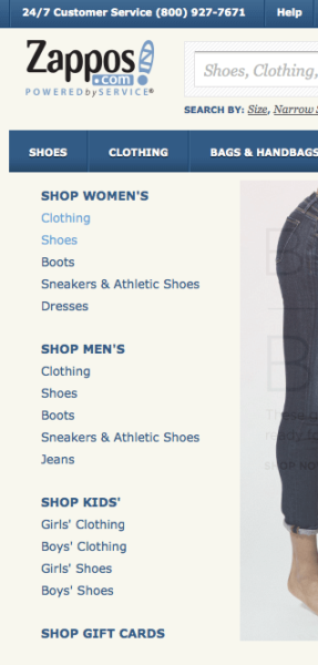
If more information is needed, Zappos provides the opportunity for visitors to drill down further on another part of the site, but note they do not overwhelm visitors from the get-go.
Try grouping information by color or shape. They key is to create distinctive groups on a page so that users’ eyes don’t wander all over the place. Here’s an example of how colors and shapes help people make sense of things on a page:
 I also place a lot of white space between groups to emphasize each distinct group on the page. In forms, I like to use white space in between fields, around the labels of fields, and under the wording above the form. That way, the form doesn’t look cluttered and isn’t so information-packed.
Here’s an example of an easy-on-the eyes (and brain) form:

If there are no groupings on a page, users are forced to stop, learn a new pattern or scheme, and then try to apply it. Pausing to figure things out causes people to slow down, and pauses are often associated with poorer conversion figures. I’ve seen cases where conversions have decreased by 200 percent because of a lack of groupings.
Don’t Create Unnecessary Worry
In trying to be through, developers and marketers sometimes provide a little too much info to potential customers. In some cases, they inadvertently spook them and discourage them from making a purchase.
Here are a couple of common mistakes and ways to avoid them:
- Companies mention their return policy even before there’s the need for a customer to consider returning a product. It’s especially important to avoid mentioning this close to any “buy now” button on a landing page. In all the tests I’ve run, doing so has decreased conversions by 10 percent to 30 percent. I recommend focusing on other unique selling propositions like shipping offers and selection delivery time to prove your company’s credibility.
- When companies talk about their privacy policy from the get-go, they plant the seed in the potential customers’ minds that they should be concerned. So folks are not spooked, try not to mention this too early in your engagement and definitely not next to your call to action. I’d also play up other credibility indicators on a page like testimonials, SSL certificates and social media icons.
Opinions expressed in this article are those of the guest author and not necessarily Search Engine Land. Staff authors are listed here.
Related stories
About the author