Case Study: Which Online Grocer Has The Best Conversion Process
Some of you may remember my debut Search Engine Land post which looked at the process for buying an iPhone 4 on various UK retailers. The article went down quite well so I’d like to repeat this process for another set of websites to see how they convert visitors into buyers. This time I’ve chosen […]
 Some of you may remember my debut Search Engine Land post which looked at the process for buying an iPhone 4 on various UK retailers. The article went down quite well so I’d like to repeat this process for another set of websites to see how they convert visitors into buyers.
This time I’ve chosen a few UK supermarkets that allow you to place orders online. This is an interesting topic given that Amazon recently moved into the grocery market and therefore started competing directly with established supermarkets.
I want to look at the unique challenges faced by supermarkets and how they overcome them, therefore increasing their chances of converting the customer. These seem to be the unique challenges faced by online supermarkets:
- Users are very concerned with choosing a suitable delivery time
- Retailers often run multiple special offers across thousands of products at the same time
- Many customers will want to repeat their order for products they buy often, therefore they may want to access these items quickly rather than going through the whole process again
As always, I need some controls for this test so I decided to test the following:
- Buying five everyday items—milk, bread, eggs, coffee and chocolate
- Having these delivered on a Friday afternoon when I’m at home
For each retailer, I’m going to answer a couple of questions:
- What they do well
- What they don’t do well
I’ll then round up with some hands-on tips which could be applied to your own website to help improve your conversion rate.
I’ve chosen Amazon, Tesco and Asda, and for the purposes of this test, I’m going to act like I’m a first time user to all three websites.
As I mentioned above, Amazon has moved into the grocery shopping space so I thought where better to start.
Amazon: What they do well
Timely landing page special offers. At the moment in the UK, it is what we call “Back to School Time”. All of the school kids will be heading back to school soon and most retailers are fighting for the money spent by parents during this time. Amazon have recognized this and highlighted it on their landing page:

Good filtering once within a category. Despite their broader problems with navigation (see below), once you are within a category, Amazon offer good options to filter and find what you want. In this example I’m in the coffee category and have some good options to filter and find what I want:

This is done well and is very relevant to the coffee category—I can’t think of any additional ways someone may want to filter for here.
Amazon: What they don’t do well
Finding basic items. I found it very hard to find a couple of the basic items on my shopping list included milk and eggs. I can understand that Amazon simply do not sell these, but surely they should stock these basic items if they expect me to do my grocery shopping with them. I suspect that with grocery shopping, users want t buy all of their items from one place at the same time. If Amazon can’t provide me with these basic items, I’m very likely to go somewhere else.
Lack of well known brands and blank search results. I had a similar type of problem with bread, there was a severe lack of what I’d call recognizable brands. I was given the chance to narrow my search to “Hovis” which is a popular brand of bread, but clicking on this returned no results which was frustrating – why show me the option if it isn’t available?

Lack of clear navigation. Amazon hasn’t done a very good job of making it easy to find items. The navigation menu across the top of the page didn’t make much sense to me and hardly covers the basics:
![]()
To get to basic items, I had to use the left hand navigation menu. This wouldn’t normally be a massive problem, except that they have put one of the most popular categories for grocery shopping near the bottom:

This may have been a conscious decision by Amazon as they seem to have a real lack of fresh produce. But surely this is part of the average person’s grocery list?!
You can’t add a product to your basket with one click. As you’ll see from the other supermarkets below, this is a bit of a flaw with Amazon. With something like grocery shopping, you don’t really need to view a full product page with details and reviews (and all the other stuff Amazon like to include!). This works for other products such as DVDs and books, but not for grocery shopping.
I can’t buy from this page:

Delivery concerns. One of my criteria for most people doing shopping is being able to choose a convenient time to receive my shopping. Amazon don’t do this. They use the same options as they would for delivering normal goods. I don’t think this is a good thing for grocery shopping. The best option I have is to pay extra and have delivery by 1pm the next day:

I think this could be a major flaw that could put people off using Amazon for grocery shopping. We all know that Amazon are pretty good at delivering other goods, but with something like groceries, I think most people will like to be in when they’re delivered. Therefore being able to choose a delivery time slot is essential.
Overall I think there are more negative points than positive with Amazon at the moment but we must remember that they are new in this market. However they need to understand that the conversion and check out process that works so well for their other products, may not actually work as well for groceries.
Next up is Asda, owned by US parent company Walmart.
Asda: What they do well
Clear call to action on homepage. Good call to action in the top left corner and good text: “Grocery shopping delivered to your door” with a picture of a delivery van and a nice big button saying “Start Shopping.”

Registration & addressing delivery concerns. Before I can start shopping, I need to register my details so Asda can verify I live in an area that they can deliver to. This is a good thing to establish first because I don’t want to go through the shopping process only to find out that my groceries can’t be delivered.
Their registration form actually looks a bit long to me and not the most appealing in terms of design. However they have a nice little title at the top which made me smile and I wondered whether this actually helped people complete the form:

To be fair, the form was very easy to complete despite not looking too great.
Another good thing that Asda does is that no matter where I am, I can always see my shopping trolley and can book my delivery slot very easily (and change it). The following is always on the right hand side of the screen:

Getting started page. I quite like the page that I’m greeted with after registration. Asda offered five steps on how to get started:

Booking a delivery slot. Booking a delivery slot is very easy. I’m given a choice between a two hour slot or an eight hour slot. My criteria is a Friday afternoon so I opt for the 2 hour slot option and its simply a case of clicking on the slot I would like:

One thing that I found quite frustrating here was that if I chose the wrong slot, I couldn’t cancel it and choose another slot. Interestingly, the cancel button doesn’t actually work! To change it, I actually had to book it, then go back in and change it.
Adding products to my basket. I don’t actually have to click through to a product page to add it to my basket. I can even select different quantities and click add, without clicking through to the product itself. This makes perfect sense because you don’t really need to know more details about these type of products, you’ve probably bought them before at the supermarket:

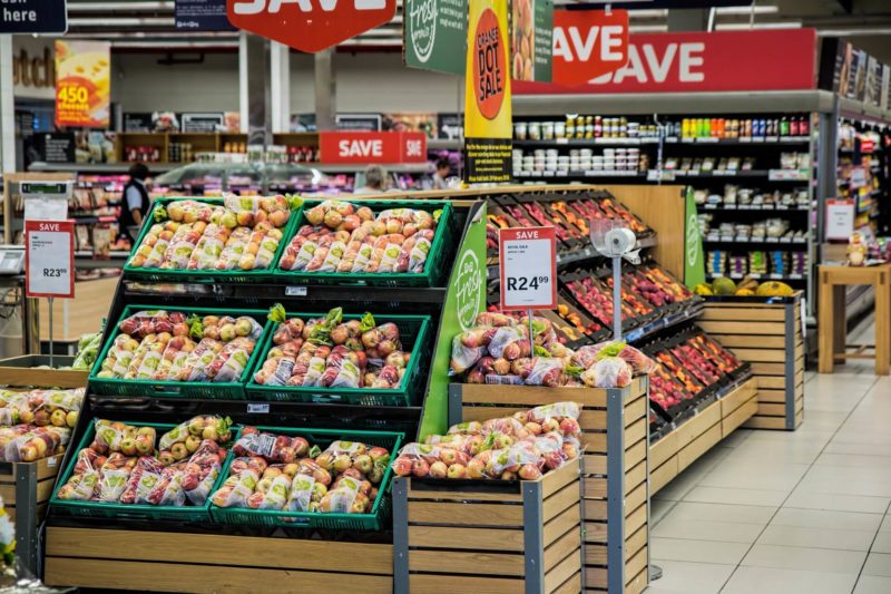
Highlighting special offers. Asda is quite good at discreetly highlighting special offers in their product listings. The small red banner is also clickable and adds the special offer to your basket straight away. Alternatively, if other products are included in this offer, you’re taken to a page where you can view different products that are included. Here you can see how they highlight a special offer on apples which is mixed in with normal prices:

Asda: What they don’t do well
Creating my own shopping list. Once I’d registered, I was taken to a useful page which told me how to get started which I thought was a nice idea to help. I was also able to use a clever little form to type in my shopping items by hand:

However, this didn’t really deliver what I expected. I was given a list of 25 types of eggs and the option of viewing up to 229! At first I thought that the system has just searched for eggs and nothing else, then I noticed the other words I’d searched for hidden away in the top corner of the screen:

I’m sure that a better system could be used here which displayed the top 5 products by popularity from each of my searches. This would allow me to scan each set of results and quickly add all of my items to my basket—all from this one page.
The other thing that could improve this page would be to fill the big white space with large buttons which take me to the other items I’ve searched for.
Making a favorite shopping list. As expected, Asda has a feature whereby you can save your shopping lists so that you can refer back to them next time you login and quickly find products. So far so good; however, this feature is very hard to find! The ability to add products to a shopping list is hidden away:

I actually had to read the instructions on how to do this (which I never do) and then I still struggled to find it. Such a fundamental feature should be obvious as many customers who want to do repeat orders will use this feature—therefore bringing more revenue for Asda.
Not making the minimum order value obvious. Another thing that I didn’t like was that the minimum order value required was not made clear. In fact it is quite a small piece of text. I didn’t actually notice this until I placed my five items into my basket, which is very frustrating. I can understand why there is an minimum order value; however I’d have expected this to be a lot more obvious than it was:

Next on my list is Tesco, one of the biggest retailers in the UK.
Tesco: What they do well
Security. One great thing that Tesco did was to reinforce the point that their website is safe for me to use—they did this at the point of registration. They even gave me a link to more detailed explanation:

Getting started. After I’ve registered, I’m sent to a getting started page which is very simple and easy to use:

One big difference here is that Tesco helped get me started in just three steps, using a bit more of a call to action style than Asda used.
Delivery options. Tesco have a similar layout to Asda, basically a grid that allows you to click on a time slot that you would like:

Nice landing pages. Tesco does quite a good job of highlighting their special offers on a section landing page. For example, the bakery section highlights some “buy one get one free” offers as well as special offers of the week:

Below the special offers (not on the screenshot) are regular links into popular types of bakery products such as white bread or brown bread, and so on.
A great upsell feature. I love this one! If you add an item to your basket which is part of a special offer, for example 2 items for £2, you are told in the basket that you have missed a promotion:

I think this is a great feature as some people will be in a rush to complete their shopping list and may not always take note of the special offers. In my example shopping list, all I wanted was a loaf of bread, and I was told that these were on special offer at a stage where I may not have otherwise noticed. Nice work here Tesco!
Tesco: What they don’t do well
Registration. The first part of the registration process is very simple and requires just three pieces of information:

However when I moved on to step 2, Tesco had similar issues to Asda’s registration process. The registration form looks a little bit daunting and not exactly appealing. Asda recognized this and put the friendly banner at the top of the form saying that the form was easy. This small gesture made Asda’s registration form a little more friendly. As opposed to this:

Now I ran into a problem here because Tesco asked me to choose my address from a dropdown menu. My address wasn’t on the list so I looked for a place to manually enter it—there wasn’t one. I had the same issue on Asda but they allowed me to not only enter my address manually, but also include special delivery instructions for the driver.
Tesco has bit of text saying “if an address is not listed above, it is because we are unable to deliver to it.” But this isn’t true—they have my neighbor listed, after all! So Tesco would have lost me here if I’d been placing an order.
Product listing pages. They seem to have a lot of wasted space on their product listings page, lots of white space doesn’t especially look good for me. When I land on a listings page, I can actually only see one product listing:

As I scroll down the page I see more listings, and to be fair, they highlight the special offers quite well and it’s possible to add to my basket with one click. However I am of the opinion that this page can be tightened up a lot:

I also don’t see the need for the big red “new” banners across each listing. Does a customer doing their grocery shopping really care if a loaf of bread is “new?”
Top Ten Takeaways
1. If users don’t need to see a full product page, don’t force them. Allow them to add to basket straight from product listings.
2. Account for users who may have unique addresses and allow them to enter them when they register.
3. Reinforce that your site is secure as soon as you can in the conversion process.
4. Highlight your special offers on your main landing pages but don’t forget to include the basic options too.
5. If you have an upsell feature available, tell your customers at the basket stage if they’ve missed out on an offer.
6. If you are going to call yourself a grocery store, sell basic groceries! (Hint, hint, nudge, nudge, Amazon…)
7. Remember your market and their delivery needs—do they need to choose a time and day?
8. Address your customer concerns as early as possible, such as letting them arrange delivery before starting to shop.
9. If you have special features such as a favorite shopping list, make it easy to use and find.
10. Think about the filtering options a certain group of products may need for a customer to find them easier.
I hope you found this useful and the top ten takeaways applicable for your own websites. As always let us know your comments and feedback below.
Opinions expressed in this article are those of the guest author and not necessarily Search Engine Land. Staff authors are listed here.
Related stories
About the author