Google Ads Getting New Google Checkout Badges
Since Google Checkout was launched last June, merchants in the program who also advertise on Google through Google AdWords have had little Google Checkout shopping cart icons in their ads. Today, Google Checkout announced the icon will be updated to a badge format similar to the Google Checkout buttons used by merchants since the […]
Danny Sullivan on February 13, 2007 at 5:24 pm | Reading time: 1 minute
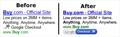
Since Google Checkout was
launched last June, merchants in the program who also advertise on Google
through Google AdWords have
had little Google Checkout shopping cart icons in their ads. Today, Google
Checkout
announced the icon will be updated to a badge format similar to the
Google
Checkout buttons used by merchants since the program started.
The image above shows the
before-and-after look. I’m still seeing “before” icons, but I imagine they’ll
roll over into the new ones shortly.
Opinions expressed in this article are those of the guest author and not necessarily Search Engine Land. Staff authors are listed here.
Related stories
New on Search Engine Land
About the author
Contributor
Danny Sullivan was a journalist and analyst who covered the digital and search marketing space from 1996 through 2017. He was also a cofounder of Third Door Media, which publishes Search Engine Land and MarTech, and produces the SMX: Search Marketing Expo and MarTech events. He retired from journalism and Third Door Media in June 2017. You can learn more about him on his personal site & blog He can also be found on Facebook and Twitter.