Hack Your Web Developer’s Questionnaire For Higher Conversion
I was recently asked by a prospect to help them complete a website design questionnaire, the document utilized by design firms that drives the design of a website. The company doing the redesign of this site specializes in e-commerce sites, so I had expected their questionnaire to focus on conversion, business goals, etc. I was […]
I was recently asked by a prospect to help them complete a website design questionnaire, the document utilized by design firms that drives the design of a website. The company doing the redesign of this site specializes in e-commerce sites, so I had expected their questionnaire to focus on conversion, business goals, etc.
I was mistaken.
Rather than be exasperated by this, I saw it as a teaching moment for my prospect and for you.
If you are driving search traffic to an online store, online service, or subscription site, I recommend that you add some hacks to your website developer’s questionnaire (also called a survey or creative brief) so that your business goals are part of their design process.
Here’s how I would change the one I was given.
Know When You Are The Wrong Person To Ask
This is the most important realization you can come to: you are a business person, marketer or something else. You are not a Web designer. More importantly, you are not your Web visitor.
Don’t let your development and design team pass the buck. They should be asking you for information that helps them make a decision. They should not be asking you for that decision.
Don’t try to make decisions. Provide the information your design team needs to make good decisions.
Any time they ask you to make specific recommendations, change the question. All questions should ask you for information that informs their decision. If they are not willing to make such decisions, you best let them go about their business and find someone else.
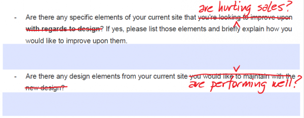
Navigation Has To Make Sense To Your Visitor
The question of how your navigation should be laid out is not one to be decided by your personal taste or by what you believe is cool. Navigation has the burden of getting people off of the home page and into your site. Once a visitor is in your site, the navigation must anticipate their next question.
As such, you should add some questions to your website questionnaire.

Navigation decisions should be based on your visitors’ needs. How will they research your on your site?
Your main navigation should guide visitors to the things that move your business forward. These are the things you need your visitors to accopmlish to be successful.
Your sub-navigation, or side navigation should numerate the alternative ways of exploring your site. Usually, information on a commercial website can be categorized, so list your categories there. If there are a lot of categories for your visitors, you may need to have some sort of expandable navigation or use “fly-outs.” Otherwise, just list the categories.
When listing your categories, don’t forget “Most popular,” “Featured Items,” and “Editor’s Choice” categories.
If you have more than two pages on your site, go ahead and include site search. Those visitors who know what they want will use this feature and they will have high expectations for it’s accuracy.
Kill The Slideshow
If there is anything that will define your character as an online marketer, it is your ability to do something that is the opposite of what everyone else is doing because the data tells you so. Such is the case with the homepage slideshow.
In test after test, this little bit of interactivity has shown to reduce conversion rates. Yet it is used on websites all across the Web. This simply means that most marketers aren’t testing this feature.
Nonetheless, there are signs that this feature is falling out of favor with traditionally high-converting websites like keurig.com, proflowers.com, Raoman’s, Woman Within, 1-800-PetMeds and the site that never resorted to slideshows, Amazon.

The Slideshow can be expected to reduce conversion rates. Pick one and go with it.
How can something so universally accepted reduce conversion rates?
We think it works like this: The automatically rotating slideshow creates motion on the page. Our brains are designed to react to motion, and just as we’re getting into the other elements on the page, the hero shot moves, breaking our concentration. We can never really digest the home page because we keep getting distracted by motion, and we totally miss what we were looking for.
Don’t be lazy. Do the hard work of picking one message for your site.
Alternatively, change the rotation rate of your slideshow to once per day (that is 86,400 seconds, if that is how your questionnaire asks). A daily rotation offers variety without motion.
Social Media Icons Are For Rock Stars
If you’ve paid good money to get searchers to visit your site, why send them off to a social media network? Are you really so attention-starved that you need likes, fans and followers instead of sales?
Most knee-jerk designers will assume you want social media icons on every page of your site. You don’t, unless you are a rock star, celebrity, or run a social network.
![]()
Don’t send your expensive search traffic to some social network. It probably won’t ever come back.
It is the “Thank You” page that is the right place to ask people to pimp you on social media. They’ve just bought your product or subscribed. They’re primed to share their brilliant action with others. Hold off until this point.
The only exception to this hack is this: If you are really good at converting social media fans into record sales, TV viewers, or movie tickets, go for it. Otherwise, keep your hard-won traffic on your site until they buy, subscribe or register.
Sell Buyers Something Else
When is the best time to sell somebody something? The answer is, “Just after they have bought something.”
That’s right. There is no better time to offer something more than when someone has just “bought” something from you. Clearly, they are “buyers,” right?
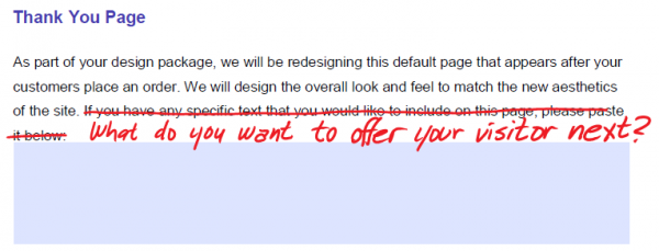
Thank You pages are a great opportunity to offer something else to your best visitors: those that buy.
By “buying” I mean that they’ve paid you in money or have paid with their contact information, in the case of a lead.
You don’t have to offer them something more to buy (but why not?). Now is the time you can ask them to share with their social networks; to friend, fan or follow you; to download something; to join a mailing list, and more.
Why bother? You got their money, right? Well, the thank you page is the most effective place to :
- Increase your average order value by selling related items
- Open different communication channels for their next purchase
- Do something extraordinary to put an exclamation point on the purchase
- Minimize buyer’s remorse and the accompanying returns
- Teach them how to use your product successfully
- Get referrals
I could keep going, but that’s for another column. So, how much time are you spending on your “thank you” pages?
Capitalize On Your Errors
It is hard to be perfect. Sometimes we ask searchers to come to pages that just don’t exist; or they existed once, a long time ago. This doesn’t mean that we need to spit in their faces. Perhaps we can still help them with their problem.
This is the job of the error page.
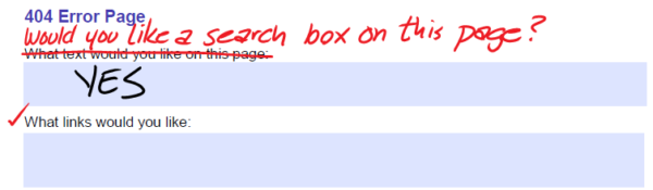 Every error page is an opportunity. Don’t screw up a second time with a lame page.
First of all, the term “404” should not appear anywhere on your error page. Instead, you should present a helpful resource coupled with a polite mea culpa.
Your 404 page should act like a homepage. If you have a site of any heft, offer a search box. Provide links to the things that you would offer on your home page. However, don’t send these visitors to the home page. You must apologize first.
Nobody Wants To Contact You
If the best thing your design firm can come up with is “Contact Us” just walk away. Instead, look at the question introduced above: “List the three most important things your visitors must do on your site.”
Create a separate page for each of these.
 A Contact Us page is the least interesting lead generation page on the Web. Try something else.
They may include things like:
- “Find a store nearby.” If this is the case, a map would be nice.
- “Get a quote.”
- “Ask a question of our knowledgeable experts.”
- “Subscribe to our free newsletter.”
In other words, everyone is trying to solve a problem, and their problem is not “I need someone to contact me.” No one wants to contact you – nor do they want you to contact them.
Ask More Of Your Web Design Firm
In all fairness, most Web design firms are responding to the desires of their clients, who are not focused on their visitors, but on their own egos. The market for websites that are driven by the whim of their owners is hundreds of millions of dollars larger than the market for those who are visitor-centric.
Success and high conversion rates go the to the visitor-centric, not the ego-driven. Which are you?
I like to believe that most designers want to do do well by their customers. If you are the kind of marketer or business owner that asks more of their design firm, you might find yourself with a site that serves your visitors (and your business) well.
Opinions expressed in this article are those of the guest author and not necessarily Search Engine Land. Staff authors are listed here.
Related stories
About the author