How To Gain Great Insights With Google Analytics Dashboards
Google recently released its new Analytics interface to all of their users. Personally, I think that one of the biggest improvements is the ability to create multiple dashboards as well as the flexibility of widgets to customize your dashboard with essential metrics. This post will elaborate further on: how to create (multiple) dashboards the possibilities […]
Google recently released its new Analytics interface to all of their users. Personally, I think that one of the biggest improvements is the ability to create multiple dashboards as well as the flexibility of widgets to customize your dashboard with essential metrics. This post will elaborate further on:
- how to create (multiple) dashboards
- the possibilities of the new dashboards
- a few examples for your own dashboards
- suggestions for new features
Multiple Dashboards
 The new Google Analytics gives you the power to create up to 20 custom dashboards for each profile. This makes it perfect to create a separate dashboard for each department in your organization or for each traffic source.
The figure at the right shows an example of one of my own accounts with seven different custom dashboards; one for the total overview and six dedicated to a specific traffic source.
This gives the user the possibility to get a rapid and good overview of what each traffic source is doing in terms of the selected metrics like visits, bounce rate, goals, revenue, etc.
For a deeper analysis of a specific traffic source, the user can dive deeper into the different Google Analytics reports or create custom reports.
Adding Widgets
The four different widgets gives the user a lot of flexibility in creating your own personal dashboards:
- Metric. Shows the value for a single metric, a spark line and what the percentage of the selected metric is compared to the total over a selected period of time.
- Pie chart. Shows a breakdown for a single metric grouped by a dimension with a max of six slices.
- Timeline. Shows a graph for one or two metrics over the selected time period.
- Table. Shows a table with one dimension and up to two metrics over the selected time period with a max of 10 rows.
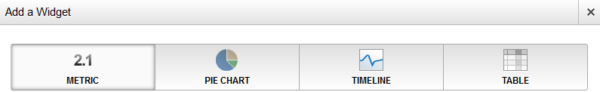
If you combine these different widgets with the filter options available for each widget, the options are great in creating your own customized dashboard.
Dashboard Examples
Before creating your own dashboard, it is important to clearly define your KPI’s and metrics for each dashboard you are going to create. If KPI’s aren’t clearly defined, you will end up with the wrong metrics or with too many metrics.
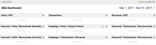
The figures below show the different metrics for one of the SEA (Search Engine Advertising) dashboards I created. It shows the overall CPC visits and revenue, transactions divided by a custom variable, most successful campaigns based on visits, visitors, transactions, revenue, as well as the keyword performance (branded vs non-branded) based on visits and bounce rate.
This dashboard gives you a complete overview of the best campaigns/keywords for the selected time period. If you mark the option “compare to”, you will also see the results for the same period before, which allows you to analyze which campaigns / keywords are doing better or worse.

As I mentioned before, the filter options are great, specifically the regular expressions give you a lot of power. They make it possible to make a specific widget for almost any piece of data you want.
The widget below shows a report with the transactions and revenue for non-branded CPC keywords. I did the same for branded CPC keywords and also with other metrics, such as visits and bounce rate. The last option, “Link to Report or URL” gives you the possibility to link directly to a standard Google Analytics report or a URL within the widget.

Here are a couple of suggestions to create a customized dashboard for SEO:
- Visits, revenue, transactions for organic keywords (branded & non-branded)
- Relevant metrics for top landing pages
- Total for organic visits, revenue and transactions for the selected time period compared to the previous time period
A clear and correct tagging policy is necessary to get the most out of e-mail, affiliate and social dashboards.
Once this is done and you have created all the dashboards, it is really easy to do a quick analysis on every traffic source. For even further analysis, just dive deeper into the data by clicking the linked report / URL or another report within Google Analytics.
Feature Suggestions
Due to the beta release, some options from the old interface are not yet available. At this stage, it isn’t possible to export or share your dashboard, which is really annoying if you want to create the same dashboard for multiple logins. You have to do every widget again and again.
Quickly adding a report to your dashboard is also not (yet) possible, everything is now done by widgets. These widgets are currently limited in regards to mobile options. At this point, it is only possible to see statistics for all of your mobile traffic, while for deeper analysis, it could be interesting to see your revenue or conversion rate for specific mobile devices or carriers.
I think this post should give you same basic insights of the possibilities with the new Google Analytics dashboards. Please let me know in the comments below how you’ve been using Google Analytics dashboards, what features you feel are missing and what you’d like to know more about.
Opinions expressed in this article are those of the guest author and not necessarily Search Engine Land. Staff authors are listed here.
Related stories
New on Search Engine Land
About the author