Mobilegeddon Revisited At SMX Advanced
Columnist Bryson Meunier recaps the lively and informative discussion at SMX Advanced around Google's mobile friendly update.
When Google’s Gary Illyes, SEO Clarity’s Mitul Gandhi and I presented in the Things You Don’t Know About Mobile SEO, But Should panel at SMX West in San Jose on March 3, Google’s mobile update could still have been Mobilegeddon.
April 21 was approaching, and many webmasters were wondering how to make their sites mobile friendly so as not to take a big hit from this update that was advertised as being “bigger than Panda and Penguin” and “significant”.
Because of this, the room was packed with webmasters eager to get the inside scoop from Google on how to prepare for the potential disaster somebody called “Mobilegeddon”.
The Mobilegeddon panel at SMX Advanced on Tuesday was a calmer, more reflective affair entirely. Taking place exactly six weeks after Google started rolling out its mobile friendly update, this session was moderated by Barry Schwartz and had panelists Gary Illyes, Mitul Gandhi and Laura Scott of RKG Merkle combing through the rubble of Google’s mobile update, taking inventory of what happened, and planning for the mobile-friendly future.

Gary Illyes, Webmaster Trends Analyst, Google

First up was Google’s Gary Illyes, who reminded people that mobile is still “super important”, using statistics to demonstrate that mobile is still something marketers should be paying attention to, even after the Google mobile friendly update.
He started with five common objections to going mobile today, including that the audience just watches television all day and spends time on social media and games, so why pay attention to mobile web and search?
But this was a clever ruse that didn’t fool most of the audience. “Mobile is still the new black,” Illyes said.
Here are some of the biggest takeaways from Illyes’ presentation:
- Mobile has changed the way we consume media. 45% of traffic to YouTube today comes from mobile devices.
- People watch more videos on smartphone than PCs and tablets combined
- Google expects smartphone penetration in the UK to be 90% in 2020, and it is 70% today
- 20% of UK consumers, including Illyes, look at their smartphones within five minutes after waking up
- The fear of being without a mobile device now has an official name: nomophobia
- In 2015, mobile searches surpassed desktop searches in Google in several countries
As for Mobilegeddon itself, Illyes joked that the name is brilliant but that he hates it.
He added that the response to the mobile update has been positive, as Google saw a 5% uptick in the number of mobile friendly sites after the mobile friendly update was announced in February of this year.
There is still work to be done, however, as the top tier of the biggest sites are still not mobile friendly. For larger sites it’s not as easy to make large updates in a small amount of time.
Illyes said that mobile friendliness at Google is calculated during its rendering process, and many webmasters are still making mistakes that are preventing Google from recognizing their content as mobile friendly, including:
- Many webmasters disallow crawling CSS and JS files
- Some are adding noindex tags to their mobile sites, which not only prevents Google from displaying a mobile friendly tag, but removes the listing from search results entirely
- It’s common not to configure the viewport, but doing so is necessary for mobile friendly designation.
- Font size is often too small. Illyes said searchers should not have to pinch and zoom in order to view content, just because they are on a different device than was intended during design.
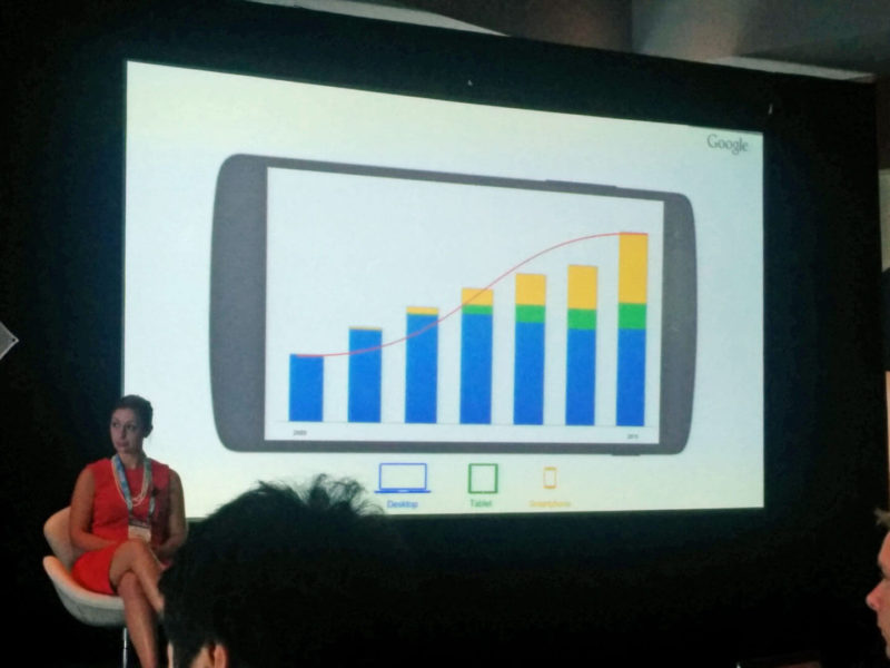
Illyes closed with a reminder that mobile is big and getting bigger. Worldwide, both mobile and Internet penetration is increasing, and people are not just accessing the Internet from desktop computers any more.
Site owners should keep this in mind when designing sites to take advantage of opportunities afforded to those that are mobile-friendly.
Mitul Gandhi, Chief Architect, seoClarity


April 21st wasn’t the day of the Mobilegeddon update, according to Mitul Gandhi, who opened his presentation by saying February 26 was a more appropriate start.
That was the day that Google did something it hadn’t done in recent memory: announce a major update to the SEO and Webmaster community.
When that happened, said Gandhi, webmasters started to panic, and rushed toward making their sites mobile friendly. There was a fear that many vendors capitalized on by inundating us with emails about getting ready for April 21.
He was even inundated, he joked, and seoClarity had sent out a fair amount of similar emails itself.
He then looked at the mobile search opportunity, noting that mobile search, while still not nearly as big as desktop search in the sample he looked at, has been growing at more than 3x the rate of desktop.

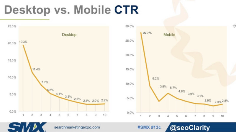
And the studies the company did on mobile click-through rate showed that mobile CTRs at position one were 27.7% compared to 19.9% for position one in desktop.
As for Mobilegeddon itself, Gandhi noted that he did see an impact, though maybe not as much as expected, in part because about 75% of top 10 search results by May 25th are mobile friendly.

By talking about the update, he argued, and acting on it, collectively we lessened the impact of the update.
Some other important figures from Gandhi’s presentation:
- Mobile growth differs based on industry. B2B sites in the SEO Clarity study see about 20% of total traffic from mobile, while sites in the Travel sector see about 35% on average
- Gandhi reiterated what Illyes said, that big brands were hit hardest by this update, as it’s more difficult for them to get mobile-friendly in such a short amount of time.
- Impact was different depending on the country, with bigger drops for brands in the UK than the US. Certain sites completely vanished from search results in Japan.
- Rankings on mobile differ from desktop by about 66%
- Sites that rely on mobile apps exclusively, like WebMD, were hit hard by the mobile friendly update
- Certain sites like AirBNB lost visibility initially and then gained visibility when they switched to a responsive design.
Gandhi closed by proposing a new definition of SEO as “Searcher Experience Optimization.”
Mobile SEO is focused on the user, he argues, even more than desktop, so we need to shift our focus to the searcher in order to do well.
Interestingly, there was a positive reaction to this new name on Twitter after the panel, as well as a discussion about the genesis of the term. Matt Cutts had suggested the name change back in a YouTube video in 2012, but was predated by both Gianluca Fiorelli in 2009 and Bryan Eisenberg in 2007.
Laura Scott, Strategy Lead At Merkle | RKG

Laura Scott closed the session with an entertaining discussion of how to mobilize your site.
This was focused on the laggards who, in spite of Mobilegeddon, still haven’t made their sites mobile-friendly.
She put some numbers behind the slow big brand adoption that both Gandhi and Illyes mentioned, saying that 46% of the Fortune 500 and 29% of the Internet Retailer 500 are still not mobile friendly.
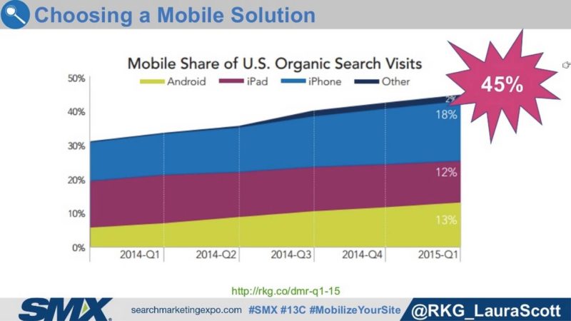
Forty-five percent of the organic search traffic that RKG Merkle sees to its client sites today comes from smartphones, Scott said, so the opportunity is large.
Scott’s presentation was filled with powerful analogies designed to persuade the late adopters of the importance of mobile, under the banner of “your mobile customer is your customer.”
Most businesses wouldn’t tolerate a poor customer experience in other channels like print or offline, she argued, but they’re giving those poor experiences to mobile searchers today.
She used a great visual of the Sears catalog cover in total, and then a detail of the catalog in the shape of a smartphone to illustrate the point.

The bulk of her presentation was on how to mobilize a site specifically. She outlined the three ways that this can be done according to Google’s guidelines, showing pros and cons of each.
What’s the best way? No answer is right or wrong, she says. All of these configurations can create great experiences for users.
The content is well-known by those who cover the mobile SEO space, but if you need details on how to mobilize a site, definitely check out her slides and Google’s guidelines that many of them are based on.
Her deck is full of powerful analogies that can help agencies and in-house SEOs persuade reluctant clients and management to finally understand that a good mobile experience is no longer optional.
For example, think of faulty redirects like calling in to customer service with a question and being transferred to one customer service representative after another, only to be told by the last representative that she can’t help you.
If you tolerated this as a business you wouldn’t last long, but the same things are happening in mobile search and too many businesses look the other way.

The Q&A at the end was both illuminating and entertaining, with the following standing out as highlights:
- Moderator Barry Schwartz asked when the page speed iteration of the mobile friendly algorithm was coming, and Gary answered “May 42.” More seriously, he said that page speed is something that Google is looking into for mobile, but that he thinks app interstitials are more pressing and will likely be next. Google does not plan on stopping with the mobile friendly algorithm and there will be future improvements.
- Google is considering a mobile index separate from a desktop index but it’s a huge change and won’t be happening anytime soon. Google currently looks at desktop content for relevance instead of mobile content, so Illyes is in favor of a separate index. People don’t link to mobile URLs like they do to desktop pages generally.
- Illyes says to pay attention to mobile video usage as a trend that marketers could take advantage of.
- At one point Google tried to set up a mobile spam task force, but they couldn’t find any spam. They found some eventually, but it took much longer than it would on desktop. Google is set up to take action on mobile sites, but it’s rarely necessary.
- Google mobile updates didn’t affect queries that were navigational in nature, so there are some sites that aren’t mobile friendly appearing for what seem to be more general informational queries that are relevant to authoritative mobile friendly sites below them. [Used cars] for example, might seem like a query that’s more informational in nature, but Google testing could have shown that it was navigational for AutoTrader.com. It begs the question if mobile user data was used to determine that queries were navigational, as it seems unlikely that sites that are hard or impossible to use on smartphones would still be the site of choice for most users for a given query. But Illyes did not detail Google’s process for determining which queries are navigational in nature.
- Illyes said, “Mobilegeddon was awesome”. He loved the transparency Google was able to provide and wants to announce more updates in the future. He thinks the next update that Google will be transparent about will be around hacked sites.
Opinions expressed in this article are those of the guest author and not necessarily Search Engine Land. Staff authors are listed here.
Related stories
New on Search Engine Land
About the author