The Mobile Content Dilemma: Brevity Vs. Optimization
Search engine optimization is a neverending quest for better content – and the more, the better. When approaching a site build, there’s often a tug of war between SEOs and site designers over what the page should say. Designers favor a “don’t make me think” approach, giving their users visuals and navigation but holding back […]
Search engine optimization is a neverending quest for better content – and the more, the better. When approaching a site build, there’s often a tug of war between SEOs and site designers over what the page should say.
Designers favor a “don’t make me think” approach, giving their users visuals and navigation but holding back on copy. SEOs, of course, are always pushing for more content, mindful of the search engines’ appetite for a page that focuses on keywords.
This debate gets interesting when applied to mobile websites. On the desktop, the question of how much copy is too much can feel very subjective: SEOs push, and designers push back. In the mobile space, the designers have a stronger point to make: that 21-inch monitor is gone, replaced by a 4-inch screen with tiny fonts. The need for brevity becomes more significant, and hard to argue against.
So how do we solve for this? How do we reconcile the need for brevity with the need for keyword-rich optimized content?
To resolve this debate, we have to look at how the typical visitor interacts with your particular website.
Come Here Often?
Let’s take ESPN.com, a desktop site that is a daily experience for a large percentage of its users. They know the URL, type it from memory, and come back frequently. Same for the mobile site.
Contrast that with a local sporting goods store. Customers visit their website maybe once or twice: first, when they research who to buy from, and maybe one more time for contact information, or to check a particular product. This isn’t meant to be discouraging – it’s simply a reality check, and helps us prioritize what factors are important to us.
If your site is heavily dependent on repeat traffic, then usability has to be a very high priority. People need to find their way through your site, and the experience has to be pleasant… or more to the point, not irritating. Fast-loading pages, with concise navigation and minimal scrolling, will be appreciated by your audience.
For the sporting goods store, the needs are very different. Here, the focus is on being found in the first place. A site needs to be competitive to be found in mobile search engines. With search being as common on mobile phones as it is on the desktop, the need for keyword-rich content can’t be overlooked. So in this scenario, brevity might need to take a backseat to optimization.
The best way to determine which scenario applies to you is to look at the metrics for your desktop site – specifically, new visitors versus returning visitors, and see which behavior is dominent.
Refining The Model
There’s a second factor to consider, one that we think about when planning desktop sites, but easily gets lost when planning mobile sites. When designing a desktop site, we look at each page as a freestanding document, and consider how that page will be used.
Home pages need branding and lots of navigation, whereas internal pages need more product-centric content. It’s second nature to most SEOs and designers to make these distinctions, and pages are designed accordingly.
But things start to get vague when it comes to mobile sites. There’s the assumption that design decisions have to be uniformly applied to the entire website: if brevity is the goal, every page must be brief! And it doesn’t have to be that way: we have as much flexibility in mobile site design as we do with desktop sites.
Top-Light, Bottom-Heavy
So if we circle back to the ESPN example, we can see that the home page will probably need to focus on usability, because people need to get to game scores and stories as quickly as possible. But once they get down to those lower-level pages, they’re looking for reading material, and brevity isn’t really desired.
These also happen to be the pages where we need SEO: the articles that focus on commonly searched teams and players. So these pages should be full-length, and optimized to draw sports fans from the search engines.
For the sporting goods store, we have different needs but similar conclusions. If people search for a business by name, they need to arrive at a concise home page with contact info displayed front and center, plus a few links to the company’s offerings.
But if they search by topic – say, a type of baseball glove – then SEO needs to roll-up its sleeves and get those pages ranked, using plenty of optimized copy and anything else in the toolbox.
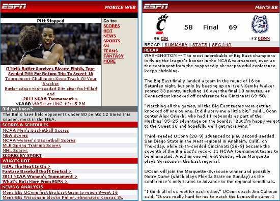
Figure 1: A mobile home page should have the essentials necessary for your typical user. Internal pages can stretch a bit longer, providing content that is comparable to a desktop site.
Wrapping Up
The key is to recognize that broadly-applied standards are not helpful or even necessary. Mobile webpages should be looked at individually, assigned a purpose that aligns with user needs, and designed accordingly. And yes, that does imply that a mobile site should be planned separately from a desktop site, and that puts us at odds with the more economical one site for everyone approach.
But in the end, it’ll be worth the added effort. The result will be a mobile site that feels right to the user, but was also easy to find five minutes ago, when the user was typing a search into their touch screen.
Opinions expressed in this article are those of the guest author and not necessarily Search Engine Land. Staff authors are listed here.
Related stories
New on Search Engine Land
About the author