Opinions expressed in this article are those of the sponsor. Search Engine Land neither confirms nor disputes any of the conclusions presented below.
How to create PPC reports people will actually read
Stop wasting hours of your week building reports that don’t even get opened.

I used to have a love/hate relationship with reporting.
I loved it because data was the sweet nectar we all need to achieve better growth. Reporting allowed us to collect it, ready to take action. Plus, there was something oddly satisfying about seeing what you had physically achieved.
On the flip side, I hated reporting because it took so much time and effort. In fact, statistically, reporting is actually the second biggest time sink for PPC managers. This isn’t surprising. (If you’re curious, keyword research was in first place. We’ve already covered how you’re wasting your time on keyword research here).
After pouring so much time into reporting, those reports were ignored. Clients didn’t care or understand. So what was the point?
But then I discovered a better way and started making reports that people actually wanted to read in a fraction of the time. You can do the same and stop hating your reporting by doing one simple thing.
Stop overcomplicating it.
Yeah, a groundbreaking statement there. If you read our work on easier PPC management, you’ll see that this is a common theme.
But don’t worry, I’m not going to give you some inspirational yet impractical quote and leave you to go on your way. This isn’t that type of article.
A data happy wonderland
Over complication of reporting comes down to two key areas:
- The data you’re using in the reports.
- How you are creating your reports.
We’re about to get into the first one.
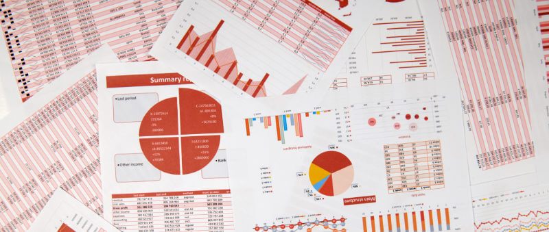
Some reports look like Willy Wonka and the data factory. There are metrics everywhere you look! Which isn’t all that helpful.
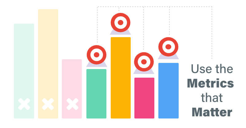
Make your reports simpler by selecting the data that matters. But that is easier said than done. You need to show the full picture of what’s going on, however not every campaign can be judged by the same metrics.
So what do you do?
Who is reading this?
Take a step back. Who is this report going to?
Putting yourself in the shoes of who is reading the reports will help narrow down the actual metrics that you need to use. If it’s going to a small business owner who just wants to know if the campaigns are worth it, make sure you show them the conversions and ROAS.
If it’s going to a marketing manager who is intent on building brand awareness, show them the impressions and clicks.
In addition, explain things to them. Tell them what these metrics mean and why they’re important – in terms that they will understand. Rather than giving people a sheet of numbers, give them value, information and context.
This will help ensure that your reports aren’t just read, but that they’re used.
The exact content you need will depend on who they’re going out to. These are people you will know better than us.
If you’re not sure – ask them. Find out the most important aspect they check and what reports are actually useful for them. There’s no point building reports for the sake of them. If they want something particular, build that and move on.
Ah. That’s much simpler.
Step back from the vanity metrics
Vanity metrics are those that serve no purpose other than to boost your ego and make things look good. But they don’t actually deliver any actionable value and should not be included in your reports.
They are a colossal waste of time.
Metrics like time on site are a great example of this. If users are spending more time on your landing page, this metric might be included in your report for a boost. But this doesn’t actually show anything. Whether someone spends 2 seconds or 4 hours on your landing page doesn’t matter – the only thing that does is taking action.
Most of this is about context though.
If you’re trying to increase sales of a new product you’ve launched, you shouldn’t be looking at ad impressions. It delivers nothing valuable other than an odd “neat!” exclamation.
So what if 5,000 people have seen the ad? Tell me how many people have bought the product.
That’s what matters. And this is what your reports should be made from.
Right, that’s data covered. Now let’s talk about how you’re actually building these reports.
Let go of the Excel sheet reports
There’s a time and a place for Excel. And I think as long as PPC lives, there will be a use for it.
I never want to make another Excel report again. Time-consuming isn’t even the word. It’s fiddly. It’s ugly and it’s practically unreadable to anyone that isn’t an Excel wizard themselves.
But we don’t live in the dark ages anymore. There are plenty of programs and tools that you can use that are far quicker and easier on the eyes. They also might make it more accurate too, as according to Adverity, 90% of all spreadsheets contain errors.
In fact, a quick Google search has brought up dozens of options, including Sisense, Reporting Ninja, Agency Analytics and Swydo. And of course, our own platform, Adzooma. In my completely unbiased opinion, ours is obviously the best.
The point is, it’s easy to find a tool that will work for you. Once you do, build templates. These will be the key to your success.
Note how I used the plural here for templates. Like there’s no “one-size-fits-all” campaign, there’s not going to be one for your reports. Create templates that are for specific purposes or people so you can roll them out exactly when you need them with minimal effort.
Get visual
By nature, we are visual creatures. That’s just who we are. It’s an instinct to seek out images – I’ll even bet that your eyes went to the images on this page before you read these words right?
Showing your data in a visual way is every marketer’s dream and increases the chances of your reports being read. A harsh but true fact there.
But there’s a difference between useful visual representations of data – and useless time-consuming gimmicks that really don’t work.
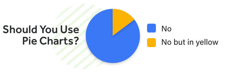
It has to fit the data and make it easy to understand. You know what this doesn’t apply to? Pie charts. There are almost no PPC metrics that fit nicely into a pie chart. And yet, so many people insist on using them for everything.
I’m hoping the below image will highlight this well…
All joking aside, picking the right graphs is a very important thing to consider. In an ideal world, every report could look fantastically engaging with professionally designed infographics. But that’s a lot of time and budget for something that isn’t needed.
You need to simplify it. Which means simple, yet visual, ways of showing the data. Generally, line graphs are some of the best options, particularly if you’re showing changes over time.
This is because you can easily see with your eyes what’s happening and follow a visual story of it moving through time.
Simple. Easy to understand. Efficient. Don’t underestimate how simple graphs can uncomplicate your reporting.
Get the AI to do it for you
Surprise, it’s another case of AI (Artificial Intelligence) saving the day. This is a recurring theme and will carry on until every business realizes that AI is an absolute necessity.
Anyway, back to the point.
AI is a time-saving miracle for reporting. Let me show you by guiding you through own reporting tool inside Adzooma.
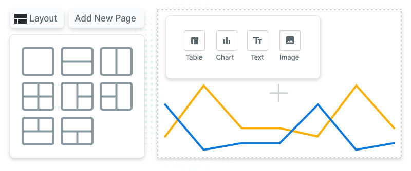
Here’s how it works.
- You go to the reporting tab in the top corner.
- Click the ‘Create report’ button.
- Add what elements you want, including text, images and even your own logo.
- With the data, select the exact metrics you want, in the format you need. Whether it’s a table or a line graph, the data will auto-populate from your account, saving you the job of having to find it yourself.
- Want to add a new page or change the layout? Just hit the buttons above.
- And you’re done.
Save and export them as needed.

One of the best features? Once you’re done – your report will be saved as a template.
So when you’re ready for a new one you just have to click it. That’s it. It will automatically update itself with the new data, ready for you to send off. That’s your reporting, done in seconds. Ready to stop overcomplicating your reporting? Try our powerful AI tools for free.
Related stories
New on Search Engine Land
About the author