Mobile Site Configuration & The Vary HTTP Header
Yesterday, Google announced more changes to the Google mobile search algorithm, which we can expect to roll out shortly. This update is intended to improve the search experience for mobile users by “address[ing] sites that are misconfigured for smartphone users” — presumably by improving mobile rankings for sites that have been optimized according to their […]
Yesterday, Google announced more changes to the Google mobile search algorithm, which we can expect to roll out shortly. This update is intended to improve the search experience for mobile users by “address[ing] sites that are misconfigured for smartphone users” — presumably by improving mobile rankings for sites that have been optimized according to their Mobile Optimization Guidelines.
In an attempt to prevent some confusion, Google also updated these guidelines to include a list of common mistakes, along with ways to avoid said mistakes. Unfortunately, confusion has been the name of the game with mobile SEO for some time now, as Google has historically sent mixed signals about what it considers mobile best practices.
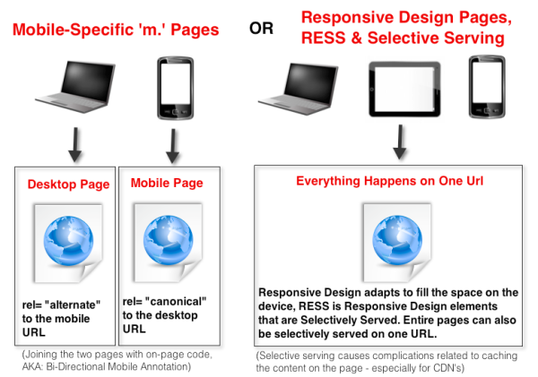
In November 2011, when Google launched the GoMo project to help businesses make “m.” versions of their desktop sites, it seemed like a tacit endorsement for the development of mobile-specific pages from Google, and that was great. Unfortunately, just over 6 months later, Google announced a preference for single-URL, responsive design websites to address mobile traffic and said that “m.” pages are more difficult for Google to index correctly.
The inconsistency in Google’s messaging about mobile SEO leaves large, enterprise-level strategists wondering if it is truly possible to future-proof their mobile search strategy. Will following the Mobile SEO Guideline de Jour turn out to be a colossal waste of time and money? Will Google change its stance again once a new strategy has been painstakingly implemented across a large site? What’s an SEO to do?
The Problem With Responsive Design
Last year, many companies took Google’s new preference for responsive design mobile solutions to heart, and started readying their development teams to update from mobile-specific pages to a responsive design approach.
Unfortunately, as most developers know, the problem with responsive design is always load time — and since load time is a ranking factor, this could have negative SEO consequences. In fact, Google’s Matt Cutts announced at SMX this week that a site speed penalty was in the works for mobile.
You might not know it, but load time must be considered a bit differently on mobile than it is on desktops. It is slightly less impacted by the total file size of the page and its component parts, and slightly more impacted by the number of round-trip server requests that have to be made to retrieve all the content for the page.
According to the Google Page Speed Team, we can roughly figure that each average round trip to the server takes between 200 and 300 milliseconds (for a 3G or 4G connection).
With that in mind, you should all be looking at the number of round-trip requests for the pages you are serving to a mobile visitor. Every 3-5 external elements on a page could represent 1 second of load time on a mobile device. Unfortunately, some of the enterprise-level sites that I have looked at for responsive design have more than 50 external resources, each of which represents a separate round-trip request.
Using Selective Serving For Mobile SEO
Google’s answer to the load time problems associated with responsive design on a mobile device is what they call “selective serving” of HTML. Selective serving enables you to serve different content based on the user-agent, either redirecting users to another URL (such as m.site.com) or dynamically serving different HTML elements within the same URL.
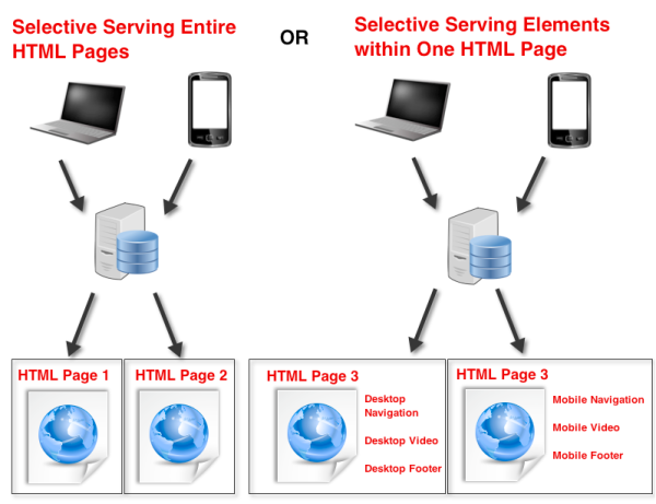
If you change elements within a page that is meant to adapt to fit multiple devices, this is generally referred to as RESS, which stands for Responsive Design + Server Side Components. (It is a horrible acronym — I know!)
If you want to address mobile visitors with a responsive design site, but have concerns about the file size of your responsive design pages, then your best option is RESS because it allows you to send smaller file size versions of content to mobile devices. Unfortunately, unless the base HTML changes, using RESS will not decrease the latency caused by numerous round trip requests.
Google is not clear how much of the HTML can change between the different versions of the page that are served on one URL; in fact, they are not clear on how much they are comparing the HTML at all.
My guess is that if the visible content is too different, you will have a problem; but, it is hard to know. This can be very stressful for companies that choose to build a variety of different landing pages to address a variety of different user-agents and serve them all from the same URL.
Google stipulates that if you are using this technique, you should be sure to actively let them know that you are changing HTML, based on the user-agent that is accessing the page. You do this by updating the Vary header that your server sends in the HTTP request to include “user-agent.” This indicates that the page content “will vary depending on the user agent that requests [it].” According to Google, it should look something like this:

Where Enterprise SEOs Have Trouble With Selective Serving For Mobile
The big issue here is that most enterprise-level sites are already using a CDN (Content Delivery Network) to speed up content delivery — but most/all CDNs have huge problems with changes to the “varies” attribute.
CDNs (including Akamai and others) take anything in this field as a signal that the content cannot be cached or served from the CDN and must be fetched directly from your server — thus rendering your CDN completely useless. So, how can SEOs for sites that rely on a CDN follow Google Guidelines and still use their CDN?

Photo credit: Privacy Canada
The Vary HTTP Header Workarounds
We all know the value that CDNs provide for large sites, and that benefit generally carries over to mobile content, too. According to Google, confusion over the Vary HTTP header is a problem with the CDNs and not their guidelines. If you are an enterprise-level SEO, you can’t just turn off the CDN, so how do you get around it? Here are some workaround options:
- Maintain your “m.” pages and set up bi-directional annotation. Link the desktop pages to their mobile counterparts with rel=alternate and rel=canonical tags (Google explains this process here). Mobile-specific pages do not need any changes to the Vary HTTP header to comply with Google Guidelines. While Google says they prefer indexing responsive design pages, they have created this method for sharing value between a desktop page and its mobile counterpart. I think Google’s preference is more philosophical than algorithmic and that “m.” pages will be able to compete against responsive design pages of the same SEO caliber.
- Call your CDN representative and see if they have a work-around. Someone from Akamai has written in a Google Group that there is a workaround. The workarounds have not been enough for my enterprise clients, but let me know if you have better luck.
- Skip the Vary header altogether. If you don’t include the “user-agent” attribute in the Vary header, it is just an opportunity cost — you are simply not sending all possible mobile ranking signals to get your mobile-ready content recognized by the mobile bot faster. According to the people that I have talked to at Google, it does not create a risk that you will be condemned for cloaking or anything like that. (Still — always approach with caution.)
- Serve variable content without your CDN. Vary headers are controlled by the server, and are sent with each element of the page that is requested. While it might be more complicated, you can also consider changing the Vary attribute of external page resources (like external images, JavaScripts, CSS, etc.) to include the “user-agent” if, indeed, that element does change across different devices. To be clear, the net impact of this change could still slow the page load, since those elements are coming directly from your server, rather than the CDN. It is only a good idea if there are a very low number of elements that must come directly from your server (<4) — and you should still test to see the impact before site-wide deployment.
The Follow-Up
This is obviously a difficult situation, and both Google and the CDNs have some valid interests. Ultimately, if a compromise cannot be reached, then webmasters are going to need a more useful and efficient way of letting Google know that a page is selectively serving.
I have suggested that there be an on-page signal, like a meta tag. There could also be a “mobile URL identification” function added to Webmaster Tools, or any number of other creative solutions. This is a known issue; but so far, Google has no useful response aside from either, “It is not our problem,” or, “Then don’t follow that part of the Guidelines.”
At this point, I think most SEOs that are working with responsive design mobile content are desperate for Google to really do something good here – we are tired of the confusion and inconsistencies, and we are just begging for meaningful rules and guidelines that we can actually follow without compromising load-time or the functionality of our CDNs.
Opinions expressed in this article are those of the guest author and not necessarily Search Engine Land. Staff authors are listed here.
Related stories
New on Search Engine Land
About the author