Google Sitelinks Redesigned: White & Gray Backgrounds With More Quick Links
Google is testing a new design for their organic search results sitelinks. The new sitelinks are showing for some searchers, although I am not able to see them myself. The screen shot above, provided by +Jon Cooper shows the a grid of four main sections of the web site. clicking on a section seems to […]
Google is testing a new design for their organic search results sitelinks. The new sitelinks are showing for some searchers, although I am not able to see them myself.
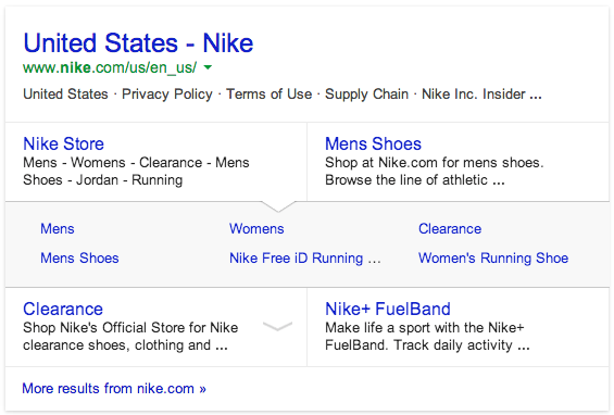
The screen shot above, provided by +Jon Cooper shows the a grid of four main sections of the web site. clicking on a section seems to expand a gray drop down area with an additional six sitelinks within the web site.
It appears that in the screen shot here, the user clicked on “Nike Store” after searching for [nike] and the six additional sitelinks showed up in the gray background area below.
We have reached out to Google for a comment on if this is something they are rolling out more widely and if so, why.
For more on sitelinks see our Google Sitelinks category.
Related stories
