Analyze data distribution more accurately with time series
Using a time series layer to histograms and box and whisker plot visualizations can add true diagnostic value. This is part three of a three-part series about Bing's data distribution tools.
Welcome back to this series on data distributions, as part of the larger initiative to evolve your analyses with the Bing Analytics Group. Before we move onto using distributions to understand changes in your data over time, let’s recap what we learned in part one and in part two.
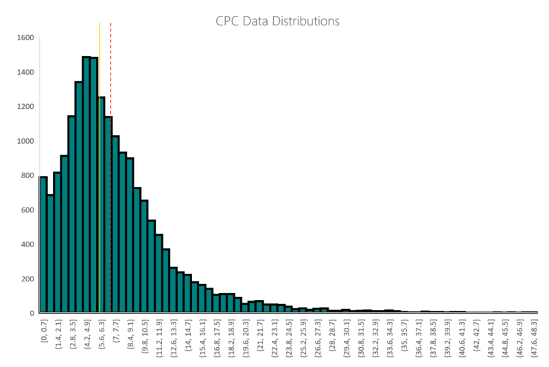
In part one of this series, we explained why taking averages at face value can be misleading, and leave us with an incomplete understanding of what’s going on in an account. We established that using data distributions is an effective way to control for that possibility, and then we covered on how to analyze a data distribution using a histogram as a visual aid.
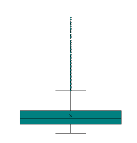
In part two of this series we examined the same set of data using a box and whisker plot.
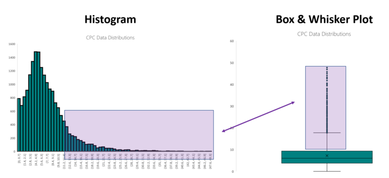
And we left off with the declaration that a graduate of the first two parts of this series should be able to identify the relationship between these two visualizations of the same data.
With this baseline knowledge firmly tucked into our belts, we move into the realm of using data distributions as time series. While there are some excellent ways to incorporate histograms and time series, none are immediately available in Microsoft Excel.
First things first, in order to get the most granular understanding of our distribution as possible, we’ve been segmenting our performance reports by keyword and by day, but now we’re going to add another layer to the time grain: month.
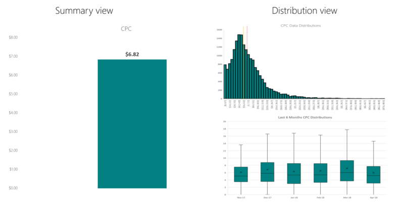
Before we get into the distribution views again, let’s visit an example of some conventional business intelligence about CPCs over a period of six months.
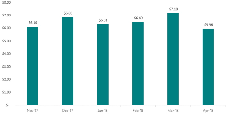
A likely analysis of a view like this would be something like, “There were relatively stable CPCs between November and February, before encountering pricing volatility in March and April.” That’s all fine and well, but we’re leaving a lot of information on the table by using averages instead of distributions.
So let’s turn these summaries into distributions.

At a glance, one thing jumps out immediately, and that’s the behavior of the outlier CPCs in April ’18. In the five months before that, outlier behavior was pretty consistent, with an upper threshold of around $50. In April this advertiser suddenly saw several instances of a keyword with CPCs over $60, and ranging up to $100, which is certainly an item of interest for optimization.
However, the presence of the outliers are skewing the y-axis, and making trends within the quartiles difficult to ascertain. In order to elucidate that quartiles a little bit better, remove the visualization of the outliers. This is made easy in Excel. Right click your plot, select “format data series,” and then uncheck the “Show outlier points” box.
This is the same data, outliers removed. Note the top of the y-axis now caps out at 20, where before it ranged to 120.
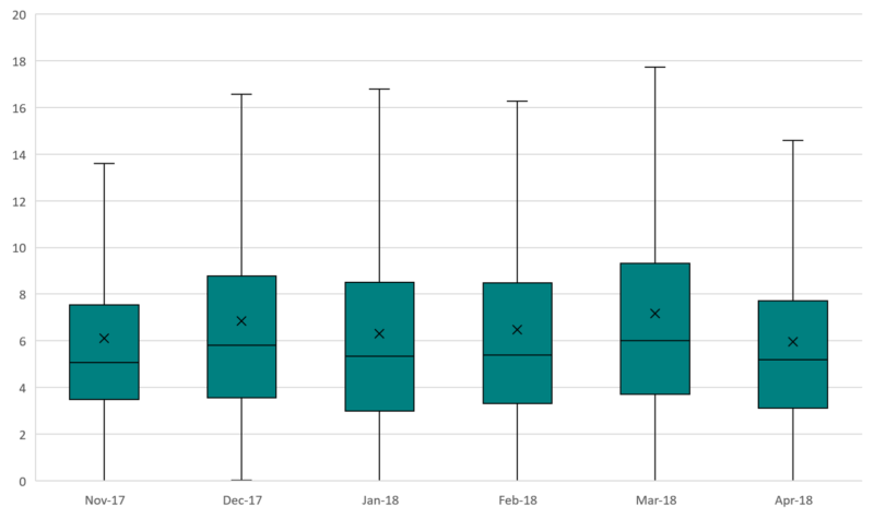
We can immediately see that the fourth quartile range is the most sporadic from month to month, and the third quartile range is also more volatile than the first or second quartile ranges. Importantly, the median CPC is consistently lower than the mean CPC, which is owed to the influence of the fourth quartile range and the outliers. Furthermore, remembering that the “x” represents average CPC, the top threshold of the fourth quartile range appears to have a distinct relationship with average CPC.
This is a good example of how looking at distributions provides the advertiser with more information that has true diagnostic value than the summary mean.
On behalf of the Bing Analytics Group, we hope you feel you’ve evolved your analyses with this series. Look how far you’ve come!
Contributing authors are invited to create content for Search Engine Land and are chosen for their expertise and contribution to the search community. Our contributors work under the oversight of the editorial staff and contributions are checked for quality and relevance to our readers. The opinions they express are their own.
Related stories
New on Search Engine Land
About the author