The Internet: It’s Like Real Life, Only With Buttons
Every time I read about social media these days, I end up hearing about how social sharing metrics are becoming a bigger factor in everything from organic rankings to driving additional clicks from visitors already on your site. And it makes total sense. If Google sees that a blog post has a ton of Likes, […]
Every time I read about social media these days, I end up hearing about how social sharing metrics are becoming a bigger factor in everything from organic rankings to driving additional clicks from visitors already on your site. And it makes total sense.
If Google sees that a blog post has a ton of Likes, +1’s and Twitter mentions, Google is probably going to think that the blog post is relevant and authoritative as well as a valuable contribution to the respective topic discussed in the post.
Even if Google wasn’t using those metrics in their organic algorithm(s), having high numbers in those little buttons on a blog post can really have an impact on getting extra clicks from people who would have not necessarily clicked on the link to the story. It’s like a testimonial. I mean, if 875 people have Liked that post, I should probably check it out, too, right? It’s called ‘social proof’ – and social sharing buttons can help you build it for your brand.
As I’m surfing through websites, I’m often wondering to myself: which sites are implementing these social buttons for optimal results?
We’ve all heard of conversion optimization and website testing related to orders and transactions, but I imagine there are ultra-aggressive conversion optimization specialists out there testing the placement of social media buttons.
Yep. That’s right. I’m talking about conversion optimization and website usability testing that isn’t focused on dollars but rather on Likes, +1’s and Tweets. If social media metrics affect SEO rankings and other forms of free traffic, then I guarantee that people are out there testing the optimal placements, colors, font sizes, etc…
Even if there are some websites out there experimenting with social badges, it’s easy to see that not everyone even has a good grip on how to best incorporate them into a website.
So now I am on a mission. No – Jake and Elwood – not a mission from God. I’m on a mission to find the perfect social sharing badge implementation. I doubt that I’ll ever find the perfect setup, but there are a lot of websites that get really close.
In this post, I’m going to walk through some of the most popular blogs and discuss how they are using social sharing buttons in a way that facilitates easy sharing, liking, subscribing.
The Homepage
When it comes to homepages, I am always surprised by how many ecommerce sites don’t have a Like button, a Tweet button or a +1 button for their homepage. We know that those things matter for SEO and for building social proof, so why aren’t websites implementing them on the homepage? It’s crazy!
Most major news sites are no better, but maybe they have a reason not to shoehorn social sharing buttons into a layout that is already full of dozens of recents news stories.
Like with everything else in SEO, there is always a balance between SEO theory and website look and feel.
from Mashable.com
There are, however, a lot of websites that are doing it right. Personally, when it comes to social media badges, my favorite blog homepage is Mashable.com. They have so many social buttons on the page – it’s like they are trying to beat me over the head with just how popular they are. And it works. I don’t know if it would work for every site, but it certainly works for them.
The Sidebar
The sidebar sharing widget is a very important element on today’s content-rich websites. It gives visitors the opportunity to follow, +1, Like, and subscribe to the site’s social profiles and feeds. If you run a blog, you really need to have one of these.
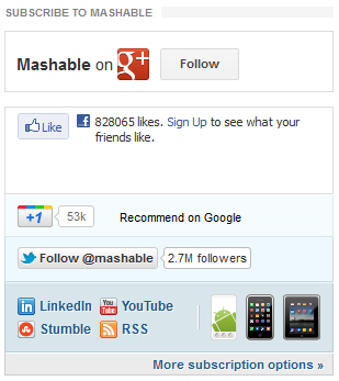
from Mashable.com
One of my favorite social sharing sidebar widget is found on Mashable.com. It’s got all the popular profiles represented: Facebook, Google+, Twitter, LinkedIn, YouTube, RSS, StumbleUpon, as well a link to view all subscription options.Furthermore, Mashable found a way to also promote their mobile apps in the widget.
The Mashable widget may not be ideal for everyone, as it takes up a lot of real estate.
In that case, my second favorite sidebar social widget is the one found right here on SearchEngineLand. It doesn’t feature as many buttons and options, and because of that, it’s not as tall. It really lets you save some space while still promoting your most important social profiles.

from SeachEngineLand.com
Along with the sidebar widgets mentioned above, there are also sidebar widgets related to Likes and Recommendations. Here are 2 examples, one from latimesblogs.latimes.com and another from huffingtonpost.com:

from LATimes.com
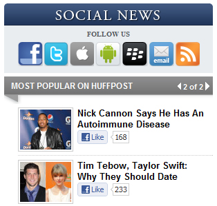
from HuffingtonPost.com
What I really like about these social widgets is that they display the current Likes and Recommendations for each article. As mentioned earlier, those numbers can often instill a sense of confidence in the article’s popularity. If the numbers are really high, it’s like I might feel left out if I don’t click on the story to at least check it out.
Taken in aggregate, it’s very possible that adding this feature to a sidebar could possibly increase your average visitor’s time on site by a significant amount. And who knows – maybe that visitor will also click the Like, +1, or the Tweet button, effectively helping grow the numbers even more!
In the same vein, websites like TheDailyBeast.com have also included a sidebar widget that streams their most recent Twitter activity:
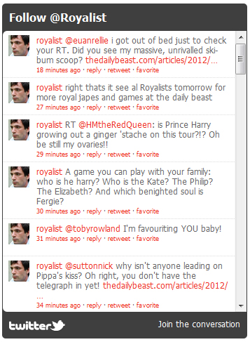
from TheDailyBeast.com
If you look for sidebar widgets on your favorite sites, you’ll most definitely find them. Most of the ones that I have seen have obviously been custom designed for the site.
I’m noticing that more and more of them are being built with a tabbed browsing feature, such as the one just to the right of this text. Not to brag or anything, but SearchEngineLand.com has a great sidebar widget that features the Most Commented, Most Liked, and/or Most Tweeted articles currently on the site. Pretty awesome, right?
Your best bet is to take what you know about your visitors and create a widget or two that will work best for them. All you really need is something that will facilitate sharing, Liking, and clicking.
The Blog Post
If you have a content-rich website, you know blog post is everything. It’s your content. It’s the value proposition of your website. It drives your organic traffic. It keeps you Panda-proof. You are counting on your content to be seen and shared, and social media buttons can help make that happen. Therefore, it is essential that you have an effective placement for your social sharing badges.
Currently, there are a few popular placement options for social media buttons:
- Below the headline
- At the end of the post
- Floating/Hovering in the left margin
The Headline
On many of today’s top blogs, you will notice social share buttons just below the headline. In some cases, such as TechCrunch.com and Guardian.co.uk, you will see the share buttons to the left or right of the headline area. These options are very common today, especially on the most trafficked blogs.
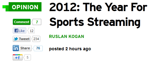
from Techcrunch.com

from Guardian.co.uk
Sites like Buzzfeed.com and HuffingtonPost.com are taking it a step further and adding subscription buttons for the author’s Facebook and Twitter profiles:
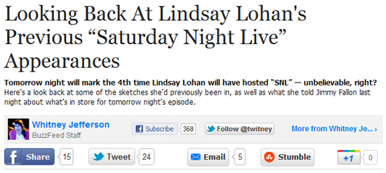
from BuzzFeed.com
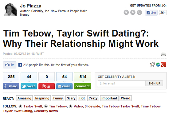
from HuffingtonPost.com
In my opinion, it’s is a very forward-thinking move. These sites are embracing the new era of personal branding, and, ultimately, they are providing even more incentive to their staff to write awesome, shareable posts.
Not only is the author writing because it’s their job, but they now know that a little extra effort on their part can lead to more followers on their personal Twitter and/or Facebook profiles, and further stand out in the SERPs when rel=auth is implemented.
If you take away anything from this post, I hope you take away the idea to really beef up your author information and social sharing options at the top of each post on your own blog.
The End of the Post
Many blog posts now feature the social sharing buttons at the top *and* at the bottom of the post. It only makes sense, right?
A visitor is probably not going to scroll back to the top of the page when they have finished reading the article, so make it easy for them to share by place additional social media buttons at the end of the post. It’s so simple, it’s genius! BoingBoing.net is a great example of this. Their setup is very straightforward and clean:
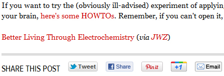
from BoingBoing.net
Note: For many of the options discussed so far, there are several popular WordPress plugins that can get you started. Here is a quick list:
Floating Options
It seems these days there is a hybrid approach to everything. I love it. Don’t like option A or option B? Well, how about we mash them together and create option AB? And wouldn’t you know – someone did with social sharing buttons on blog posts!
Just check out what Mashable.com does on their posts:
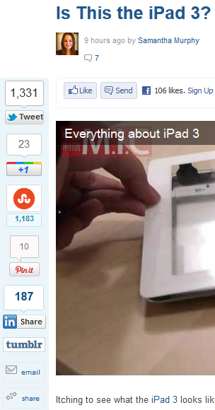
from Mashable.com
I think this floating set of social badges is really fun. If you’re running a WordPress blog, there are a couple of popular plugins that will create this rail-style icon set: ‘Digg Digg’ and ‘Sharebar’. Digg Digg also lets you create a fixed position for the buttons if you want that layout.
The major advantage to this social button setup is that the buttons are always in view for the reader, so you don’t need buttons at the top and bottom of the post. In fact, in many cases, this hovering list of social badges can help to reduce clutter.
Other Ways To Promote Sharing
Before I wrap things up, I’d like to point out two additional strategies that I’ve come across in the past year or so.
Let’s start with Twitter ‘Web Intents’. The main thing that I like about it is that it lets users Tweet directly from your site.
For example, you could link a sentence from inside your post, and when a visitor clicks on the link, a box opens up with the sentence pre-loaded in a text field – ready to be tweeted! The concept is really cool, as it adds another dimension of interaction for users on your site. For a quick explanation of how it works, check out this post from HighTechDad.com.
Finally, I found this gallery over at NationalGeographic.com, and I was immediately drawn to the implementation of Facebook Like buttons for each image.
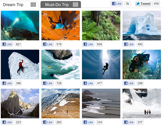
from NationalGeographic.com
If you have a website that features picture galleries, you should check out doing something similar. Furthermore, it could also be a great way to have a contest. Just tell people that the picture with the most Likes by a certain date and time will win. ;)
And to wrap it all up, I’d like to leave you with a quote from Steve Jobs:
“We made the buttons on the screen look so good you’ll want to lick them.”
Personally, I wish everyone would take the same attitude when creating their social media buttons.
Contributing authors are invited to create content for Search Engine Land and are chosen for their expertise and contribution to the search community. Our contributors work under the oversight of the editorial staff and contributions are checked for quality and relevance to our readers. The opinions they express are their own.
Related stories
New on Search Engine Land