Homepage Sliders: Bad For SEO, Bad For Usability
One of the most prevalent design flaws in B2B websites is the use of carousels (or sliders) on the homepage. Carousels are an ineffective way to target user personas, which ends up hurting the site’s SEO and usability. In fact, at the recent Conversion Conference in Chicago, about 25% of the speakers mentioned carousels — […]
One of the most prevalent design flaws in B2B websites is the use of carousels (or sliders) on the homepage. Carousels are an ineffective way to target user personas, which ends up hurting the site’s SEO and usability.
In fact, at the recent Conversion Conference in Chicago, about 25% of the speakers mentioned carousels — of those, 100% condemned them. Over the last three months, I have conducted extensive research to suggest that carousels are a bad option for B2B websites.
Research Methodology
I looked at 30 different B2B websites across various industries. Of those 30 sites, a shocking majority of them — 18, to be precise — contained carousels, which is what inspired this research.
After thoroughly evaluating those 18 websites, I was able to identify numerous recurring SEO and usability issues. I also looked at analytics data from three websites using homepage carousels. With B2B websites, carousels seem to only be used for one of three reasons: branding, thought leadership or product/service promotion. The sampling I took is representative of each of the three carousel uses.
SEO Issues
In my research, I found the following SEO problems with the use of carousels: multiple h1 headings, Flash usage, slow page load speed and shallow content.
Alternating Headings
Many of the carousels I looked at were built with jQuery, AJAX or HTML5. In most cases, the headings in the slider were wrapped in an h1 tag. Basic SEO best practices state that there should only be one h1 tag per page, and it should appear before any other heading tag. The problem with using h1 or any heading tag in the carousel is that every time the slide changes, the h1 tag changes. A page with five slides in the carousel will have 5 h1 tags, which greatly devalues the keyword relevance.
Flash Usage
It pains me to even have to bring up this point, but a few of the websites I looked at served up slider content using Flash. Avoiding Flash to serve up content is SEO 101; but apparently, some people are still doing it. Flash objects on a page should have been killed off with the blink and marquee tags, but some designers still think it looks cool. Flash content cannot be crawled by all search engines — so stop using it to display important website content.
Poor Performance
As with any website, the more you complicate and add things, the slower the page loading speed. I came across a few sites featuring full-width carousels packed with high resolution images, which greatly impacted the page load speed. Every second it takes to load a page past two seconds hurts the user experience, and has an impact on search performance. In fact, Matt Cutts recently announced an upcoming penalty for slow page load times for mobile pages.
Content Replacement
As stated earlier, carousels are used as an ineffective method of targeting user personas. Many websites I evaluated took this to an extreme by using shallow content on the page. Some had no content whatsoever. Content is a requirement for ranking for keywords. If you have little or no content, you cannot expect to rank well for any search terms.
Usability Issues
I also found the following usability issues with the use of carousels on the B2B sites I surveyed.
Nobody Clicks On The Carousels
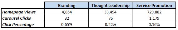
Survey of B2B websites using carousels
The chart above is a data sampling of three sites for which event tracking has been set on carousels. The first site uses the carousel purely for branding purposes. The second site uses the carousel for promoting webinars and white papers. The third site uses their carousel for promoting their services. As you can see from the chart, barely anyone clicks on the carousel. In my next three usability points, you’ll see why those few clicks aren’t even worth the use of a carousel.
Content Is Pushed Below The Fold
Nothing irritates me more than landing on a page where I only see graphics and am forced to scroll down below the fold to locate the content. Content sells — images do not. Sadly, most websites using carousels push their lead-generating content below the fold, meaning that I can see their big, ugly carousel and not the information I was seeking. Forcing users to scroll is a major usability issue. A user should only be forced to scroll down after the page has grabbed their interest and enticed them to continue reading.
The Megaphone Effect
Perhaps the biggest usability issue carousels create is something I call “the megaphone effect.” When a user lands on a page, his or her attention is drawn to the carousel because it has revolving content, alternating text, color changes, and all sorts of other attention-stealing features.
It’s like grabbing a megaphone and telling users to look at the pretty images, but don’t pay any attention to the content below (even though this contains the information they want). Imagine yourself sitting on the couch trying to find something to watch with your significant other. He or she has the remote, and every time a new channel loads up and you try to figure out what’s playing, he/she changes the channel on you. Annoying, isn’t it?
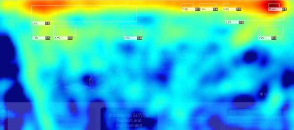
Heatmap of a B2B website using a carousel
The heatmap above was taken from the website I identified above as the “thought leadership carousel” site. Most of the attention is drawn to the navigation first, followed by the carousel. Everything below the carousel has a few random dark blue streaks of attention, but otherwise is mostly barren.
The content below the carousel contains important information (like what the business does) and a few conversion elements. But, the user will rarely see any of that content because his or her attention is dedicated to the carousel. That’s a lot of attention to steal for something that only 0.22% of users click on.
Confusing Objectives
When a user lands on a page, they use the h1 tag before anything else to determine whether or not the page will contain the information they are seeking. When a carousel is used, the user will assume the page talks about whatever heading is used in the carousel. Every time the carousel changes slides, the assumed topic of the page is changed to whatever the new slide talks about. This is confusing and irritating for users. Don’t make them think so much!
Alternatives To Carousels
There are several creative alternatives to engage users in an SEO-friendly way without using carousels. I would recommend giving some of these a try.
- Remove carousels immediately!
- Implement behavioral content triggering to deliver personalized content based on previous site activity.
- Ask users to identify their persona — see Officite.com (not a client of mine) for an example of this.
- Use compelling images in conjunction with high-quality content to help communicate the message more effectively.
- Use feature areas to help users navigate to where they want to go.
Contributing authors are invited to create content for Search Engine Land and are chosen for their expertise and contribution to the search community. Our contributors work under the oversight of the editorial staff and contributions are checked for quality and relevance to our readers. The opinions they express are their own.
Related stories
About the author