Mobile-first updates from SMX East
What does the mobile-first index mean for you? Contributor Eric Enge summarizes a panel from SMX East with tips for how to prep your mobile site and content.

As every SEO knows, the rise of mobile searches has prompted Google to prioritize mobile signals in determining search results. To that end, the search giant is in the slow-going process of rolling out its mobile-first index, which is expected to be fully implemented sometime next year.
In the meantime, getting sites ready is a high-priority item on SEOs’ to-do lists, which is why the topic was addressed at this week’s SMX East conference in a panel discussion titled, “SEO For Google’s Mobile-First Index & Mobile-Friendly World.” The speakers included Leslie To, director of SEO for 3Q Digital; Ashley Berman Hale, director of SEO at Local SEO Guide; and Gary Illyes, webmaster trends analyst for Google.
Today’s post will cover the key points presented in this panel.
Leslie To: Is it the year of mobile yet?
Leslie To breaks down the process of preparing for the mobile-first index into two major categories:
- Configuration-agnostic auditing
- Configuration-based auditing
Configuration-based auditing would involve those things you need to do that are specific to your mobile configuration (whether that’s a mobile subdomain, dynamic serving or responsive web design).
Configuration-agnostic auditing, on the other hand, involves items you need to address regardless of your mobile configuration, and this is what To covered first.
Configuration-agnostic auditing
Let’s start with a summary look at what matters regardless of mobile configuration:
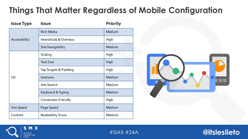
Tips:
- Use HTML for rich media and video content, and use the video element to download and decode the content.
- Avoid interstitials. If you want to promote your app or email list, use banners rather than full-screen overlays or interstitials. Users don’t like them, and neither does Google.
- Consistently test your global navigation and mine internal search data to refine that navigation (based on what you see users aren’t finding). Further, remember that mega menus don’t always work well on mobile. Simply put, don’t overwhelm users with menu options when you have limited screen real estate.
- Do allow content and media to scale to fill device screen size, as that provides a good user experience. To help with this, stay away from absolute declarations in your CSS.
- Do allow all font sizes to scale, and use 16px as your base font size. Don’t require users to zoom to read, interact with or consume content. No one likes to do that.
- Make your tap targets at least 48 pixels wide to make them easy to hit. In addition, space your tap targets 32 pixels (or more) apart. Don’t require users to zoom to tap buttons, links or form fields.
- Allow common gesture features on your e-commerce site, especially pinch/double-tap to zoom. Don’t use low-resolution images that become pixelated when you zoom.
- Configure internal site search to make content easier to find, and actively harvest site search queries to learn more about what users are looking for on your site so that you can make navigation, layout and content improvements over time.
- Enable contextual keyboards that change based on required input types. Using one standard keyboard layout for all input can be difficult for users to deal with. Don’t assume the limitations of physical keywords. For example, if you’re looking for someone to enter a domain name or email address, have a “key” that they can tap to enter “.com” — these types of contextual features will save them time.
- Make it easy for users to convert, whether it’s via a form fill, a phone call or your shopping cart. Enable click-to-call by wrapping phone numbers with telephone schema. Don’t require more than three clicks to complete a conversion.
- Implement all the basics of page speed. This means things like enabling gzip compression, leveraging browser caching and getting server response time under 2oo milliseconds.
- Don’t use render-blocking JavaScript, especially for external scripts. Don’t use inline CSS attributes and/or a large CSS file.
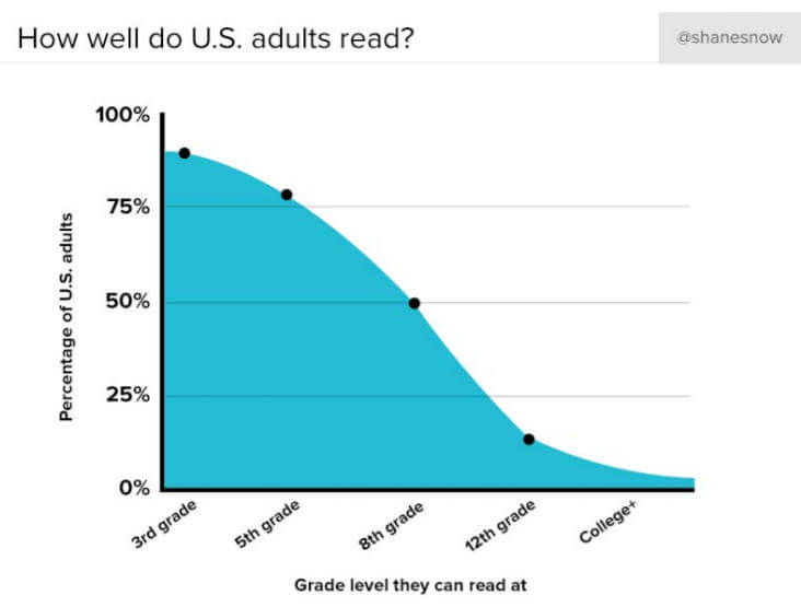
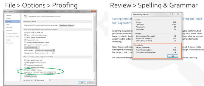
- Don’t make the language on your site too complex. Readability is a big concern (and not just for mobile sites). To give you some perspective, here is a look at how well US adults read:
Leverage readability indexes, such as:
- Flesch reading ease
- Flesch-Kincaid grade level
- Gunning Fog index
- SMOG Readability formula
You can get readability measurements for your content within Microsoft Word. There are two paths to navigate to it, shown below:
Configuration-dependent auditing: Mobile subdomains
If you’re using a mobile subdomain, you will need to implement bidirectional linking, with a rel=alternate tag on your desktop pointing to your mobile site, and a rel=canonical tag pointing from your mobile site back to your desktop site. These are sometimes called switchboard tags.
A common question that many people ask is whether or not Google will want publishers to reverse the direction of those tags with the advent of the mobile-first index. To date, Google’s answer to that has been no, that this is not necessary. They will simply assume the reverse. From Google’s perspective, if they tried to get everyone to switch them, a certain amount of chaos would be likely to result.
Do minimize cross-linking, so that your default links in the mobile experience should be to other pages in the mobile experience. But you should also provide the alternative desktop experience for users who want it. One benefit is that you can monitor clicks and, if there are lots of them, it may indicate problems in your mobile experience that you need to debug.
Do say no to blanket redirects, and try to make them all one-to-one. If you have no corresponding mobile content, leave users on the desktop page.
Configuration dependent auditing: Dynamic serving
For those using dynamic serving, you will need to implement the Vary HTTP header. This will help prevent problems with users being served the wrong versions of your pages due to ISP-caching. Without this header, ISP caching may cause mobile users to get your desktop page, and vice versa.
Watch out for, and avoid, unintended content differentiation between desktop and mobile because both sites are maintained differently.
Configuration dependent auditing: Responsive
With responsive sites, make sure you’re not blocking CSS or JavaScript files from being crawled. Check for the Meta viewport tag, as it gives directions on dimensions and scaling:
- Width-device-width: matches content to the physical width of the device.
- Initial-scale: initial zoom when visiting a page.
- User-scale: allows for zooming (values are “yes” and “no”).
Use a comma to separate attributes so that older browsers can parse different attributes.
Do make sure that images and videos are also responsive, but don’t allow video to scale beyond the viewport size.
Last but not least, don’t base breakpoints on specific devices. Leverage Google Analytics’ Device Report to determine whether your breakpoints are properly serving your customers most of the time.
View Leslie To’s full presentation here:
https://www.slideshare.net/slideshow/embed_code/key/GchnM29RpulpR4
Ashley Berman Hale: Mobile Friendly IRL, Beyond Best Practices
Ashley’s focus is on how you deal with the problem if you can’t get the budget or approval to proceed with making a site mobile-friendly.
When trying to get buy-in from stakeholders, Berman Hale suggests leaning on Google documentation and sharing relevant case studies. She also suggests showing desktop vs. mobile traffic over time — even in industries that are slow in moving to mobile, your analytics data is highly likely to show a strong trend in favor of mobile over time. Related to this is the idea of looking at competitor sites in SEMrush and showing their mobile traffic over time.
For some businesses, the issue may be that they only have a small budget. If that’s your situation, consider starting small. For example, you can break down your mobile friendliness action items into more manageable parts, including:
- by site section.
- by product.
- by customer.
- by element.
Another practical tip is to focus on getting people on board one at a time. These kinds of approaches can help you build momentum in a positive way.
In other cases, the challenge might be that the code is a hot mess, and everyone is afraid to touch anything. The incremental approach can work well here, too. For example, you can:
- compress your images.
- figure out how to strip some CSS.
- implement AMP on just a few elements.
Or perhaps your role is such that you only have control over the content on the site, and not the coding side of things. You can still make a difference. You can accomplish this by thoroughly understanding the intent of people who are reading your content on mobile and making it easy for them to find what they want.
This starts with upfront research, including your keyword research. Use this to help you understand the likely user intents, and then form your content around those concepts. Structure your content to make it easy to find, and create snackable, modular elements. In addition, modify your metadata and markup to communicate what users will get by engaging with your content.
You may have people in your business who care only about brick-and-mortar sales. But local search is typically a huge driver for that, and local search often is mobile search.
The key to unraveling this is learning how to track the progression from local searches to your site and business. Setting this up can help you get what you need to show people that local (and mobile) is critical to your business.
Or, if you’re in the right business, you may be able to call in legal. Your industry may have accessibility requirements, and a solid mobile experience may simply be something that you’re required to do.
Lastly, you should always pick your battles and “choose what hill to die on.” Make sure you are making steady progress over time; the path to maximum mobile-friendliness is definitely a marathon, and not a sprint.
View Ashley Berman Hale’s full presentation here:
https://www.slideshare.net/slideshow/embed_code/key/osxCv1DHg2k9td
Gary Illyes: Google’s perspective
Illyes explains that, traditionally, the Google index is based on crawls of desktop content. However, the problem Google has had is that on many sites, the desktop site would have more content on its pages than the corresponding mobile pages. This was leading to problems in search because Google would return pages to mobile users based on the content they found on the desktop pages, but the users would then get served the mobile page and the content wasn’t there.
This created frustration with the quality of Google’s results, and this ended up driving the idea of switching to a mobile-first index. What this means is that Google will crawl mobile sites and base their search index off of the content they find from that crawl.
Illyes’ message on this is: “Don’t freak out.” Google is approaching this very carefully, and they don’t yet know when a full mobile-first index will go into effect. They started experimenting with it two years ago, and it did not go well at all.
Currently, they have moved a small number of sites into a mobile-first index, and they have been monitoring those to make sure they’re not being hurt in terms of traffic and ranking as a result.
Eric’s note: Google has to be very careful about these types of changes. While they may be desirable at some level, searchers often have pretty specific things they want and need, including specific brands, and if they’ve been artificially demoted, this will also result in user frustration. This is the same reason that things like HTTPS and page speed are such weak ranking factors.
Illyes next notes that if your site is responsive, you’re good to go! But many of the sites that have other mobile configurations are not good to go.
Common issues with mobile sites are:
- Some of the content and links from the desktop site may not be present.
- Rel=annotations may not be there (e.g., hreflang).
- Structured data may be missing.
- Some of the media and images may be missing.
Illyes then shared the example of one site that did not move over their hreflang tags, and they lost 50 percent of their traffic. This is exactly the type of thing that Google wants to avoid.
Here are the things you should do to prepare for the mobile-first index:
- If your site is responsive, you’re already ready to go.
- Make sure your mobile pages have all the same videos and images as your matching desktop pages.
- Make sure your mobile site has all the content and all the links that show up on the matching desktop pages.
- Make sure to implement hreflang tags on the mobile pages.
- Make sure to carry over the structured data from your desktop pages.
Last, but not least, don’t panic!
Contributing authors are invited to create content for Search Engine Land and are chosen for their expertise and contribution to the search community. Our contributors work under the oversight of the editorial staff and contributions are checked for quality and relevance to our readers. The opinions they express are their own.
Related stories
New on Search Engine Land
About the author