How To Recover If You Got Nailed By Mobilegeddon
Columnist Neil Patel shares his tips and advice for analyzing the impact of Google's mobile-friendly algorithm update -- and getting your mobile presence on the right track.

Google’s mobile-friendly algorithm update is old news. For some websites — those that are enjoying 100% total mobile optimization — the algorithm update is a distant memory of a past event.
But for some websites, the effects remain — and the damage is very real.
The mobile-friendly algorithm update caused a sweeping change on the digital marketing landscape. Suddenly, websites with mobile traffic but no mobile strategy were suffering the consequences.
If you’re still dealing with the aftershock of the mobile-friendly algorithm, this article is for you.
Don’t panic.
Why should you not panic? In general, panic is a bad idea. In the case of the mobile-friendly update, there are actually several steps you can take to address the problem.
If You’re A Small Business, You Can Make Changes More Quickly And Easily
As Mobilegeddon approached, small businesses feared that they would be the hardest hit by the algorithm update. According to CNBC, only 20 percent of small businesses had a mobile-friendly website or app.
A business’s “smallness” is actually a strategic advantage in this case. Small websites generally have fewer Web pages, making it easier to update the entire site. Plus, small websites are less likely to break under the strain of a site-wide responsive design update. Any site design update that does take place should be relatively easy to fix, considering the scope of the problem.
The real advantage, however, lies in a small business’s agility and decision-making. It’s easier for a small business CEO to say, “Hey, we need to update our website!” than it is for a Fortune 500 business to make the same change.
Lucasz Zelezny, the head of SEO for uSwitch.com explained it this way:
Small businesses tend to be far more flexible with their tech teams able to apply changes far quicker and easier than larger enterprises due to a less complicated infrastructure, also making it easier to roll out new software and processes.
If you’re a smallish business, don’t let your small size keep you from making a big change.
WordPress, the world’s most popular CMS, makes it easy to make a website mobile-friendly. There are dozens of plugins that offer mobile themes for mobile visitors. So if you’re on WordPress, it may be able to address your mobile friendliness issue through a theme change. You may risk some UX damage; however, it may be worth it to become mobile-friendly.
Changing your WordPress theme isn’t something you should do on a whim. A simple theme change will alter every portion of your website, past, present and future. In some cases, it can completely ruin your formatting and other custom features of the site.
But which is worse, to continue experiencing the consequences of a non-mobile-optimized website or to get mobile optimized and deal with some UX uglies?
You can take your time fixing the design issues, but you’re out of time to make your website mobile-friendly. If 50 percent or more of your traffic was coming from mobile devices, then you may be best served by making a responsive theme switch and letting the chips fall where they may.
Run Diagnostics
As you head into repair mode, it helps to know exactly what’s going on with your traffic and website. Here’s how to gather your data.
Look At Your Overall Traffic
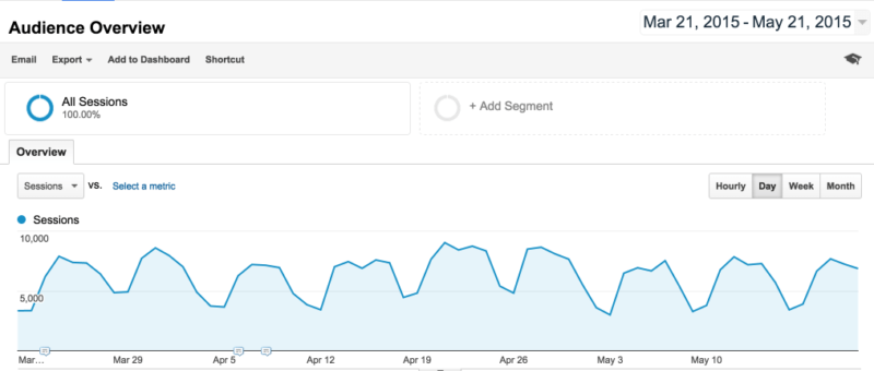
The quickest way to check the impact of the mobile-friendly algorithm is to peek at Google Analytics. If your traffic took a nosedive around April 21, 2015, then you got nailed.
In the screenshot below, I isolated traffic from March 21 through May 21 to provide a three-month traffic overview of the site. The site experienced no decline during the week of April 21, suggesting that this website is safe from the ravages of the mobile update.
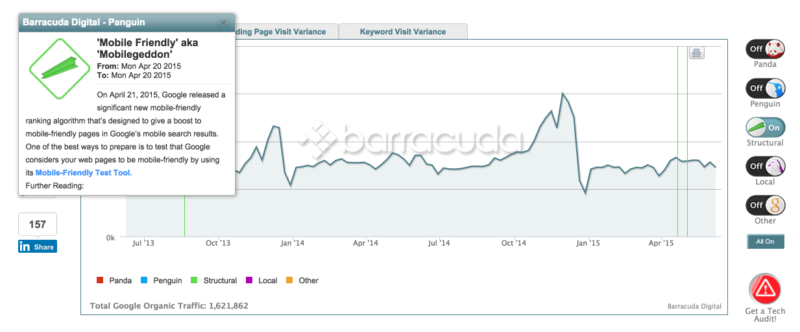
An easy way to identify traffic changes resulting from algorithm updates is to use the Panguin Tool by Barracuda Digital.
By logging in with your Google credentials, you can view a year of traffic data, with a timeline view of all the Google algorithm updates.
Compare Mobile Traffic And Desktop Traffic
Another helpful metric to keep in mind is your percentage of mobile users. You can view this data in Google Analytics by navigating to Mobile → Overview. The chart should give you a percentage breakdown of how many users are coming from desktop, mobile and tablet.
In the case of the website below, only 10% of the site’s visitors are accessing it from mobile devices.

Note: Per Google, the mobile-friendly update did not affect tablet users/traffic.
@Jumzle The upcoming mobile-friendly change is for mobile users, not tablet users.
— Google Search Central (@googlesearchc) April 1, 2015
Analyze Individual Pages
Make sure that you’re not just looking at site-wide data. Overall traffic metrics and percentages will not provide an accurate view of the mobile update’s impact.
Why not? Because the mobile-friendly update affected individual pages in the SERPs, not websites as a whole. This is different from typical algorithm updates, in which an entire website might lose search engine visibility. In the case of the mobile-friendly update, only specific pages not optimized for mobile were affected.
Here’s how it works, thanks to some handy analysis by Econsultancy’s Graham Charlton.
Using the Google Mobile-Friendly Test, Barclay’s home page received a passing score.

However, an under-the-hood analysis of internal pages revealed problems:
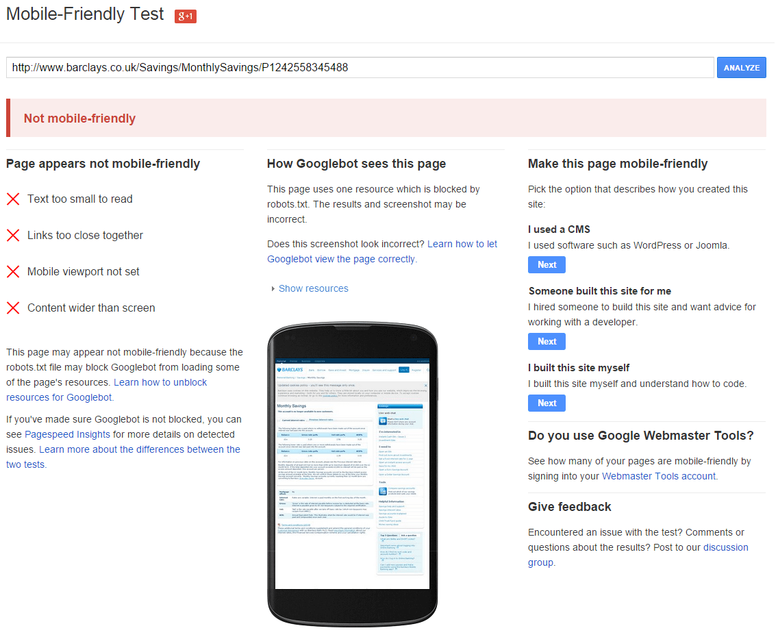
What kind of problems? The kind that lead to major ranking drops, it appears.
Prior to April 21, the internal page analyzed above had a cruising altitude near the top of the SERPs. After the update, the page tanked.

(Note: Charlton is using PI-Datametrics for his data.)
That’s why analyzing individual pages is critical. So how do you analyze individual pages?
Google’s Mobile-Friendly Test tool is a great way to analyze pages one by one. The best way to look at individual pages throughout your entire site, however, is through the Google Search Console (formerly Google Webmaster Tools).
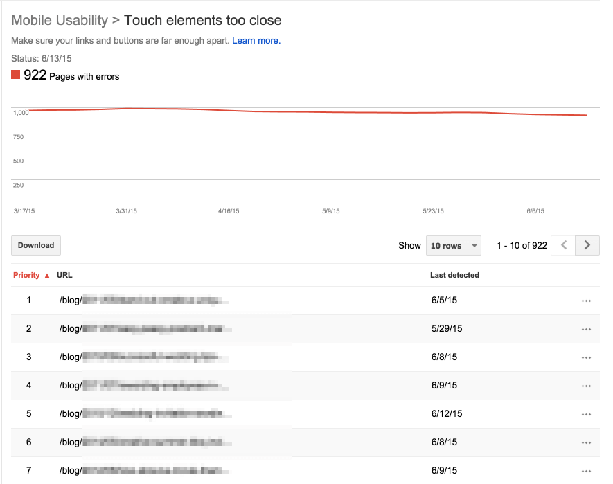
Log in to the Search Console and click on Search Traffic → Mobile Usability. Here, you’ll get an idea of the true extent of the problem, page by page.

Don’t be content to simply see the number of pages with errors. Identify exactly which pages have errors. It could be that it is affecting only product pages, your blog, a content silo or some other type of page.
In the case of the website above, I drilled down into the pages with touch elements too close and found that the entire blog was dysfunctional for mobile devices.
Look at this information carefully so you can make sure that you’re fixing the right problem.
Do Repairs
Once you have the data, you can understand what it is you need to fix and where you need to fix it.
What happens next is carrying out the relevant repairs. The exact repairs will vary. For example, if only a few of your pages have mobile usability problems, it could mean that just a few simple tweaks in the CMS are in order.
If, on the other hand, you have a near site-wide problem, you may need to do something drastic, like redesign your entire website.
Site redesigns come with a unique set of pitfalls, so be cautious as you approach this task.
Conclusion
Unlike Penguin or Panda penalties, the Mobile-Friendly update is the simplest one for recovery purposes.
Google tells you exactly which pages were affected, why they were affected, and what to do. As to the actual repair, you’re going to have to tame that beast yourself. With a competent developer as an ally, the job shouldn’t be too overwhelming.
In conclusion, keep a close eye on your traffic after you’ve made the right changes. A website is a living and dynamic entity. You’ll constantly need to analyze, identify, adjust and respond to a variety of digital forces.
Was your website affected by the mobile-friendly update? What did you do?
Contributing authors are invited to create content for Search Engine Land and are chosen for their expertise and contribution to the search community. Our contributors work under the oversight of the editorial staff and contributions are checked for quality and relevance to our readers. The opinions they express are their own.
Related stories
New on Search Engine Land
About the author