The Anatomy Of A Compelling Call To Action Button
In the vast majority of cases, the path to a conversion starts with the click a of button. The most compelling offer in the world will not result in a website goal being completed unless you can successfully entice a visitor to hover over a button and tap their mouse. Accordingly, the biggest single thing […]
In the vast majority of cases, the path to a conversion starts with the click a of button. The most compelling offer in the world will not result in a website goal being completed unless you can successfully entice a visitor to hover over a button and tap their mouse. Accordingly, the biggest single thing a webmaster can do to improve conversion rates is to modify the wording, appearance or behavior of a button.
Thankfully, one of the easiest website elements to test is a button. Technically, buttons are usually discreet image files that can be swapped out with hardly any code modification required. In terms of procedure, there’s perhaps no more straightforward A/B test that can be run than measuring the comparative performance of two buttons.
Testing always plays a pivotal role in conversion rate improvement, but it is particularly important in crafting a winning button. User interaction with buttons is notoriously idiosyncratic: the precise reason why a visitor will choose to click one button over a virtually identical alternative is next to impossible to decipher. The best-performing button is as often as not a surprise to the tester. And when it comes to buttons, there’s many things that can be tested.
The Button Call-To-Action
At a basic level, it is important that a visitor knows the consequences of clicking a button, and feels reassured that clicking will not result in any negative or unwanted consequences. It must at once inform and inspire confidence.

Clear messaging: the Firefox download button lets visitors know exactly what they're getting
As calls-to-action go, button wording like “click here,” “go” and “submit” tell visitors little about what clicking accomplishes (one study found that “submit” may be the worst way of enticing a user to submit a form).
This is particularly true of a ubiquitous call-to-action button that appears on all pages of a site, where the context of the button might not provide a visitor with enough information to want to proceed.
Make it obvious what action (and benefit) a visitor can expect from a button click.
This is not to say that a button’s call-to-action should be wordy or ingenious. Twitter was observed by multiple sources to be testing different variations on their sign up button.
One can only surmise that the extremely pedestrian “Sign up” that currently is displayed on their site performed better than livelier constructions such as “Give it a try” and “Let me in.” Sometimes the best wording for a button is the simplest.
In situations where users might fear that their personal information will be shared, their computer might be at risk or that they might incur a charge, the call-to-action button (or text in close proximity to it) should be employed to reassure visitors.
A call-to-action button for a web-based software service might inform visitors that no installation is required. The submit button for an opt-in form where an email address is required might do well to include the message “no spam!” in big friendly letters.
An A/B test conducted for a solar energy company demonstrates how both clarity and reassurance in a button call-to-action impact conversions. Their original button that encouraged a visitor to “Click for Your Solar Consultation” was both vague (what’s a “solar consulation”?) and failed to remind users that clicking did not entail a commitment. Changing this text to “Get Your No Obligation Quote Now!” resulted in a 74% boost in conversions.
Instilling a sense of urgency has also been shown to lift conversion rates. On one hand, the simple addition of words like “now” and “today” (“download now!”, “sign up today!”) can improve conversion rates without making any particular claim about the timeliness of an offer. On the other hand, specifically stating or implying that an opportunity is limited might encourage a user to click a button for fear that they’ll be missing out by not doing so.
A Wider Funnel case study cites a 106% increase in bookings for a recreational vehicle company based on changing a persistent call-to-action to include a reminder that availability was limited, and changing the button text from “Go” to “Get RV Rental Pricing and Availability Now!”
Perhaps obviously, if you’re offering something to a visitor without charge it is often beneficial to remind them that they’re getting something for free. A Visual Website Optimizer case study saw a 28% conversion rate lift for online address book Soocial simply by adding the words “It’s free” next a button with the call-to-action “Sign up now!” And, Firefox saw a lift from 9.73% to 10.07% for downloads by changing their button copy from “Try Firefox 3” to “Download Now – Free.”
Like almost anything having to do with button performance, there are exceptions even to the seemingly logical proposition that a call-to-action that includes “free” should outperform one that doesn’t.
Successfully instilling a sense of urgency can be incredibly nuanced as well: membership portal site Kajabi observed a 2% lift when they changed their button text to read “Get instant access now,” but a 252% increase in conversions when this was changed to read “Get started today.”
All of this to stress the importance of testing button call-to-action copy. However, much prior experience and common sense may suggest that one call-to-action is superior to another, it’s impossible to say which of two buttons will perform better without testing.
Button Prominence & Placement
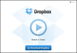
Prominence: Dropbox employs whitespace in order to make their download button stand out
An effective button should be clearly visible on a page, and at least relatively prominent in relation to other elements.
On a landing page – and indeed for most pages, where this is feasible – a button should appear above the fold. The likelihood that a button will be clicked is greatly diminished if a visitor has to scroll to see the it.
For this reason, it is also common to see a call-to-action button placed both above the fold and at the bottom of a long page. Just a user is less likely to scroll down to click a button, they’re also less likely to go back up if they have scrolled past a button.
In a relative sense, button size matters as well. There shouldn’t be any question in a visitor’s mind of where they are meant to click. In one split test, Eric Graham reported a sizable lift in conversion rate simply by increasing the size of a opt-in button.
As size is relative, however, this does not mean that you should simply build bigger buttons, but that they should stand out from other page elements. This can also be achieved in large part by judicious use of white space: a button surrounded by white space will be much more prominent than one which is lost in a sea of text and graphics.
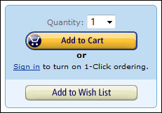
Competing buttons: there's no doubt which is the more important button on this Amazon page
Proximity to other page elements is important as well. Obviously for an e-commerce site an “add to cart” button that’s right next to a product should perform better than one that’s further removed.
In other situations, it is important to keep a call-to-action button close to such things as value propositions, testimonials and feature lists that are intended to stimulate conversions.
Inevitably, a primary call-to-action button will be sharing real estate with other, competing buttons. The most important button should draw maximum attention to itself, though without interfering with the usability of buttons that have other functions (buttons must be in some way necessary, or they shouldn’t be appearing on the page).
Giving prominence to the most important button can be achieved by manipulating the size, color and contrast of this button.
Button Color & Contrast
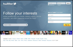
Using contrasting colors: even in this thumbnail view, the Twitter "Sign up" button is unmistakable
Color has a demonstrable influence on whether or not a user will click on a call-to-action button, but determining precisely which button color will result in the highest number of clicks is, yet again, a matter of testing.
It has sometimes been said that a red buttons (and red text links) perform best: by changing the color of their call-to-action button from green to red, Performable increased conversions by 21%.
Rightfully, Performable did not ascribe this to any inherent value of red over green, but speculated that it could be due to the color preferences of their specific audience, or how the red stood out in contrast to their website’s green color scheme.
Using contrasting colors is certainly a key factor in making a button stand out, particularly if there are many other interactive elements on the page. So it may be that increases observed in conversion rate from changing the color of a button may have less to do with the specific button color than how this color stands out on the website.
Certainly, a red button on a website full of red buttons is unlikely to be distinguished from its neighbors, and receive any greater attention as a result of its color.
Button Behavior
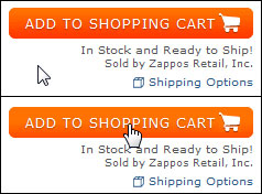
Button behavior: when mousing over this Zappos button, the pointer changes appearance and the button (subtly) changes color
It should be clear to visitors that a button is really a button – something you can click on that will result in a specific action – rather than simply a graphical element on a page.
Graphically speaking, there are a number of ways to do this, including embossing the button, placing the call-to-action text in a discreet bordered area, or offsetting the button from other graphical elements.
The button must also behave like a button when a user mouses over it. If a visitor hovers over a button and the cursor does not change from a pointer to a hand symbol, then that visitor is less likely to click.
For buttons that are not hyperlinked (and so do not automatically generate a hand symbol in the mouse over state) this can readily be accomplished with CSS.
A change in the button’s appearance itself on mouse over, such as a change in color, is a further signal (if not actually a small inducement) to the visitor that the button is clickable.
A Little Button SEO
In many situations, such as buttons used for the shopping cart functions of an ecommerce site, the button itself is not a hyperlinked element, and as such has no specific association with a target URL.
In many instances, however, a button is directly linked to a page indexed by the search engines. Adding an <img> alt attribute will provide the search engines with text they will associate with the target page: if you are targeting keywords on that target place, you should employ them in your <img> alt.
Furthermore, an <img> alt attribute (or, depending on the browser, an <a> title attribute) may be displayed to a visitor when they mouse over the button, providing yet another opportunity to reinforce or augment your call-to-action (“start your no obligation trial!”).
Contributing authors are invited to create content for Search Engine Land and are chosen for their expertise and contribution to the search community. Our contributors work under the oversight of the editorial staff and contributions are checked for quality and relevance to our readers. The opinions they express are their own.
Related stories
New on Search Engine Land
About the author