3 Neuromarketing Considerations For Landing Page Optimization
Last month, I attended a webinar by Tim Ash called “Understanding the Brain’s Need for Novelty & Shortcuts.” This made me think and realize that many of our PPC landing page strategies are “shortcuts” and relate directly to the field of neuromarketing. Neuromarketing is a relatively new field of marketing research that studies consumers’ cognitive […]
Last month, I attended a webinar by Tim Ash called “Understanding the Brain’s Need for Novelty & Shortcuts.” This made me think and realize that many of our PPC landing page strategies are “shortcuts” and relate directly to the field of neuromarketing.
Neuromarketing is a relatively new field of marketing research that studies consumers’ cognitive and emotional responses to marketing stimuli. It seeks to learn why consumers make the decisions they do and what part of the brain our decisions stem from.
In this article, I’ll cover several brain “shortcuts” and discuss ways to successfully implement them on PPC landing pages. As an extra bonus, many of the pointers can also be used on primary website pages, too.
Why Are Brain Shortcuts Important?
The answer stems from our reptilian brains – the part of the brain responsible for survival and that’s the most powerful and oldest of our coping brain functions. It is responsible for the following actions:
- Instinctive survival
- Fight or flight responses
- Anger
- Aggression
- Fear
- Revenge
- Territorial behavior
- Reproductive instinct
With this in mind, it’s important to not to trigger survival responses from our reptilian brain. For example, when threatened or wounded, the reptilian brain will automatically think “fight or flight.. For our online marketing to be effective, it needs to be “non-threatening” and keep the reptilian brain at bay.
Here are several ways to create “shortcuts” and keep the reptilian brain in check. Under each suggestion, I’ve included PPC landing page comments.
1. Provide Clear & Simple Choices
The brain remembers clear and simple choices well. It particularly remembers items well in chunks of 3-4 segments. Too often, we have all seen examples like the promotional apparel page below. The page has way too many options and visitors not given any clear direction on what or where to focus on the page.
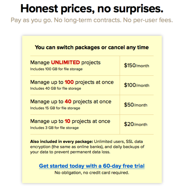
On the other hand, the page below from the Basecamp.com website is very clear and also incorporates the idea that the brain remembers items well in chunks of 3-4.
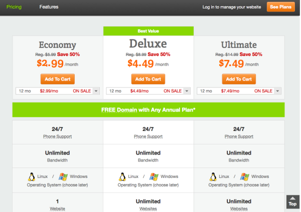
Another effective way to provide clear and simple choices is where you highlight the “most popular” or “best value” product for your buyer. This helps simply the decision making process for your buyers. Here’s an example from Godaddy.com.
If using a category pages, fewer items per page works best. The 3 x 2 column/row combination works well. If your current pages are long, try pulling product lines into distinct choices and have limited number of choices in each category.
For example, you could break out a generic light bulb page to individual pages that represent brands like Phillips, GE and/or types of bulbs high efficiency, soft light bulbs, etc.
2. Anchor To Higher Priced Items
We connect/relate to what we first see. In the book called Predictably Irrational by Dan Ariely, when test subjects were asked to think about their social insurance number and then guess the price of a product, people with higher social insurance numbers guessed that products were more expensive than people with lower social insurance numbers.
So, place items you want people to select or engage with at the top of your pages. Expensive items that appear at the top of a list get selected more often. And you have seen this type of anchoring in many places. Here are some examples:
- Wine list have more expensive options listed first
- When you buy a car, the price of the car is negotiated and then encouraged to add additional options
- When buying an expensive suit, the salesman sells you the suit then goes on to sell you “inexpensive” shoes, shirts, ties, etc. after you have been “anchored” to the price of the suit.
The biggest tip for landing pages for landing page optimization is to show prices on your pages in decreasing order. Here’s an example from the Zappos.com site.
3. Customers Want To Belong So Help Them Relate
We all relate to a cultural “tribe” and we want to feel at home. Use this idea to help people feel at home on your site and with your advertising. Buyers are looking at identifying and identifying with others so help people identify.
Here are some examples of how people relate:
- By type of car we drive – Honda guy vs. BMW guy vs. hybrid car guy
- By type of exercise we do – crossfit, skiing, etc.
- People can also relate in many other ways. By body type, disease, etc.
Here are some considerations of PPC landing pages:
a) Write specifically to your target audience
For example, B2B pages should have a buttoned up tone. Or, if your product lends itself to it, use a more carefree tone. Groupon has a reputation for the strange way they write on their site.
b) Speak to specific people within your audience
In one of our PPC accounts, we sold light therapy devices. We designed specific pages for “aliments” like depression, seasonal affective disorder (SAD), jet lag, etc. The depression & SAD terms outperformed “light therapy device” terms.
If you’re familiar with PPC, you’ll know that this is highly unusual. An affiliation to a particular group could have been a contributing factor to these pages outperforming more generic terms like “light therapy device”.
Contributing authors are invited to create content for Search Engine Land and are chosen for their expertise and contribution to the search community. Our contributors work under the oversight of the editorial staff and contributions are checked for quality and relevance to our readers. The opinions they express are their own.
Related stories
New on Search Engine Land


