Google Testing New Search Results Page Look. Does Anyone Actually Like It?
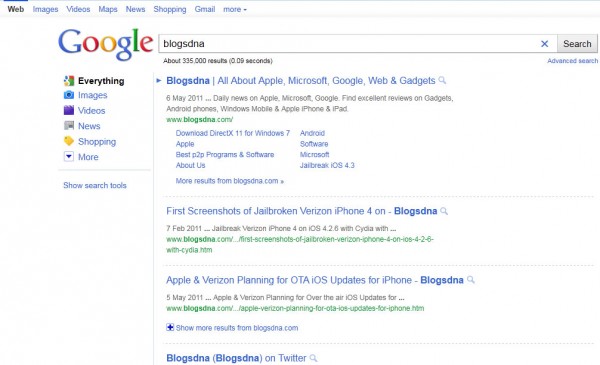
Over the weekend, I received a dozen or so emails, tweets and other notifications of a new Google search results page interface and layout. I personally do not see it, but from the screen shots shared with me, it doesn’t look pretty.
There is a lot of white space, dotted lines to separate one search result for the next, and to me, it just seems like something is missing.
The news was covered widely and can be seen on Techmeme for a glance at some of the stories.
Here are screen shots from @HilzFuld and BlogsDNA, but there are many many more floating around the web. Honestly, I am shocked to see how many people actually see this test.
Here are those screen shots:

Related Stories:
- Official: Google Won’t Offer Option To Restore “Classic Google” Look
- Meet The New Google Look & Its Colorful, Useful “Search Options” Column
- Google Tackles Its “UI Jazz” Problem, Tests Streamlining Search Options Feature
- New Google UI In Wild Again, With Auto-Detected Location
- Google User Interface Test Gives Searches Control Over Snippets
- Google Experimental: Opt-In To Google User Interface Experiments
Explore more on
Add Search Engine Land as a preferred source on GoogleEditorial disclosure
Search Engine Land is owned by Semrush. We remain committed to providing high-quality coverage of marketing topics. Unless otherwise noted, this page’s content was written by either an employee or a paid contractor of Semrush Inc.
About the author