Google’s Mobile Knowledge Graph Cards Get Some Color
Google is adding a more colorful experience to their mobile knowledge graph cards. In some cases the results are gray but others have bright green or red.
Barry Schwartz on March 23, 2015 at 9:07 am | Reading time: 1 minute

Google has added some color to the knowledge graph cards in the mobile search interface. If you search for some queries that may trigger the knowledge graph, when the knowledge graph comes up, it may be more colorful than you remembered. Alex Chitu from Google Operating System spotted this and shared some examples, which I was able to replicate.
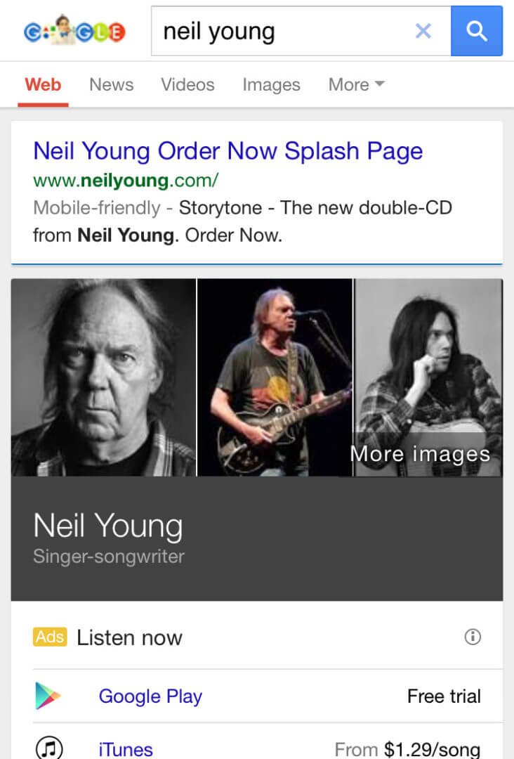
I am just curious, why do some have color and some do not. For example, a search for [breaking bad] or [tori amos] have green and red colors respectively but a search for [neil young] is just boring old gray grunge look:
Is Google using an algorithm to apply the red colors to the Tori Amos knowledge graph card? I am not sure but would be interesting to test.
Related stories


