Google To Launch New Search Results Design With Larger Fonts & No Underlines Soon?
Over the past few months, Google has been testing many, many layouts that made the search results look a bit easier to read by increasing the font size and removing some of the underlines for the hyperlinked content. It seems Google has increased those tests, as we are seeing more and more searchers post about […]
Over the past few months, Google has been testing many, many layouts that made the search results look a bit easier to read by increasing the font size and removing some of the underlines for the hyperlinked content.
It seems Google has increased those tests, as we are seeing more and more searchers post about seeing these updates on Twitter, Facebook and other areas. Both Danny Sullivan, Matt McGeee and myself are able to replicate the new design either using our native browsers or via incognito mode in Chrome.
Here is a side by side image of the old and new user interface for Google’s search results:
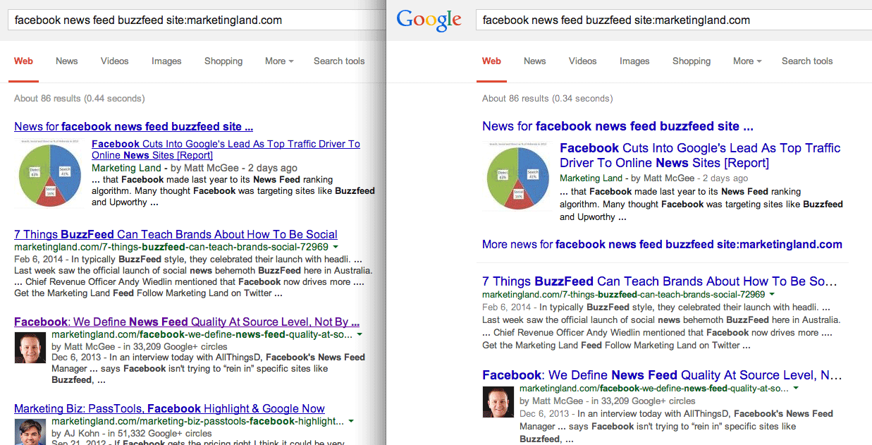
You can click on it and notice the side by side comparison showing the larger font, more white space, no underlines for hyperlinked content and more.
Here is a zoomed in view of the old design:
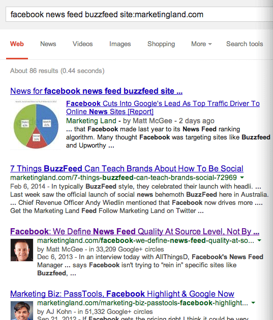
Here is a zoomed in view of the new design:

Google has not responded to our questions about this design but if we had to guess, we’d see this new design launched in the near future.
For more on these design tests, see our Google User Interface category.
Related stories
New on Search Engine Land
About the author
In 2019, Barry was awarded the Outstanding Community Services Award from Search Engine Land, in 2018 he was awarded the US Search Awards the "US Search Personality Of The Year," you can learn more over here and in 2023 he was listed as a top 50 most influential PPCer by Marketing O'Clock.
Barry can be followed on X here and you can learn more about Barry Schwartz over here or on his personal site.