Microsoft Advertising UI: What’s new (so far)
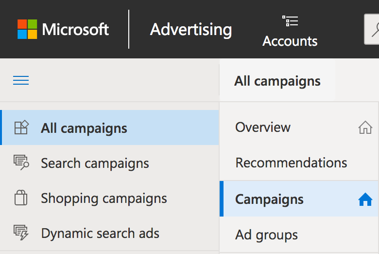
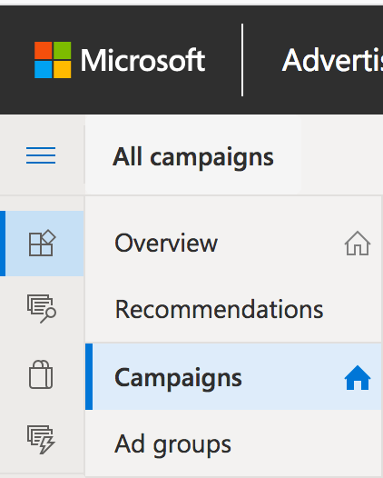
Love it or hate it, the double sidebar makes context switching a lot easier as you move between ad accounts or from other search engines.
Microsoft Advertising (formally Bing Ads) has come a long way in the last year as they rebrand the advertising platform and look to let everyone know they are still an option. Plus a refresh of the Advertising Editor was a welcome change last year as well.
What has been the biggest change since last year is updating the new UI within the ad manager itself. This UI update does not include the Microsoft Merchant Center platform, which is still only accessible through the old UI. However, you can still import from Google into Microsoft and that should not change when the Merchant Center gets an update.
Bulk operations are also not available in the new UI but hopefully that change will come sooner rather than later. Changing any ad manager, let alone one that has stood the test of time is not an easy feat. Shout out to the Microsoft PM working on this because I can only imagine how hard this change is and all the code and backend fixes that need updating.
So what has changed is what you want to know? I know I did when I came in one morning and saw the option to switch over to the new UI.
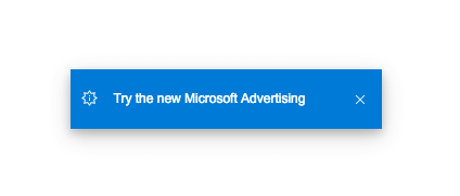
I got a cool little popup/icon asking if I wanted to switch over. It was subtle I would say…I imagine they are doing this in phases for the rollout. Of course, I said yes because who doesn’t want to try something new and shiny?
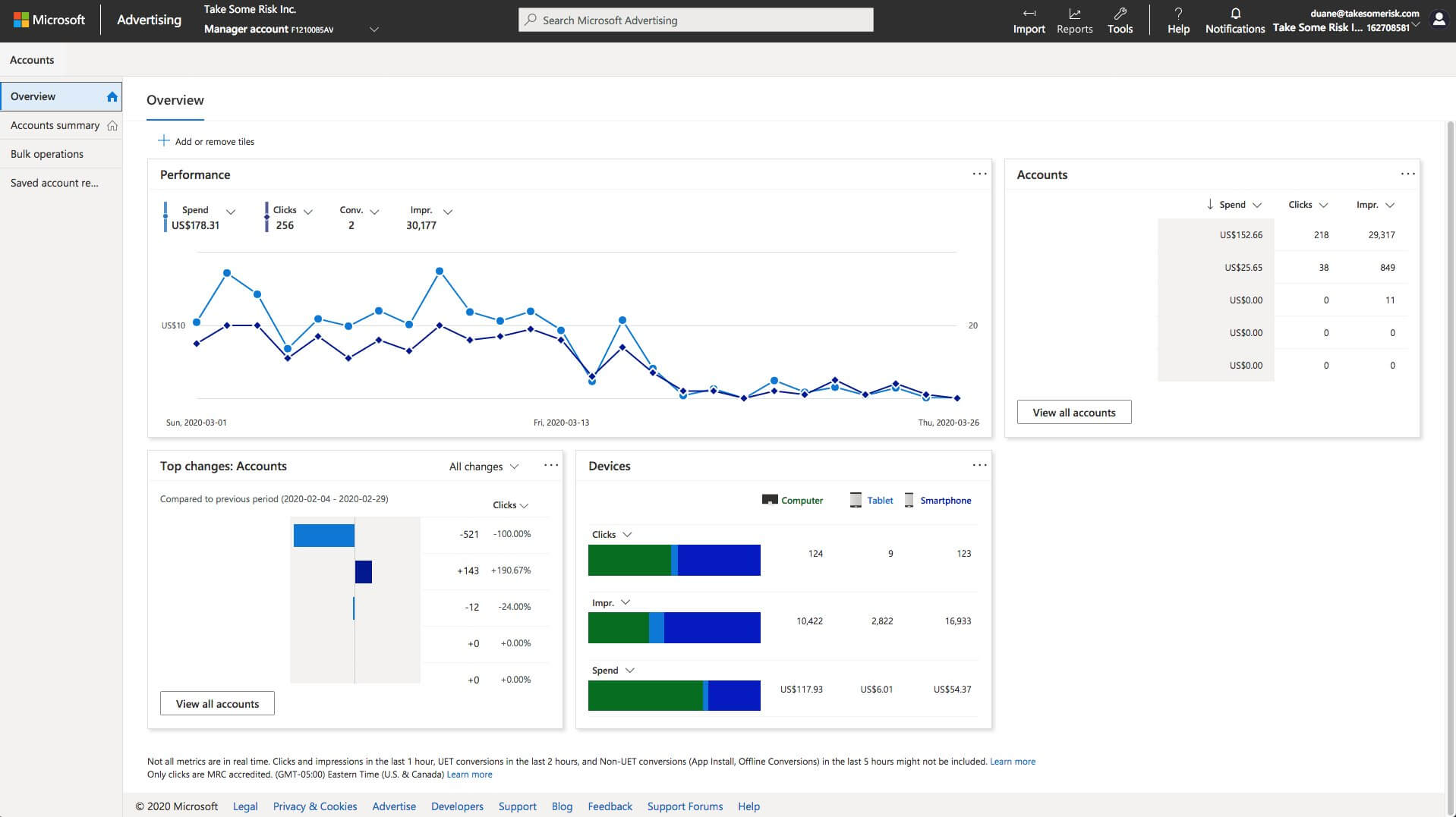
Overview section
Something we come to expect from Google, and even paid social platforms like Pinterest, is an overview tab that looks at performance for that ad account or across all your ad accounts in your Business Manager.
I will be the first to admit I don’t use this screen and actively ignore it as I like to get into the trenches with ad accounts. Plus a general overview of all my ad accounts does not help tell me who is winning and who needs more TLC this week.
However, I’m not everyone and I’m sure some will find this a useful addition to the ad manager.
Account summary
There has not been any major changes to the Account Summary section. All the buttons and dropdowns have the same name but maybe the order they are presented in has been tweaked.
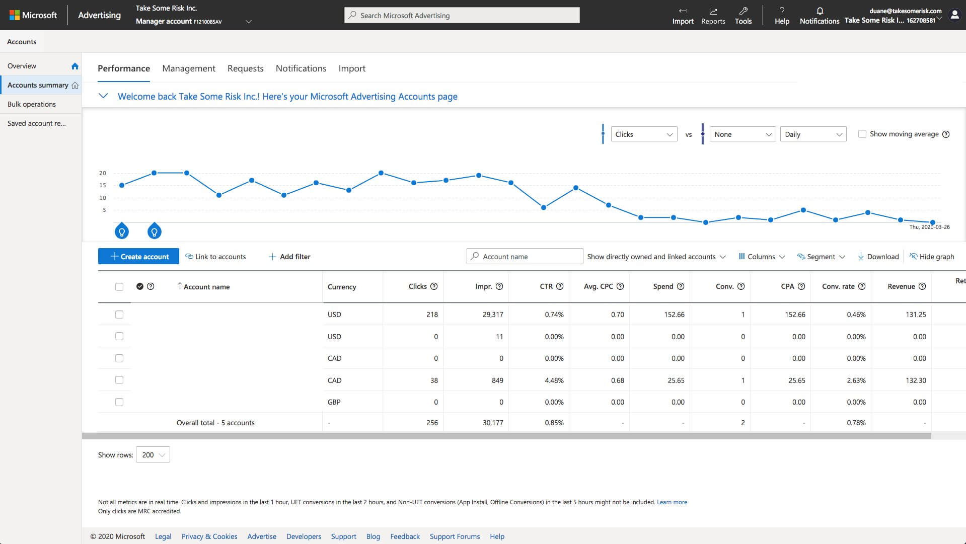
The search field box has been brought front and center, while options for custom columns, segments and downloads are all farther to the right of their usual spot. This is similar to other ad managers. That has been one thing Microsoft has tried to do well, knowing when to minimic other ad managers and knowing when to chart their own path.
One great thing to know is your custom and modified column views should get ported over to the new UI. They did for me at least! Whoever the PM is on this should get an air high five. Such a small detail but tons of time saved!
Double sidebar navigation
Every ads manager from Facebook to Google has been working hard to make their UIs easier to use in the last few years. Some have fared better at it than others and I know this is not an easy change to make.
You may have even seen me tweet my love for the Snap Ads manager. It’s honestly the easiest paid social ad manager to use out there right now. Very intuitive and makes logical sense. Totally not sorry Facebook. I ended up telling my Pinterest AMs to just copy Snap and be done with it on our last team call.
I digress. What does this all have to do with Microsoft Ads Manager? They are nailing all the small details that take you from good to pretty bloody awesome for an update.
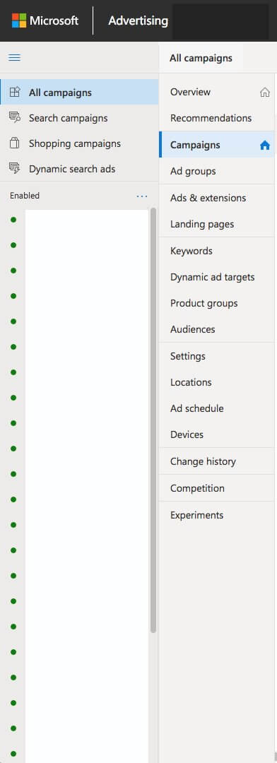
The double sidebar is here! Love it or hate it; this makes context switching a lot easier as you move between ad accounts or from other search engines.
Plus when you move from an open to a collapsed view in the sidebar. All the little icons just make sense across Search, Shopping and Dynamic Ads. Really love the little shopping bag icon for Microsoft Shopping Ads.
Microsoft Ads tools
This is similar to Google Ads but a few things that make it different is that the Merchant Center link is in a different spot. There is also a link to Microsoft Ads Editor, intelligence tool and of course the naming convention is all Microsoft!
Plus the Import and Reports options are still giving you the same features you are used to in the old UI. One thing I don’t see in the new UI is the Opportunities button, which may be getting a new home in this UI. That is waiting to reveal itself….as I don’t see it in the new UI right now.

Conclusion
This is just a taste of what is changing the Microsoft Ads Manager. There are a lot more changes coming in 2020 when you consider Merchant Center needs a new UI and other areas of the ad manager. What do you think of the new UI?
Contributing authors are invited to create content for Search Engine Land and are chosen for their expertise and contribution to the search community. Our contributors work under the oversight of the editorial staff and contributions are checked for quality and relevance to our readers. The opinions they express are their own.
Related stories
New on Search Engine Land