A Marketer’s Guide To Table Formatting In Excel
If there’s one task most marketers share — whether their focus is SEO, paid search, or social media — it’s collecting and interpreting data. Being able to slice and dice the data to find actionable insights is key to effective analysis. Yet, one of the biggest mistakes marketers make is trying to wrangle static data […]
If there’s one task most marketers share — whether their focus is SEO, paid search, or social media — it’s collecting and interpreting data. Being able to slice and dice the data to find actionable insights is key to effective analysis.
Yet, one of the biggest mistakes marketers make is trying to wrangle static data instead of taking advantage of Excel’s table formatting, which basically turns your data range into an interactive database. I hope to rectify that injustice against innocent data with this guide.
Microsoft introduced table formatting in its 2007 version (2011 for Mac). For me, it was love at first sight. You’ll understand why when you see all the cool things you can do with your data once you format it as a table. We’ll just use one of the built-in styles for now but then customize one later in the post to show how easy it is to create a branded table.
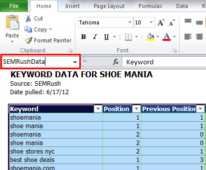
I’ll demonstrate using a data dump from SEMRush for a shoe website I checked into after seeing the coolest shoe store in Manhattan last week, Shoe Mania. (Disclosure: I have no affiliation with the store or the site.) My poor friend risked life and limb for an emergency stop.
SEMRush is a great jumping-off point for competitive analysis because it lets you know the keywords that the site is ranking for on the first two pages of Google. It shows you Google US by default, but you can also choose from nine other countries or Bing (US only).
As with nearly any tool out there, you have the ability to export the data as a CSV file. CSV data dumps epitomize ugly data, but in less than two minutes, you can take a hideous data dump like this and transform it into a work of data art between table formatting and some strategically executed conditional formatting (a topic for another post). If you want to follow along, you can download the Excel file I use in the post.
The original data dump is in the first tab. Then, I have a tab for the table formatted using a built-in style, with a third tab for the same table that is formatted using colors I pulled from the site’s logo. (The Chrome Eye Dropper extension is a great tool for getting the RGB values of colors you find on a website.)
Table Setup
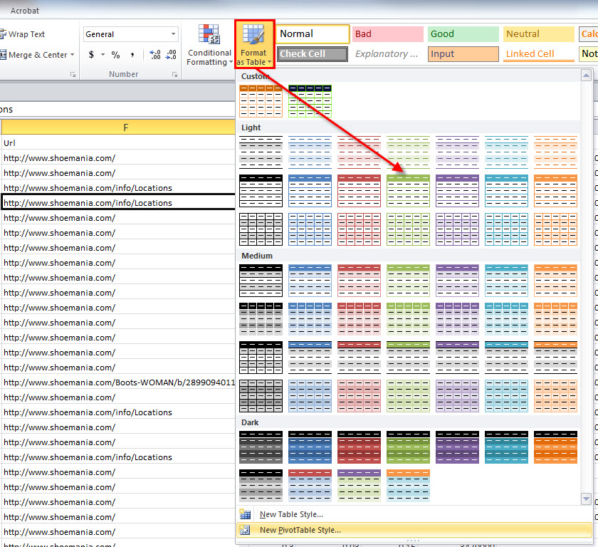
To get started, select any cell inside your data set, then choose Home > Styles > Format as Table (On a Mac: Tables > Table Styles).
A ‘Format as Table’ menu will pop up. This will give you a drop-down of table formatting options. I chose to use the middle green format in the Light category.
Excel will auto-detect the perimeter of your table and populate the range. It will also auto-detect headings. If that option isn’t selected (which sometimes happens in the Mac version of Excel), just select it.
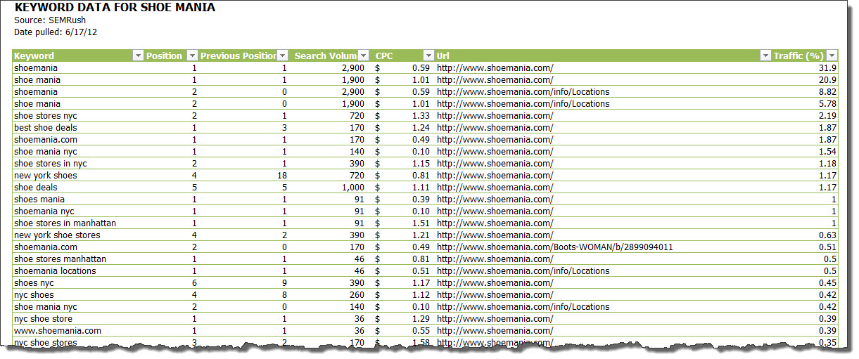
I cleaned the data up a bit by hiding a few columns I don’t use (select column(s) > right-click > Hide), adding number formatting (under Home > Number), auto-expanding the column widths (double-click on any column separator), and turning off gridlines and headings to dial back on some of the noise (View > Show for PC or Layout > View for Mac).
I also added some summary data at the top of the sheet, leaving me with a worksheet that is clean, visually appealing, and interactive. I do this with every data export I open in Excel, without exception.
Sort & Filter
The best benefit to formatting your data as a table, in my opinion, is the multiplicity of sort and filter options it affords. You can access these by clicking on any of the down-facing triangles in the header row.
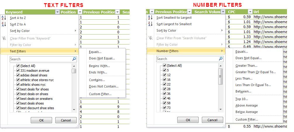
If your column contains text you’ll see filter options specific to text, and if your data contains numbers, they will be tailored to numbers, as you can see in this comparison:
Sort Options
There are three ways you can sort your table:
- Smallest to Largest (or vice versa). This option is self-explanatory, really. Click on the down-facing triangle in the column’s heading you want to sort the table by, and choose your sort option at the top of the drop-down menu.
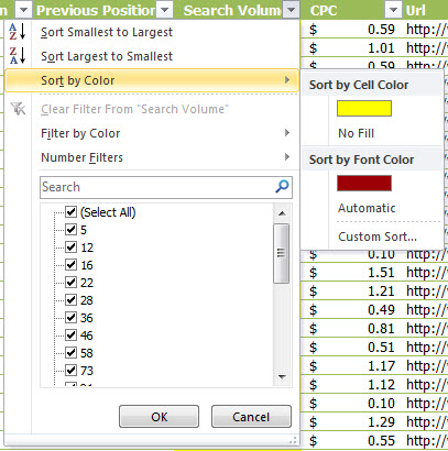
- Color. Whether you apply a background fill or font color manually or by using conditional formatting, you can use that color to sort your data. I used conditional formatting to format the top 10% of Search Volumes with a yellow fill and the bottom 10% with a red font.
(You can get to these options under Home > Styles > Conditional Formatting > Top/Bottom Rules for the PC or Home > Format > Conditional Formatting > Top/Bottom Rules for the Mac). I wouldn’t actually hatchet the formatting like this; I just wanted to demonstrate where the different formats show up in the fly-out menu.
Now, you can sort the column by cells with a yellow fill, red font, no fill, black (or “Automatic”) font color, or a combination of factors using the Custom Sort option. So if I wanted the keywords with the highest search volume to float to the top of my table, I’d simply click on the yellow bar under Sort by Cell Color.
- Custom. If you want to sort by more than one value, you can choose Custom Sort under the Color menu. This is a UI faux pas on Microsoft’s part, in my opinion, since you can use a custom sort that doesn’t use color formatting at all. It’s even worse on the Mac. You don’t even get a Custom Sort option unless the column has some kind of color formatting. If it gets too confusing, just select any cell in the column you want to sort by and choose your sort option(s) under Data > Sort & Filter > Sort (same for the Mac).
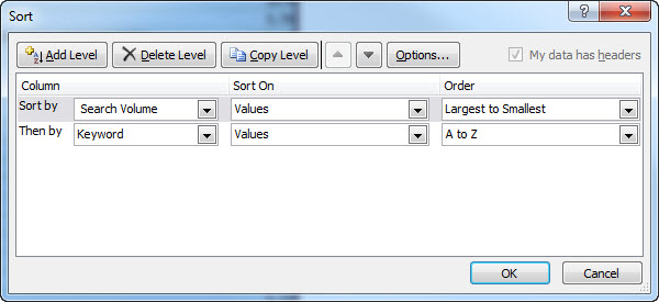
In this example — as I frequently do with SEMRush data when analyzing it — I sorted first by Search Volume in descending order and then by Keyword in ascending order, which essentially allows me to see if keywords are driving traffic to competing landing pages.
Sometimes, especially with branded keywords, this is a good thing because it indicates indented or multiple listings; other times it means that Google can’t tell which page to send traffic to for a particular keyword.
Filter Options
As the name suggests, the filter options hide rows based on the criteria you choose. No data is lost in this process. It’s just temporarily hidden to help you hone in on the data you’re trying to interpret.
At any time, you can release these filters by choosing Clear Filter from [Heading] from the drop-down menu on a PC and the Clear Filter button on a Mac.
- Text. One great use of text filters is to filter out branded keywords in analytics, webmaster tools, or SEMRush data. Regrettably, Excel doesn’t support regular expressions (regex) out of the box, but fellow columnist Crosby Grant has shared a hack to use Regex via macros in Excel here. Otherwise, you can use two filter options at a time (concatenated with “and” or “or”).
You also have two wildcard characters available to you: * and ?. The question mark represents a single character, and the asterisk any series of characters.
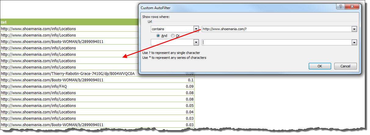
With this example, I was able to filter out all of the branded keywords for Shoe Mania by using a combination filter, as you can see in the screenshot below.
However, one time I was trying to filter by all keywords that contained halloween, and it was no small task. People have no idea how to spell the word, and I had about 20 different variations and only two filters to work with.
I was eventually able to capture all but a few with a “Contains” filter that employed both the ? and * wildcards. The result was h?l*en.
That translates to, “I know it starts with an h and then could have any one letter after that (to capture the variations that use an o instead of an a). Then there’s an l, followed by a total free for all, finally wrapping up with an en at the end.”
Then, I used another “Contains” filter that tacked an e at the end of all that, lassoing the few stragglers that were left.
You can also use the ? wildcard to filter out keywords that send traffic to the homepage, if you wanted to focus on your internal landing pages, by adding ? to the end of the homepage URL — e.g., https://www.shoemania.com/?.
Number: You can take advantage of any of the number filters I showed earlier.
Color: In the same way you can sort by color, you can also filter by color.
Manual Selection: This option allows you to select and deselect individual values from the filter drop-down. To easily find a particular value, you can also use the search box.
Table Formatting
As I mentioned earlier, if you want to choose one of the table styles that come baked into every theme — accessed under Page Layout > Themes (Mac: Home > Themes) — you can do that from the Format as Table drop-down menu.
However, if you want to apply specific colors to keep with your branding, you can create a custom table style by choosing New Table Style under the Format as Table drop-down.
Custom Formatting Options
For demonstration purposes, we’ll use Shoe Mania’s blue and green logo colors to apply some formatting to the header row and borders. I always like to have border colors, so I can turn off gridlines on the rest of the document. (I’m on a mission to rid sexy data of distracting gridlines.)
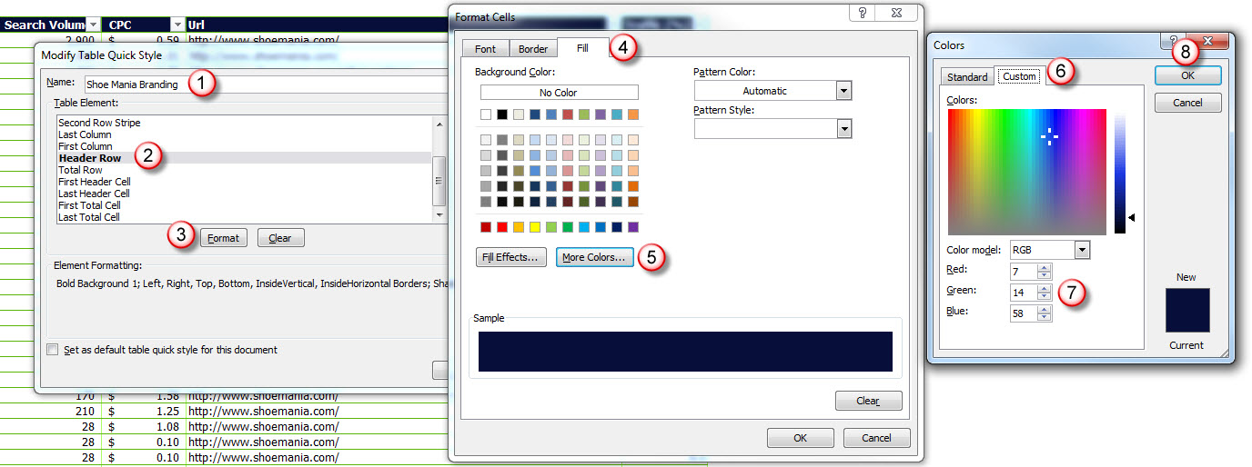
To keep this post from becoming an ebook, I’ll show in this screenshot how I formatted the fill color of the Header Row and changed it to Shoe Mania’s dark blue color
To give the text more contrast, I set the Color to white and Font Style to bold by navigating to the Font tab in the Format Cells dialog and choosing those options.
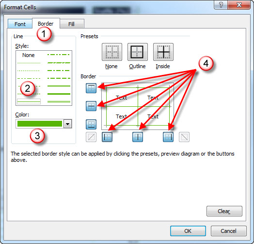
Finally, I formatted the border by choosing Whole Table from the New Table Quick Style menu (since we want to apply these borders to the entire table and not just the Header). Once in the Format Cells dialog, I chose the thin line style under Style, then set the border color to green by entering the RBG values from the Color drop-down menu.
Pro Tip: One thing to remember, if you want to change the border color, is you have to choose your color and then either click on each of the lines you want to apply this color to or select the individual buttons.
There are, of course, lots of other ways you can format your table. The best approach is to poke around in there and experiment with different styles. You can always go back and edit your custom style by right-clicking on it from the Format as Table drop-down and choosing Modify.
Design Tab Options
If you click on any cell inside a formatted table, a Table Tools tab appears with a secondary Design tab immediately below it.
In the Mac version, you’ll find the table formatting options under the Tables tab because it would just make too much sense for Microsoft to keep the UIs between the two platforms parallel.
In any case, these tabs offer a plethora of additional formatting options. I won’t detail all of them — just the more generally useful ones.
Table Name: To give your table a name, click a cell inside the table and press Ctrl-A (Mac: Command-A) twice. The first time selects everything but the header, and the second time selects your entire table. Then enter your name in the Name Box just west of the Formula Bar. No spaces or hyphens are allowed — only letters, numbers, and underscores (ick). But you also can’t start a table name with a number. Don’t ask. My preference is to use camel case to name tables.
To rename a table on a Mac, click the Rename option under Tools and enter the table name in the text box that appears below it and to the left.
Naming tables can be very helpful in two ways:
- To navigate large workbooks with multiple tables. You can easily navigate to one of your tables by choosing your table from the Name Box drop-down menu.
- For referencing purposes in vlookups. If you don’t know how to use vlookups, check out Distilled’s Microsoft Excel for SEOs guide. It’s a must-learn skill that enables you to stitch together data from different sources as long as they share a common data point. For example, you could get the status codes for each of the landing pages using Screaming Frog’s List Mode and pull those in to a new column using the landing pages as the common data point or impression and CTR data from Google Webmaster Tools using the keywords as the common data point.
Remove Duplicates: This is a very useful option that allows you to deduplicate your data. Excel prompts you in a Remove Duplicates dialog to choose which columns you want to use for this deduping process. This is especially handy if you merge different data sources together into one file. To remove duplicates on a Mac, click the Remove Duplicates option under Tools.
Convert to Range: This option will remove the filters from your table. I never found a reason to use this until one day Danny Sullivan complained on Twitter about the filters in his tables. After probing a bit, I found out he wanted to print the table and didn’t like the appearance of the filtered headers. So I told him about this option, which gave him all of the style from his table without any of the functionality. This option is also available on a Mac under Tools.
Total Row: As you would suspect, this option allows you to add a total row at the bottom of your table.
Other Cool Tips
This post can’t possibly cover all the cool options you have with tables, but there are a few faves I’ll mention here.
Adding Rows and Columns
You might say to yourself, “Hey, I can get all the same functionality by adding filters to the header row.” (Just select the cells that make up the header row and go to Data > Filter to do this.) I’ve seen examples where marketers will boldface the headers and add these filters. It’s pretty bourgeois when you can get fully formatted tables with the same number of clicks.
However, one option you get with a formatted table that you won’t get by just adding filters is the flexibility in adding new columns or rows to your table. If you click just to the right or below the table and enter a value, the table will automatically expand to include the new row/column.
Printing Just a Table
If you want to just print your table, Excel provides that option in the Print dialog. (Sorry, Mac users — this is a PC-only option.) Click anywhere inside the table and press Ctrl-P. Then click the Print Active Sheets drop-down and choose Print Selected Table.
Ghosted Table Headers
If you scroll down the page, you will see a ghosted version of the headers stick to the top of the window. (You have to have headings visible for this to work.) In the 2010 PC version Microsoft also added the ability to access your filters but left this additional feature out in the 2011 Mac version.
Learn More
To learn more about how to rock tables in Excel, check out Microsoft’s resource for the PC and for Mac.
Contributing authors are invited to create content for Search Engine Land and are chosen for their expertise and contribution to the search community. Our contributors work under the oversight of the editorial staff and contributions are checked for quality and relevance to our readers. The opinions they express are their own.
Related stories
New on Search Engine Land

