Bing Maps Launches New User Interface
Bing Maps has been doing some cool stuff lately on the functionality side of things, but the look-and-feel has been pretty stagnant for about a year now — since Bing’s launch last summer. To remedy that, Bing has announced the full launch of its new Maps experience. Here’s what Bing Maps looked like in June […]
Bing Maps has been doing some cool stuff lately on the functionality side of things, but the look-and-feel has been pretty stagnant for about a year now — since Bing’s launch last summer. To remedy that, Bing has announced the full launch of its new Maps experience.
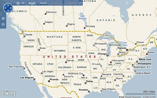
Here’s what Bing Maps looked like in June 2009 when Live Search became Bing:
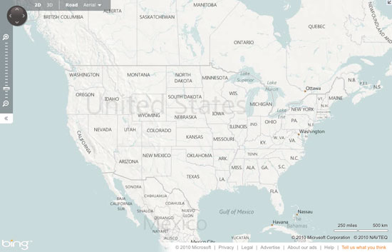
And here’s what Bing Maps looks like today:
There’s a lot of stuff underneath the hood related to AJAX vs. Silverlight, raster tiles and vector graphics, etc. You can read Bing’s blog post if you need to know all that.
For most users, the visible changes include:
- New colors to differentiate between content types/layers.
- Bigger fonts and labels.
- New data with more detail, especially in Central and Eastern Europe, the Middle East, Oceania and Asia.
Also new is “Dynamic Labels” — a new navigation tool that’s only available as a beta in www.bing.com/maps/explore/ when you choose it from the Map Style selector.
Contributing authors are invited to create content for Search Engine Land and are chosen for their expertise and contribution to the search community. Our contributors work under the oversight of the editorial staff and contributions are checked for quality and relevance to our readers. The opinions they express are their own.
Related stories
About the author