Mobile optimization: What it is & how to do it
Sponsored by Semrush , written by Nichola Stott , & edited by Nichola Stott
What is mobile optimization?
Mobile optimization is the process of improving your website to provide a better experience for smartphone and tablet users.
Key elements of a mobile-optimized website include:
- Responsive design: Adapts the page layout to various screen sizes and orientations
- Mobile-friendly navigation: Streamlines the menu for easy use on smaller screens
- Fast page load speed: Minimizes waiting time for users on the go
- Easily parsable content: Structures text and images for optimal visibility on small screens
- Touch-friendly elements: Provides buttons and links that are easy to tap with fingers
Tip Check for mobile issues on your website with Semrush’s Site Audit tool.
Why is mobile optimization important?
Mobile optimization is important because most internet traffic comes from mobile devices.
Optimizing your site for mobile users makes it easier and more enjoyable for them to engage with your website.
In other words, you improve the user experience (UX) for what could be more than half your audience.
(And there’s no negative impact on other users.)
This can lead to:
- Higher engagement and conversion rates
- Lower bounce and cart abandonment rates
- More return visitors
It might give you an edge over competitors, too.
Since mobile optimization can enhance your website’s visibility in search engines.
Google uses mobile-first indexing. Which means it evaluates the mobile versions of webpages when ranking search results.
If you optimize for mobile, you’re more likely to rank prominently. And get more organic traffic.
Tip Read our mobile SEO guide for more advice on optimizing for search engines.
How to optimize your site for mobile
1. Use a responsive design
Responsive design is a design approach that allows website content to automatically adapt to different screen sizes and devices.
It helps ensure good UX across mobile, tablet, and desktop devices.
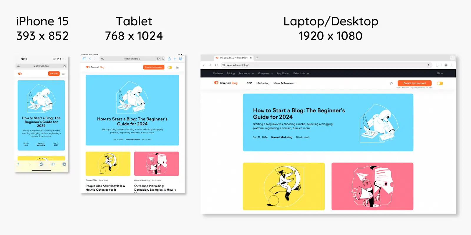
For example, Semrush’s blog appearance adapts to phones, tablets, and laptops. Like this:
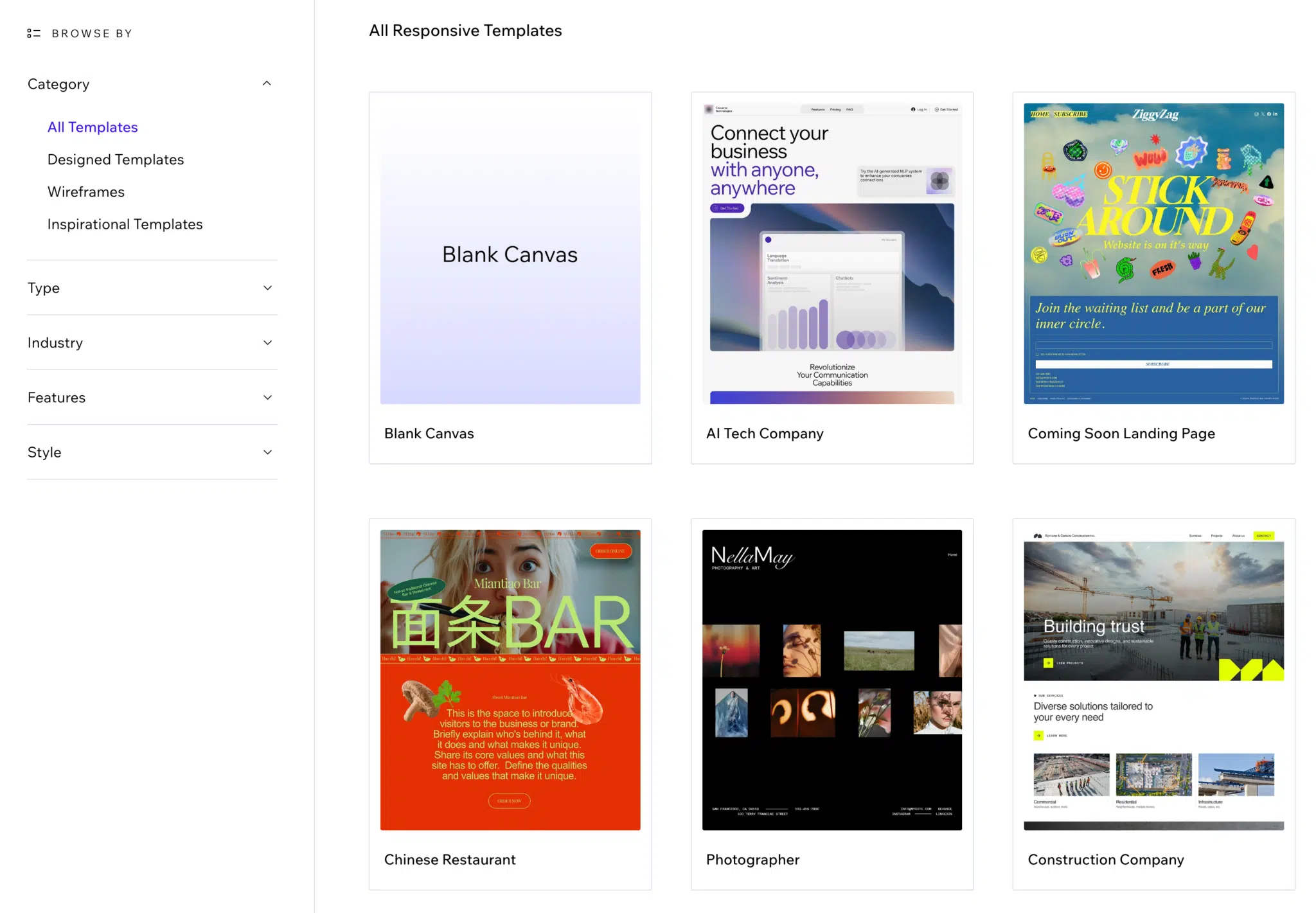
Some website builders, like Wix and WordPress, allow you to install premade responsive templates.
Like these:
Alternatively, hire a web developer to create a custom design for you.
Tip Semrush’s Site Audit tool lets you know if any viewport tags or viewport width values are missing from your site. These are bits of code that ensure your responsive design works properly.
2. Focus on accessibility
Website accessibility is about making your site usable for everyone, including people with disabilities.
Checking your website’s accessibility is important when optimizing a website for mobile. Because what worked for desktops may not work for smartphones and tablets.
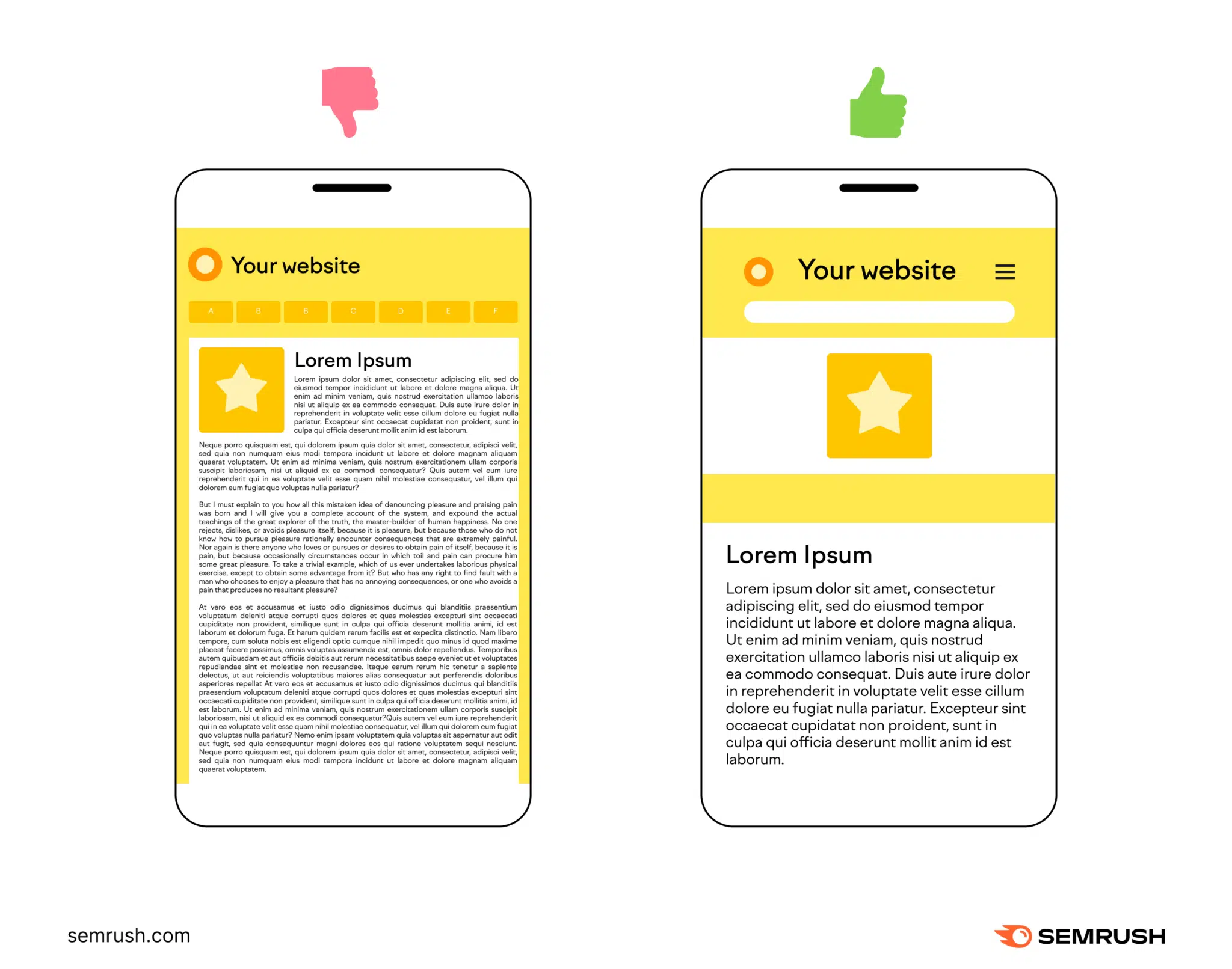
For example, Nike displays this navigation menu on larger screens:
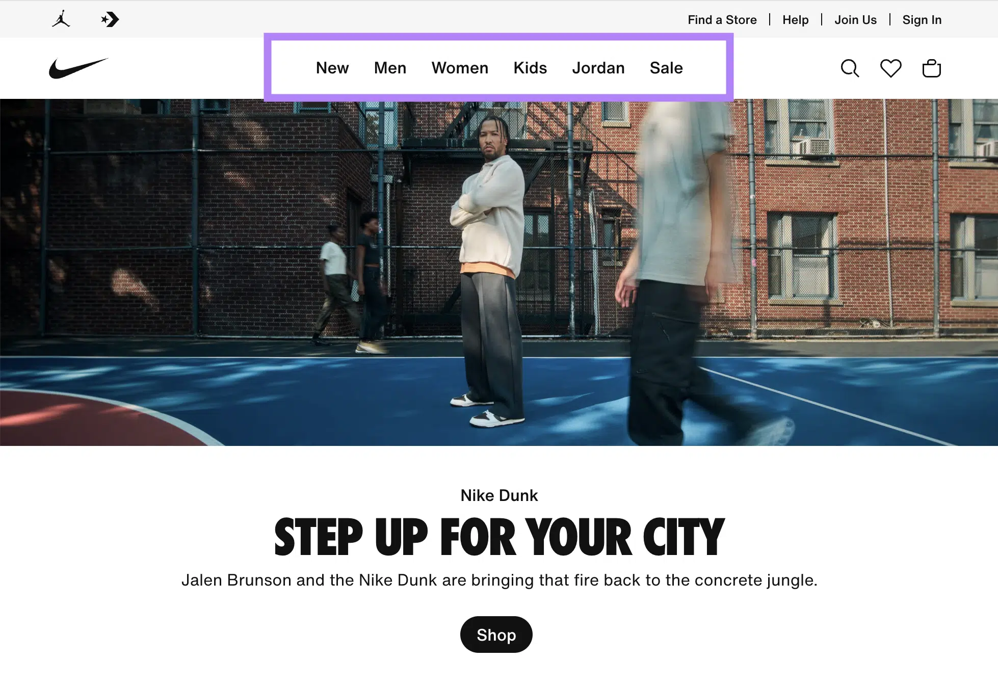
This would be difficult to read and engage with on a small touchscreen. Especially for users with visual or mobility impairments.
So, Nike uses a burger menu instead:

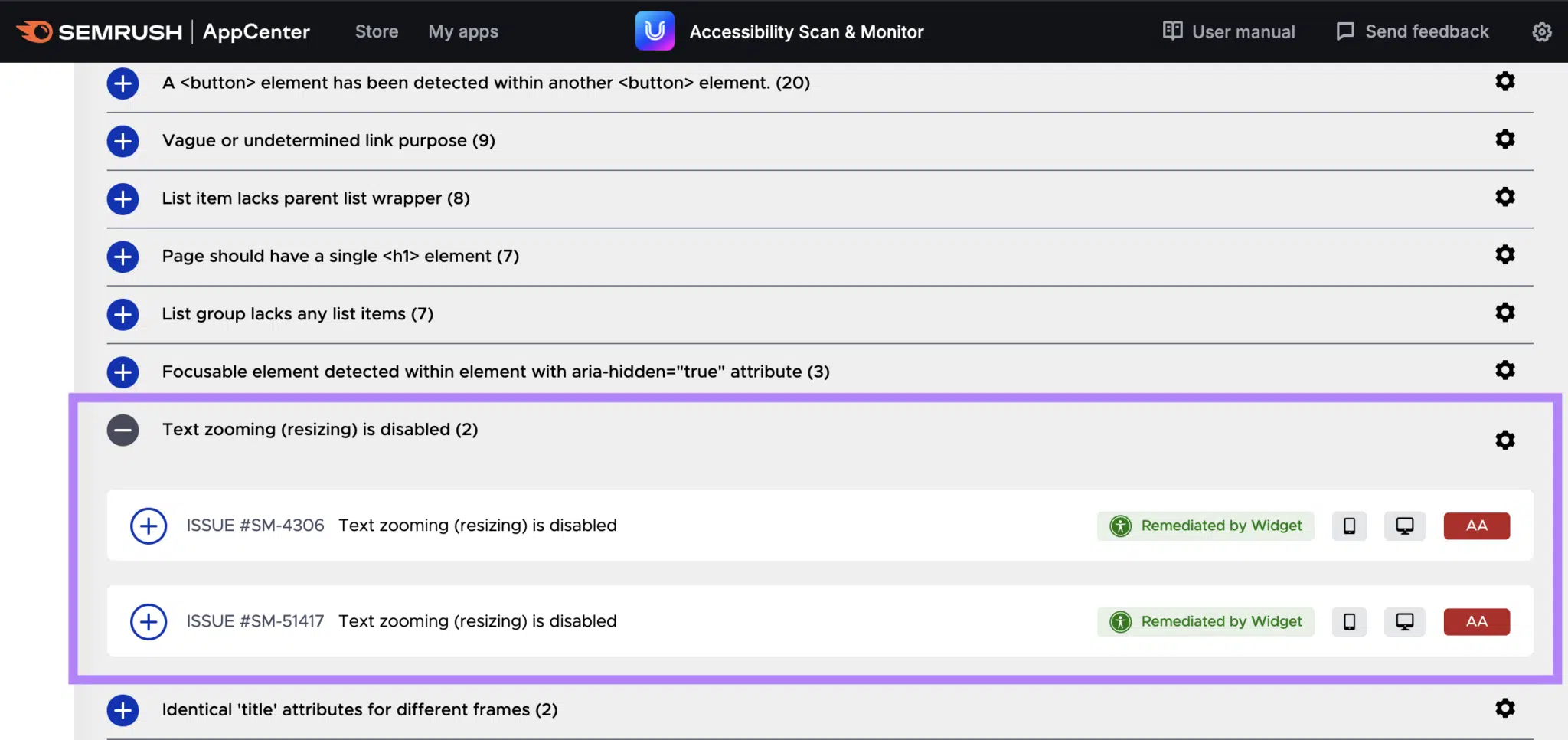
You can review your website’s accessibility with the Accessibility Scan & Monitor app.
It checks for issues affecting desktop and mobile users. And tells you how to resolve them.
3. Optimize images and videos
Optimizing images and videos for mobile devices is essential for fast loading and proper display.
It also increases the chance that your visuals—and the pages they’re on—show in search engine results. And so drive more traffic to your site.
Here are some quick tips for success:
- Implement responsive image and video sizing on your site
- Resize image and video files to the maximum dimensions required
- Compress image and video files using online tools or website plugins
- Use modern file formats where appropriate: SVG and WebP for images and MP4 for videos
- Implement lazy loading to delay loading images and videos until they’re needed
- Avoid auto-playing videos to save user data and improve page load time
- Use adaptive streaming for videos to adjust video quality based on the user’s connection speed
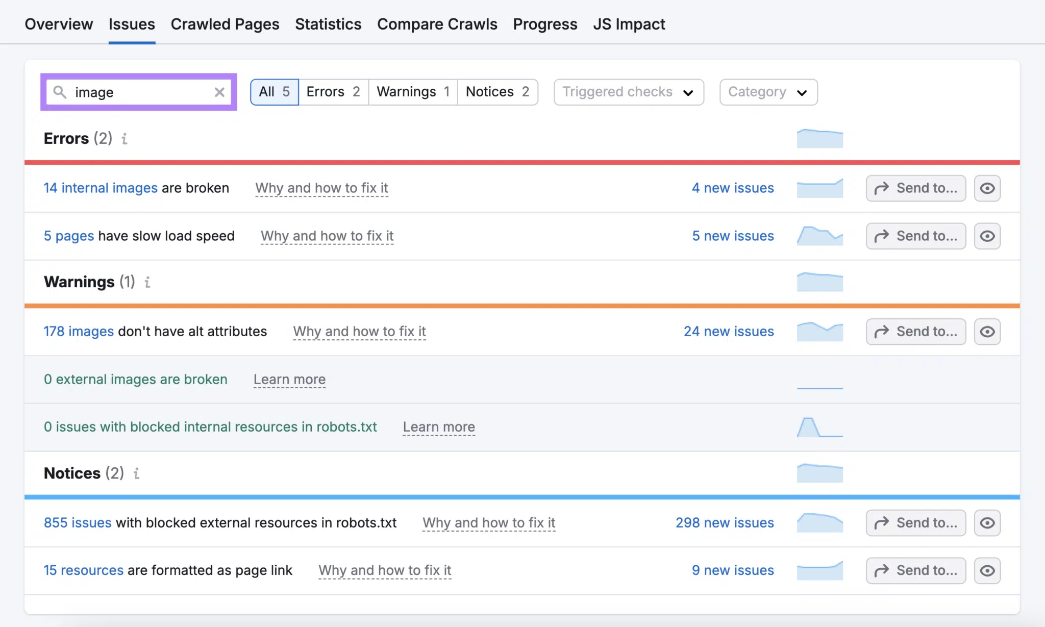
Tip Semrush’s Site Audit tool notifies you about slow-loading images on your site. And various other image-related issues.
4. Improve Core Web Vitals
Core Web Vitals are a set of key webpage metrics measured by Google:
Largest Contentful Paint (LCP) is how long it takes the main content on the page to load. Just a few milliseconds can be the difference between someone staying or leaving your website.
Cumulative Layout Shift (CLS) is how much the layout moves around while the page is loading. If there are lots of shifts, mobile users are more likely to click the wrong thing and get frustrated.
Interaction to Next Paint (INP) is how long it takes the page to respond after a user interaction (e.g., a button click). If this is slow, users are more likely to abandon their action.
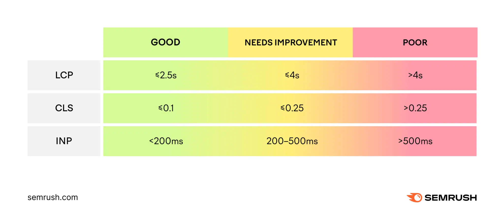
These metrics affect UX and your visibility in Google search. So it’s important to see how your website measures up. And consider making improvements.
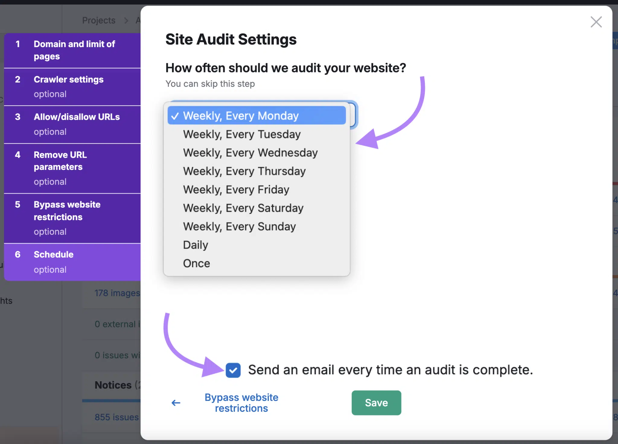
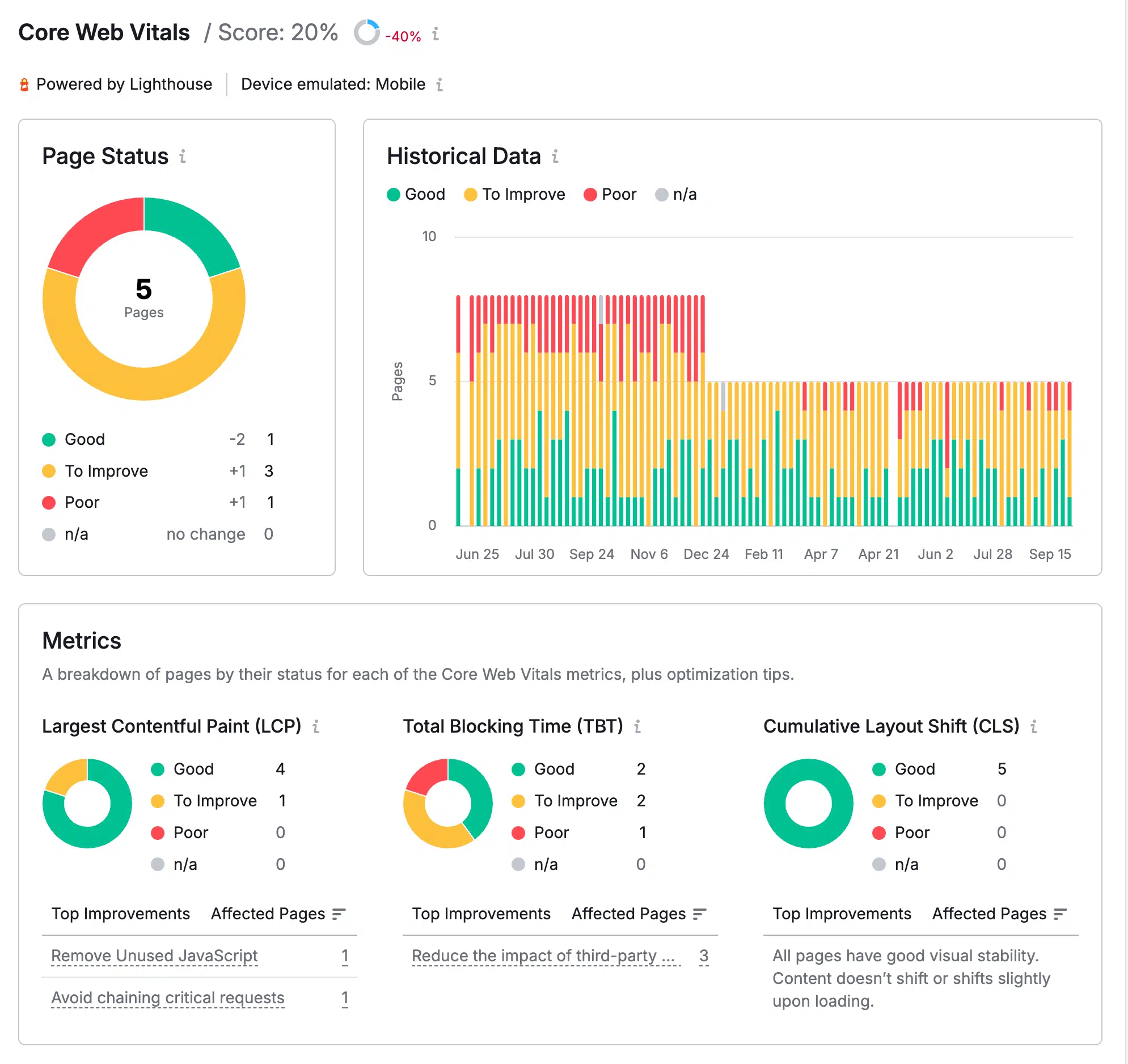
Measuring and monitoring your Core Web Vitals is easy with Semrush’s Site Audit tool.
Just open the Core Web Vitals report after setting up your project:
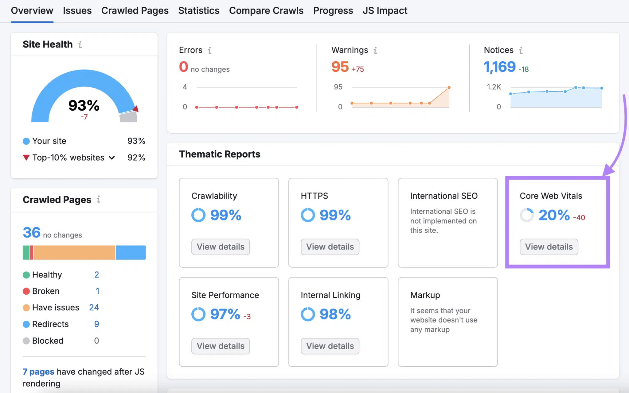
Then, see whether you have any pages in the “To Improve” or “Poor” category.
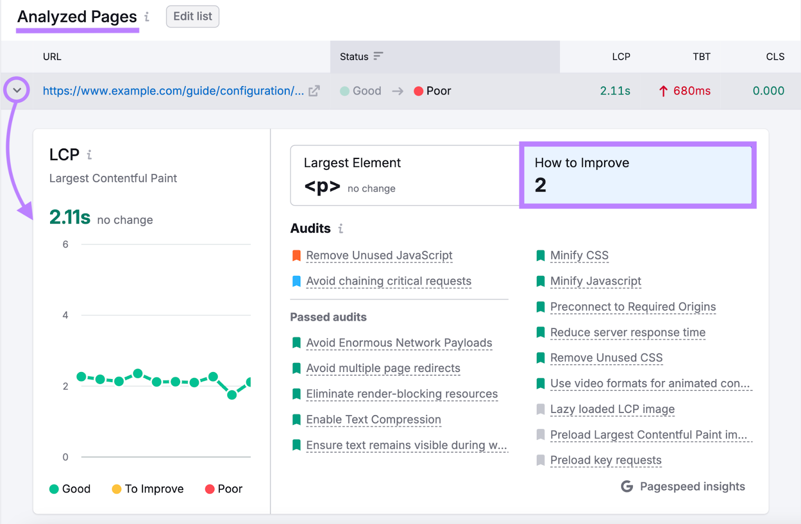
If so, scroll down to the “Analyzed Pages” section. And click the arrow beside a page’s URL to learn how to improve its Core Web Vitals.
[create-campaign destination_url=”https://www.semrush.com/siteaudit/” show_input=”false” header=”Find and Fix Mobile Issues” text=”with the Site Audit Tool” button_text=”Sign Up Now” bg_images=”https://static.semrush.com/blog/uploads/media/96/fd/96fd495930d058321d5f78f5554aff88/trial-superbanner-1.png” bg_button=”-success”]
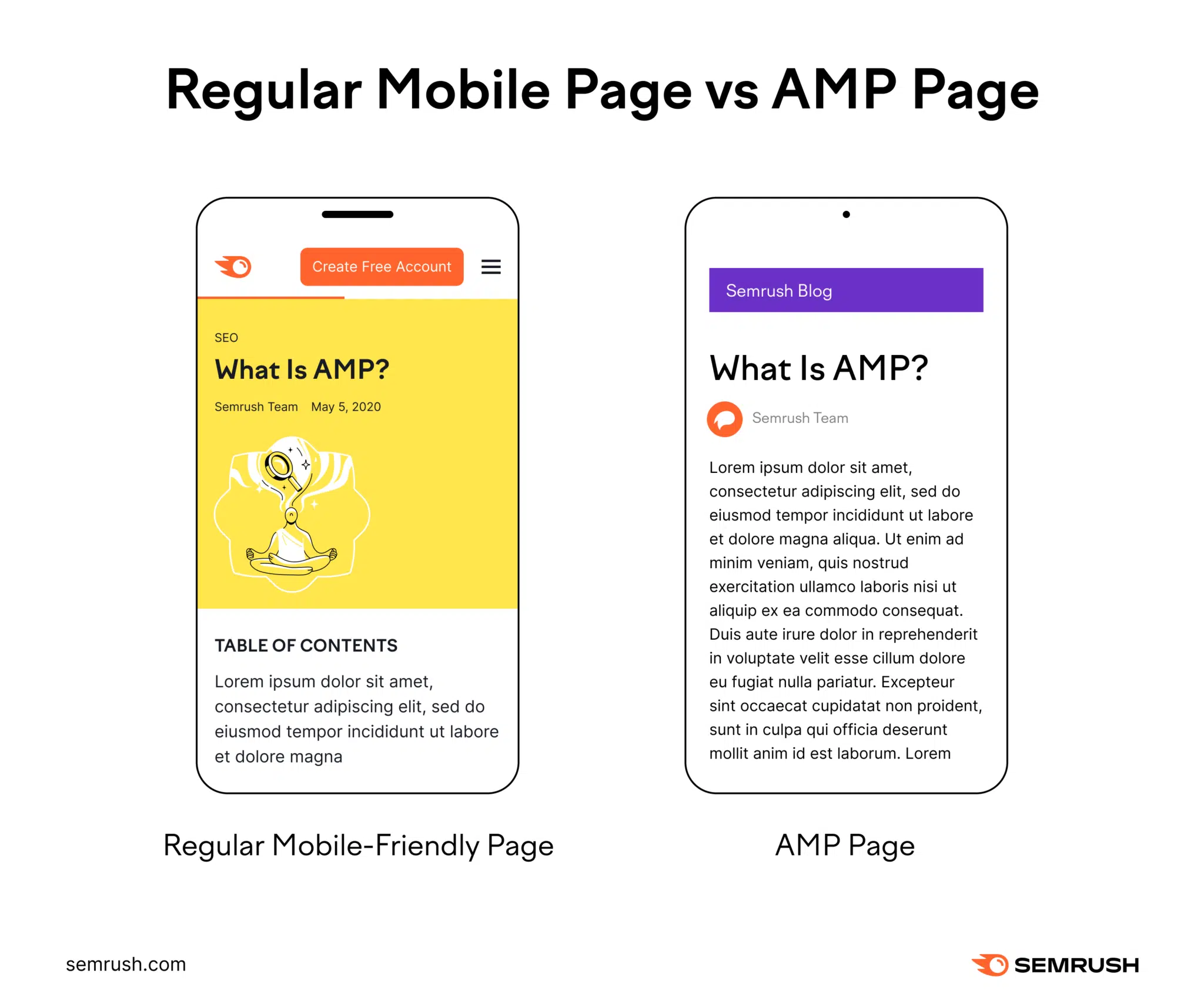
5. Consider using AMP pages
AMP pages (formerly known as “Accelerated Mobile Pages”) are lightweight versions of webpages designed to load quickly on mobile devices.
Here’s what a regular mobile-friendly page looks like compared to an AMP page:
Using AMP can improve the UX on your website. But doing so often requires developer support and can be challenging to maintain.
If you’re interested in setting it up on your website, check out the Semrush AMP guide.
Note Using AMP used to be a requirement for appearing in Google’s “Top Stories” section on mobile devices. But that’s no longer the case.
6. Make content easily digestible
Making content digestible means ensuring it’s easy to read and understand.
This is particularly important for mobile users. Because they have smaller screens and are often on the go.
Consider these tips to improve your content’s digestibility:
- Use short paragraphs and sentences
- Put the most important information first
- Place content into collapsable sections
- Leverage charts, infographics, etc.
- Stick with simple language
You can get detailed feedback on your writing with ContentShake AI.
The app provides recommendations based on your target readability level (e.g., seventh grade). And allows you to make instant improvements with the help of AI.
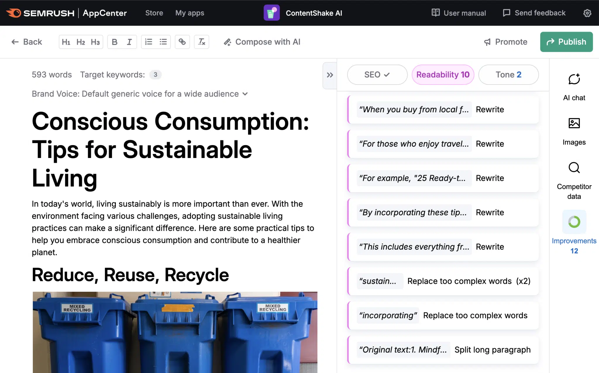
You’ll also get help with SEO, tone of voice, and much more.
Keeping your website optimized for mobile devices
Technology evolves, user behaviors change, and your needs develop.
That’s why it’s important to continuously review your mobile optimization strategy.
Monitor website metrics to see what’s working and what isn’t.
And schedule regular website audits using the Site Audit tool. To ensure you aren’t missing any important issues.