How To Use Excel To Easily Spot SERP CTR Trends
Get better insights from your SERP Impressions Vs Clicks report with Excel wizardry for SEO content teams.
Data fiends and worshippers at the temple of clear data visualisation will have suppressed a dry chuckle when reading Google’s recent announcement on improved detail for Search Query reports in their webmaster tools interface.
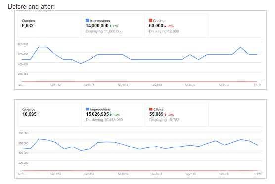
The reason for our data geekery? Google’s ‘Impressions Vs. Clicks’ before and after comparison illustrating the impact of their change.

Spot the difference! Google’s charts showing before & after their data update.
You would be forgiven for taking a few seconds or more trying to discern the minor change in visual impact in the two charts above.
It is a shame, as the underlying data tweak is a welcome, and important, change in policy from Google: increased accuracy in their impressions and click data allows for much more accurate reports highlighting actionable outcomes that can have a significant impact on your SEO campaign’s bottom line.
The failure of these charts to visualise this important data to allow a useful insight (for example, try to pick out a firm outcome just looking at the charts above. Anyone, Bueller, anyone?) is a critical failure in Webmaster Tools.
Fortunately, however, Excel can help us easily create some actionable reports using this new data accuracy in super-sharp time.
Solving Poor Trend Charts: Double Vertical Axis FTW
The killer issue with Google’s existing charting is inherent to their data: impressions will always dwarf click data. The solution: chart clicks on a separate axis.
Exporting data is straightforward, although Google’s API for Webmaster Data does not allow for easy exporting of impressions and click data yet. (Google: this is my Christmas wish for 2014, please!) As a result of this limitation, we will only be able to work with the top 500 rows of data for any segment we apply. This should still be enough for some trend insights.
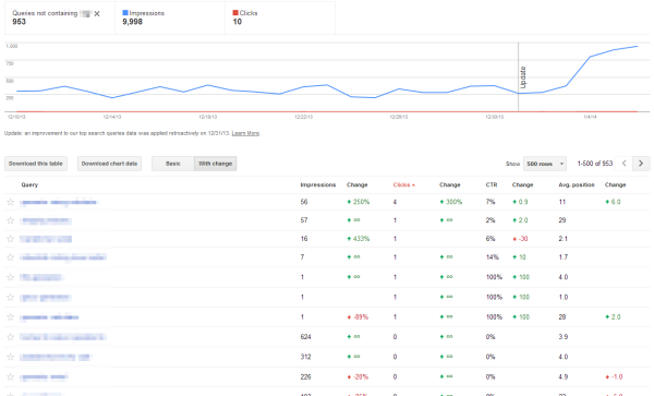
Set your report to 500 rows, apply desired filters (for example, remove brand terms, select US only, etc.), and then “Download Chart Data” in CSV.

Filter your data to exclude brand or target a specific location for more actionable insights.
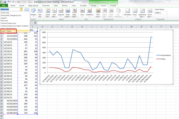
At this stage, we can quickly graph out our data to better see any top-level trend by throwing clicks onto a secondary axis.
Open the CSV file in Excel and create a 2-D line chart with the data. In Excel’s ribbon bar, select “Layout” from “Chart Tools.” (In 2013, it will be “Format” rather than “Layout.”) In the drop down on the far left, select Series “Clicks” and then click the Format Selection button underneath. For your series options, select “Plot Series” on “Secondary Axis.”

Charting Impressions Vs. Clicks in Excel
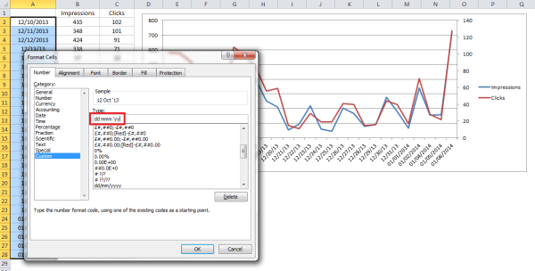
You may also wish to apply formatting to the date range information to make it more easily understandable for you and your team. Below, I’ve used some custom formatting to show dates in UK format with my preferred layout. (BTW, you’ll also need to cope with the export data using US date layouts if you’re changing them to UK. I’ve set up some data resorting to solve that on import.)

Formatting Date Ranges for Clarity
We’re then left with some clear trend data like the below, which allows me to see easily that between the 14th and the 20th of December, our SERP CTR was much greater than normal.

Clearly Visualised Impression Vs. Click Data
Digging into the individual term data will show me which terms overperformed for that period. I can also easily see that there was better performance at the start of the data in this snapshot, so re-snapshotting the data for an earlier date range to compare against this trend is another quick outcome. Using Google’s WMT interface, I can filter by date and sort by CTR to find the key contributors to this performance.
Incidentally, I also add axis titles and a concise, clear title at this stage to ensure the data is clear and stands alone in the chart.
My outcomes: by knowing the terms contributing to increased SERP CTR, I can identify the organic snippet shown and pull out whatever call to action was used and was successful during that period. This can be used to improve the SERP CTR of my other listings for similar pages.
Bingo: I can now freshen up underperforming snippets with a proven conversion CTA for my business.
Micro Reports For Key Performers
Since we now have more accurate data from Google, we can also dig into the other data export available from Webmaster Tools and set up a few “Canary” micro reports to quickly spot SERP risers and fallers with good precision and high actionability.
To pull the data, set your rows to 500 again, apply filtering as before, then click “Download This Table” in CSV. To import the UTF-8 characters Google regularly encodes in this data to Excel, you will likely need to import as text, setting the encoding to UTF-8 and identifying the commas as data delimiters.
From there, you can apply a pivot table to the data, which will allow you to dynamically play with your charting data to either further segment the data by applying text filters, or simply to adjust pull-though term data for associated visualisations. Create your pivot table in a new tab, and for future reports you can simply replace the ‘Data’ tab and all your pivot segmentation will be applied with a quick refresh. (Hit CTRL + Alt + F5 to refresh all pivots in an Excel workbook.)
One of the most useful pivot architectures here is setting Avg. position as a report filter — then using the Query as a label, and then impressions and clicks as values. (usually I grab the “Average” value here, but Max or Min may also be appropriate, depending on the final report you’re building.) Then we can segment our report into top three ranking, top 10, or whatever ranking blend we choose.
This is particularly useful to find weaknesses within high value top ranking terms.
I like to also break out report sets where there has been at least one click for reports focused on already performing rankings. For example, here’s a segment incorporating: location, non-brand, within a defined date range, minimum of 100 impressions, for all ranking positions, sorted by average impression change MoM.

Canary Report
Though small, this range shows me terms that should be driving visits, but aren’t — which are improving and which are failing. Pulling out the worst performers will give me content refresh options that will improve my ranking position and deliver a better SERP CTR to boot.
As you can see, there’s a world of useful reports waiting at the touch of a button to speed your content strategy onto SEO success in 2014: get your copies of Excel at the ready and get mining.
Contributing authors are invited to create content for Search Engine Land and are chosen for their expertise and contribution to the search community. Our contributors work under the oversight of the editorial staff and contributions are checked for quality and relevance to our readers. The opinions they express are their own.
Related stories
New on Search Engine Land