Google Begins Multi-Month User Experience Update
Today, Google has launched the first of many design changes that will impact all of their products, including search. Their blog post says the updates will roll over over the next few months, but that they have a philosophy of “constant revision and improvement”, and notes three primary principles driving the change: Focus They say they’re […]
Today, Google has launched the first of many design changes that will impact all of their products, including search. Their blog post says the updates will roll over over the next few months, but that they have a philosophy of “constant revision and improvement”, and notes three primary principles driving the change:
Focus
They say they’re “bringing forward the stuff that matters to you and getting all the other clutter out of your way”, which in part means “hiding navigation buttons until they’re actually needed”. I get what they are saying, but this type of user interface behavior tends to drive me crazy as I hunt for things that used to be there and that I can’t find anymore. We’ve seen this type of behavior with the Google search UI since the last update that introduced the sidebar navigation. The links for the types of results and search tools change based on the search. I’m forever clicking “More” and “More search tools”, but I imagine most people think that whatever links are listed there are the only options available.
See below where a search for [google plus] doesn’t show the option to see only blogs and a search for [seattle thai restaurants] shows no search tools at all.
Elasticity
Google says the “new design will soon allow you to seamlessly transition from one device to another and have a consistent visual experience” to better take into account cell phones, tablets, and TVs (all of which Google now partially power in some way).
Effortlessness
Google says the plan is to “combine power with simplicity” to “make sure you have all the power of the web behind you. They say they’ll use the latest technologies (like HTML5) and the “latest, fastest browsers.” Does this mean they’ll continue to drop support for older browsers?
What’s Changed So Far
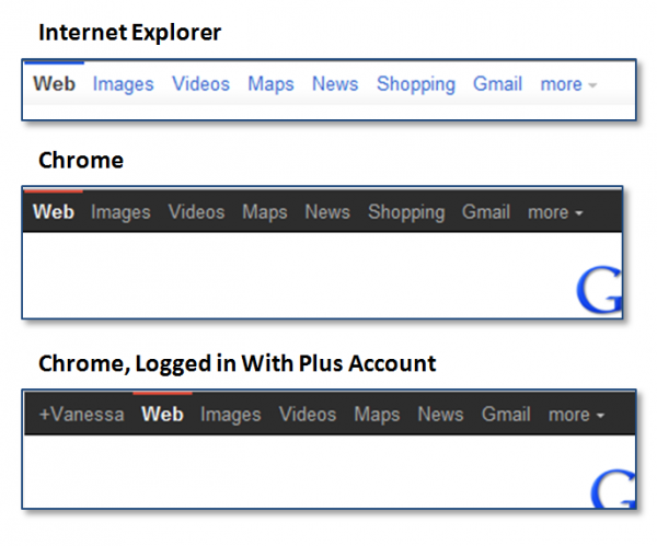
The post mentions their constant rollouts and indeed that’s the case even today as not everyone is seeing exactly the same thing. I’m seeing a new black bar in Chrome and Firefox (which we reported just yesterday), but not in Internet Explorer, as you can see below:
In all browsers and variations of being logged in or out, I still see the colorful sidebar, but some are seeing a muted gray and red sidebar (which we reported last week, although in this case, the “I’m feeling lucky” button remains, but the buttons are muted), as you can see below.
Despite Google’s post that they make changes all of the time, the search UI in particular has been fairly consistent other than major redesigns. Are the “constant” changes in part a result of new leadership over the search look and feel now that VP Marissa Mayer no longer manages that aspect of Google?
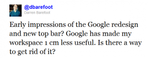
So what do people think so far? Not everyone loves it.
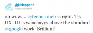
But some people do!
And apparently there’s lots more with this came from don’t get too used to this version.
Contributing authors are invited to create content for Search Engine Land and are chosen for their expertise and contribution to the search community. Our contributors work under the oversight of the editorial staff and contributions are checked for quality and relevance to our readers. Search Engine Land is owned by Semrush. Contributor was not asked to make any direct or indirect mentions of Semrush. The opinions they express are their own.


