Mobile-first indexing: Everything you need to know
Stay ahead with insights to enhance mobile performance, achieve content parity, and create a seamless user experience.
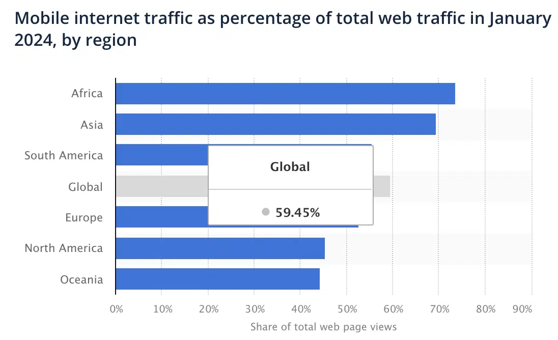
Up to 59.45% of all web traffic globally comes from mobile devices, per Statista. This makes mobile-first indexing more crucial than ever for search visibility.

Evolving user behavior has changed how Google evaluates and ranks websites.
For website owners and SEO professionals, this isn’t just another technical requirement.
If your site isn’t optimized for mobile devices, you risk losing visibility in search results, as Google prioritizes mobile-friendly sites for indexing and ranking.
What is mobile-first indexing?
Mobile-first indexing means Google uses the mobile version of your website as the primary basis for indexing and ranking rather than the desktop version.
The evolution of mobile-first indexing tells an interesting story about the changing landscape of internet usage.
When Google first noticed the mobile surge in 2015, they launched the “Mobilegeddon” update, marking mobile-friendliness as a ranking factor.
By 2016, they began testing mobile-first indexing on select sites, leading to a gradual rollout in 2018.
The transition to mobile-first indexing has not been without its challenges.
Initially slated for completion by September 2020, the deadline was delayed due to the disruptions caused by the pandemic.
After several adjustments, the initiative was successfully finalized in October 2023. (Or, technically, maybe last June?)
Fast-forward to 2025, and we’re at a crucial junction: sites without mobile accessibility face the risk of becoming non-indexable.
Best practices for mobile-first success
If your site still isn’t optimized for mobile devices, you’re likely experiencing significant drops in search visibility – or worse, complete removal from search results.
The good news?
It’s not too late to implement these mobile-first best practices and recover your search presence.
1. Prioritize mobile performance
Your mobile site’s performance directly impacts your search rankings. Here’s what you need to focus on:
- Optimizing Core Web Vitals: Focus on Largest Contentful Paint (LCP), Interaction to Next Paint (INP), and Cumulative Layout Shift (CLS).
- Reducing load times to under 2.5 seconds: Use tools like Google’s PageSpeed Insights to identify bottlenecks. Compress images, leverage browser caching, and minimize server response time to achieve this benchmark.
- Minimizing JavaScript execution: Defer non-critical JavaScript and remove unused code.
- Implementing efficient image loading strategies: Use next-gen formats like WebP, implement lazy loading, and serve appropriately sized images for mobile devices.
2. Content parity is critical
Ensure your mobile site maintains content quality while adapting to smaller screens:
- Keep all important content from your desktop version: Don’t hide crucial information on mobile. All content that provides value should be accessible on mobile devices, per Google’s Mobile-First Indexing Guide.
- Maintain equivalent headings and structured data: Your mobile site should contain the same structured data markup as your desktop version. This helps search engines understand your content consistently across devices.
- Preserve internal linking architecture: Maintain your site’s link equity by ensuring all important internal links are present on mobile. This includes navigation links, related content links, and footer links.
- Keep metadata consistent across versions: Title tags, meta descriptions, and header tags should be equivalent on both mobile and desktop versions to maintain ranking signals.
3. Technical optimization
Several technical SEO elements require attention:
- Configure proper viewport settings: Set your viewport meta tag correctly with width=device-width, initial-scale=1.0. This ensures proper rendering across different screen sizes.
- Ensure crawlability of resources: Check that your robots.txt isn’t blocking any critical resources needed for mobile rendering. Use Google Search Console’s URL Inspection tool to verify crawlability.
- Implement responsive design practices: Use fluid grids, flexible images, and media queries.
- Verify proper canonical tag implementation: Ensure your canonical tags correctly point to the appropriate versions of your pages to avoid duplicate content issues.
4. User experience considerations
Mobile users have unique needs that must be addressed:
- Create thumb-friendly navigation: Design tap targets at least 48 pixels wide/tall with adequate spacing between them. This reduces user frustration and improves engagement, according to Google’s Material Design guidelines.
- Use readable font sizes: Implement a minimum font size of 16px for body text. Follow the golden ratio for user-interface design.
- Implement adequate spacing between clickable elements: Maintain at least 8px of space between tap targets to prevent accidental clicks and improve user experience.
- Avoid intrusive interstitials: Follow Google’s guidelines on pop-ups and interstitials to avoid penalties while still maintaining effective calls to action.
5. Testing and monitoring
Regular maintenance is essential for mobile success:
- Use Google’s Mobile-Friendly Test tool: Regular testing helps identify potential issues before they impact your rankings.
- Monitor mobile performance in Google Search Console: Track mobile usability issues, Core Web Vitals, and mobile-specific crawl errors through Search Console’s dedicated mobile reports.
- Conduct regular mobile usability audits: Implement a quarterly audit schedule to catch and fix mobile-specific issues proactively.
- Track mobile vs. desktop rankings separately: Use tools like Semrush or Ahrefs to monitor your site’s performance across different devices and adjust your strategy accordingly.
The path forward
Mobile-first indexing isn’t just another algorithm update. It’s a reflection of how people access information today.
Success requires a holistic approach that balances technical optimization with user experience.
By implementing these practices, you’re not just preparing for mobile-first indexing. You’re building a foundation for long-term search visibility.
Contributing authors are invited to create content for Search Engine Land and are chosen for their expertise and contribution to the search community. Our contributors work under the oversight of the editorial staff and contributions are checked for quality and relevance to our readers. Search Engine Land is owned by Semrush. Contributor was not asked to make any direct or indirect mentions of Semrush. The opinions they express are their own.


