SMX Advanced session recap: Mobile-first and AMP
Contributor Patrick Stox recaps an advanced SEO session where speakers shared how to perform audits in a mobile-first world and tactics to maximize the effectiveness of your AMP content.
 I covered the Mobile-First & AMP For The Advanced SEO session from SMX Advanced. The session included the always impressive Alexis Sanders, Technical SEO Account Manager at Merkle, as well as new-to-me Kevin Malarick, SEO manager, product at Edmunds Inc.
Alexis Sanders, Merkle
Alexis was up first as she blazed through a ton of information on mobile and accelerated mobile pages (AMP). She started her presentation by asking, “Why mobile?”
More people are accessing the internet via mobile both domestically and globally, and Google is adapting.

The issue is that mobile is not the same as desktop. Mobile has its own challenges, including:
- Smaller screen sizes.
- Fat-finger issues.
- Forms.
- Mobile devices are slower, and mobile networks are slower.
- Data consumption is growing.
- Traffic is split between browsers and apps.
- We get stressed out by mobile delays. Our stress levels when a mobile page loads slowly are higher than when watching a horror movie (and slightly less than when doing a math problem).
- Behavior.
- 81 percent of people still convert on a desktop.
- CTR on devices is different; desktops outperformed mobile.
Mobile-first indexing
What is mobile-first indexing? According to Google, “Mobile first indexing means Google will predominantly use the mobile version of the content for indexing and ranking.”
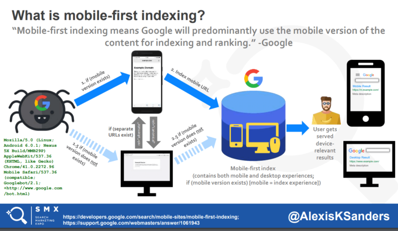
Alexis shared that Google will prioritize the mobile-first index and that it is not a separate index/database. She recommends having a responsive or mobile-friendly site going forward, and if you have a separate site like an m-dot, dynamic or adaptive, you have some things to do:
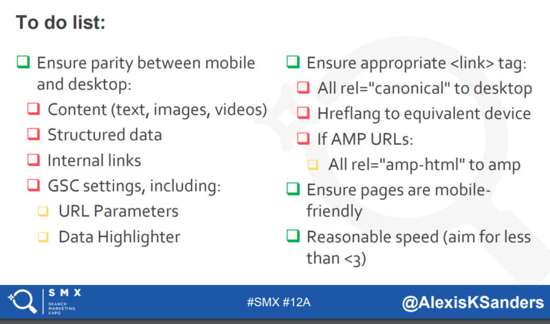
Alexis suggested you don’t have to worry about changing your backlinks; Google will consolidate the signals to URLs in the canonical cluster. This point was confirmed by Google webmaster trends analyst John Mueller in a tweet.
Another interesting tidbit is that mobile URLs do not need to be in the XML sitemap.
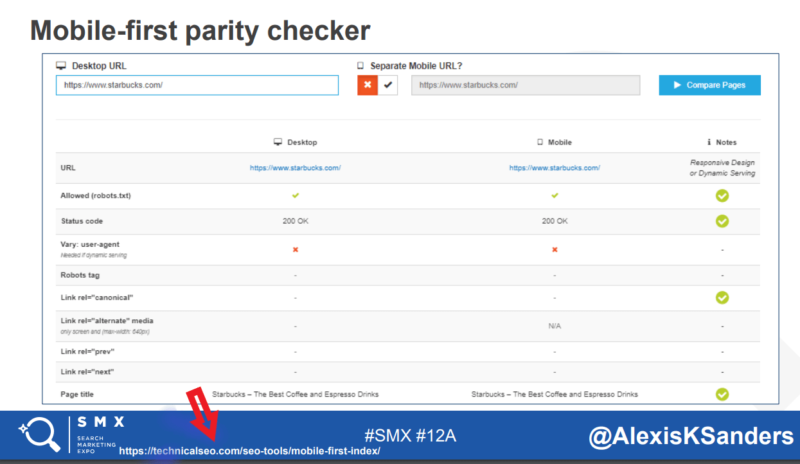
Alexis recommends Max Prin’s mobile-first parity checker to look for differences between your mobile and desktop website.
AMP
What is AMP? According to the AMP Project:
The AMP Project is an open-source initiative aiming to make the web better for all. The project enables the creation of websites and ads that are consistently fast, beautiful and high-performing across devices and distribution platforms.
Over 25 million domains and 100+ top tech providers and platforms support AMP. Alexis says It’s not about AMP; it’s about speed.
She collected a bunch of websites using AMP and found mostly publishers and some e-commerce. Two companies, BMW and TASTY, are the only two websites she found using AMP for their primary experience.
Alexis ran a test and found that the AMP cache allowed Pinterest to be 43 percent faster. Some of the things that made AMP faster:
- The critical rendering path flows better.
- AMP experiences had fewer requests, especially images.
- AMP is designed to gracefully deal with JavaScript failing.
- AMP prevents render-blocking JavaScript by making it asynchronous.
- Extensions and embeds don’t block rendering page layout.
- Third-party JS not allowed yet.
- All CSS is inline within the HTML document; there are no additional requests to get .css files, no extra round-trip time.
- CSS is limited to 50 kilobytes, AMP allows 50,000 characters of inline CSS.
- Lazy loading and prefetches lazy loaded resources.
- Only run GPU-accelerated CSS animations.
- Fonts require zero HTTP requests.
- AMP pre-positions resources based on preset sizes to page layouts.
- Intelligent resource prioritization, optimizes downloads so important resources download first.
- AMP uses extensive resource hinting; it doesn’t prerender expensive things in terms of CPU like third-party iFrames.
- Google AMP cache, a proxy-based CDN that validates AMP documents, caches resources and rewrites URLs to normalize parsing.
Alexis had several reasons why people are hesitant about AMP, including hosting on Google cached URLs, maintaining two website experiences, cost factors and the fact that you could focus efforts on optimizing your main site’s speed. She noted that Google has said they are not collecting any data from AMP pages.
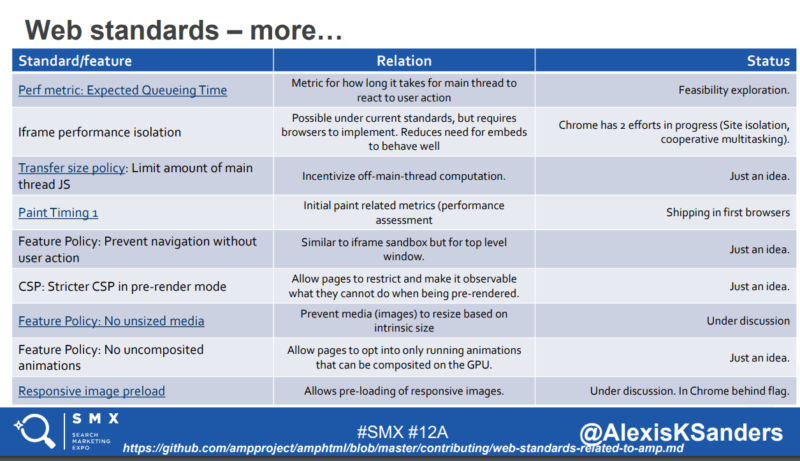
The AMP team is looking at taking their wins and insights and making them mainstream. Web packaging, iframe promotion, performance timeline, feature policy and more.
Finally, Alexis talked about user experience on mobile and had a pyramid of goals to show what makes for a good user experience on mobile.
Kevin Malarick, Edmunds Inc.
Next up was Kevin, who spoke about content, natural language processing, and JavaScript rendering.
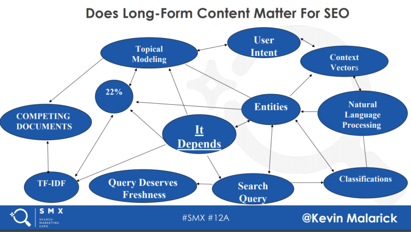
Mobile-first indexing is here. Check your log files or look for a notice in Google Search Console. He spoke for a while on how to write content that included entities, elements found on the competition’s pages, topical relevance, matching user intent, what people are searching for and some things around natural language processing.
Kevin recommended a list of tools to use and draw from so users and the search engines better understand your content, such as:
- Schema.org.
- Wikidata/Wikipedia.
- Google Cloud Natural Language Processing API.
- DBpedia.
- Google search operators.
People scroll now more than in the past: In 2010, 80 percent of viewing time was above-the-fold, and in 2018, 81 percent of viewing time occurs within the first three full screens. Scrolling has definitely increased.
Kevin talked about the CSS object model (CSSOM) and document object model (DOM) trees, which combine into the render tree. This determines the layout of each element and the paint process that renders pixels to the screen.
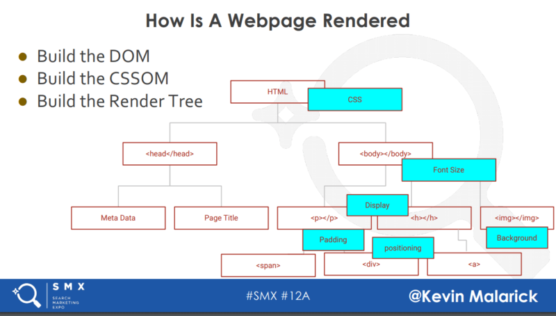
How Googlebot is rendering a web page:
- Headless Chrome.
- Chrome 41.
- Server-side content.
- JS is executable, but DOM rules all.
Kevin then moved into talking about what options webmasters have for long-form content. He outlined the four types:
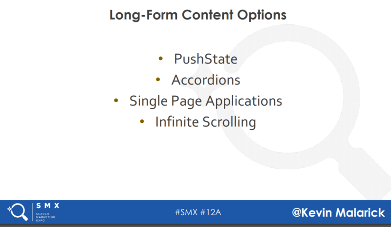
In talking about single page applications (SPAs), Kevin said the benefits of using SPAs were link equity consolidation, crawl budget efficiency and topical modeling. He said to watch out for user accessibility and web routing.

He ended with his summary of recommendations for mobile-first long-form content:
- Research the query.
- Formulate topical coverage.
- Review your logs and traffic.
- Audit the pre-rendered and post-rendered page view.
- Display accordion content.
- Use 1:1 content to URL for PushState.
- Publish single-page apps for advanced experiences.
- Use server-side content for search.
Want to learn more? Join us in October our SMX East “Obsessed With SEO & SEM” conference in New York City, where top industry experts will share their tips, tactics and strategies around SEO and SEM topics.
Contributing authors are invited to create content for Search Engine Land and are chosen for their expertise and contribution to the search community. Our contributors work under the oversight of the editorial staff and contributions are checked for quality and relevance to our readers. The opinions they express are their own.
Related stories
New on Search Engine Land
About the author