3 Common Landing Page Flops To Avoid
In a previous article, I covered 3 Common PPC Ad Copy Flops. In this article, I’ll cover common landing page flops and discuss ways in which pages can be tweaked to improve conversions, overall marketing messages and various other factors. Some of my examples relate to common webpages but logic can obviously be applied to […]
In a previous article, I covered 3 Common PPC Ad Copy Flops. In this article, I’ll cover common landing page flops and discuss ways in which pages can be tweaked to improve conversions, overall marketing messages and various other factors. Some of my examples relate to common webpages but logic can obviously be applied to PPC landing pages.
Landing Page Example #1 – Unclear Call To Action
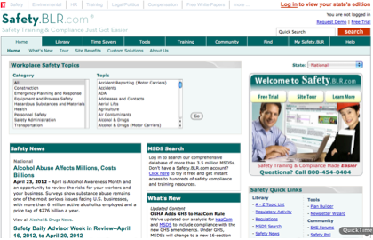
This is a very good example of a page with no clear focus. Because there are too many words on this page, it does not have a main focal point or direct you to take a particular action. Left to guess, you’d probably select a category and topic at the top of the page, press go and see what information it brought back.
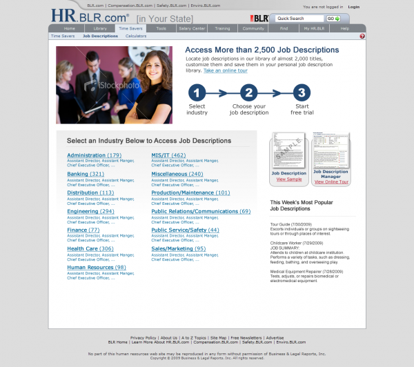
Customer actions should not be left to chance and pages should be designed with specific objectives in mind. Here’s a better page:
The above page is clear and specifically tells users what they need to do and how many steps it will take for them to get the information they seek.
One of my most favorite tests is not to add new elements to pages but to remove elements. If there’s no difference in overall conversion rate, the information has no business at all being on the page. You’ll notice the latter page is much less cluttered than the former one.
Landing Page Example #2 – Too Many Form Fields
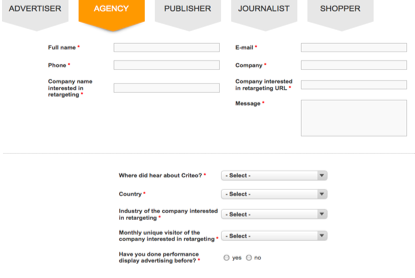
This is an issue many companies suffer from. In the form below, Criteo has 12 required elements including phone no, email and requires the prospect to answer very personal questions.
Additionally, this is one of many lead forms the company has (they have others for advertisers, publishers, journalists, shoppers, etc.). It makes the company look like a machine, seem impersonal and like they want to close a sale fast.
A better way is to think in phases, starting with getting basic contact info, then askis for additional information by follow up email or via a direct phone call to the prospect.
Take a look at the Cityproof example below:
For more information on form optimization, check out my article called 10 Form Optimization Tips for Landing Pages.
Landing Page Example #3 – Images On Page
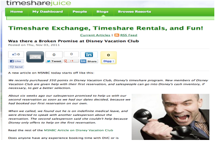
The best images are images of your actual products or services. In the example below, the image of a man losing his temper over a timeshare purchase or share issue will not convert as well as images of products or services themselves.
In this case, compelling images of the timeshare would have been a better image option.
Contributing authors are invited to create content for Search Engine Land and are chosen for their expertise and contribution to the search community. Our contributors work under the oversight of the editorial staff and contributions are checked for quality and relevance to our readers. The opinions they express are their own.
Related stories
New on Search Engine Land


