Search Marketers: The Time To Focus On Mobile User Experience Is Now
Ignore smartphone and tablet users at your own peril. Columnist Susan Waldes shares the good, the bad, and the ugly of user experience with mobile search ads.

The mobile web of today reminds me of the regular web in 1999. There are huge brands with little to no presence, poorly executed redirects, outdated copyrights, dangling snippets of code, completely broken page layouts, overzealous “features” that crash the session, lack of adherence to UX conventions, and absurd page load times.
While many companies have invested in complex development environments, intense QA processes, and tightly controlled release schedules for their desktop sites, the mobile versions often beg the question, “Does anybody at the company ever LOOK at this, with their eyeballs, on a mobile device?”
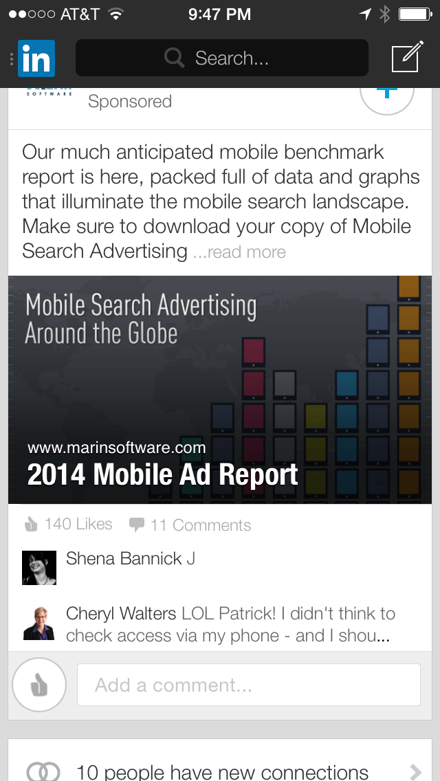
One evening about a month ago, I was perusing LinkedIn to catch up on some industry articles. While doing so, I came across this in my stream:
A mobile benchmark report from Marin! Interested, I clicked the link and was directed here — to a non-mobile-responsive page:

Not mobile responsive
Ironic, right? A highly funded public company in the digital advertising world, promoting their mobile benchmarking data, within a mobile app, and they didn’t use a mobile responsive landing page.
I don’t mean to beat up on Marin, though — they are by no means an outlier on these kinds of “oopsies.” I see large brands with all kinds of big mobile fails all the time. (Also, to Marin’s credit, they quickly responded to some user feedback and fixed the page.)
This one was certainly good for a chuckle, but the business impact is basically nil — one poorly formatted social share. However, there are dizzying missed revenue and acquisitions opportunities on today’s mobile web. Apologies, but I need to quote this statistic again: 50% of paid search clicks on Google will be mobile by the end of next year!
To go back to my 1999 comparison, unlike the non-mobile web, all those embarrassing sites from the late 90’s and early 00’s were actually okay. Why? Because the whole system evolved together. Bandwidth and user expectations were evolving at the same rate the user experience was.
In 1999, I remember clicking on a thumbnail to see a bigger picture of something and happily waiting a minute or more as pixel after pixel loaded. Wow! I didn’t have to drive to the library, pore through complex catalogs and load up some microfiche to see this photo (if you don’t know what microfiche is, rejoice, but don’t tell me about it because you’ll make me feel old).
But user expectations have changed since then; we expect fast, we expect easy, we expect intuitive. When these expectations aren’t met, we not only “back out” (speaking of bad mobile UX, sometimes you can’t even back out) and go elsewhere, we also often get a bad taste in our mouth for a brand.
The SEM Outlook
Now, let me focus specifically on mobile SEM. While the AdWords creative format limits totally erroneous execution, the missed opportunities abound. I set out to find just one brand rocking a mobile PPC strategy from ad text through thank you page that I could use as an example to steer clients in the right direction.
I started with highly competitive keywords. I figured that, in industries where a click can easily reach $50, there is a large financial incentive to invest in making mobile work — not to mention that businesses can benefit from those (still, at the moment) less expensive, less competitive searches.
So, I pulled out my mobile phone and searched for every highly competitive keyword I could think of, recording the good, the bad and the ugly. To my surprise, the “good” was often pretty “ugly.” You’ll see what I mean shortly.
When I didn’t find a single “perfect” example, I reached out the #PPC twittersphere for ideas on additional competitive keywords and searched those. I started searching some random things that came to mind.
Still, I haven’t found my “perfect” needle in the haystack. I’ve narrowed the hundreds of examples that I’ve captured to just a few that exemplify the positive and negative trends I’m seeing.
This search for [plumber] directs me to an ARS/Roto-Rooter franchise. It isn’t beautiful, but it is effective.
Some notable wins:
- An offer is used in the ad text — a best practice, when possible, that addresses the higher immediacy of a mobile search. Even better, the same offer is echoed on the landing page!
- Whether by design or happenstance, the ad seems designed for a mobile device, with no truncation in the description line 2 or the sitelinks.
- The city name is used in the display URL and on the landing page, indicating that I’m in the right place – important on local services.
- The landing page has 2 mobile-friendly conversion options, a call or a schedule appointment option. All info and conversion opportunities are front and center, above the fold.
- The main criticism here would be that more extensions would be nice for additional information and to give the ad a larger portion of real estate. In particular, this advertiser should consider using a call extension so users could skip the need to visit this page at all, since a call is clearly a conversion action for them.
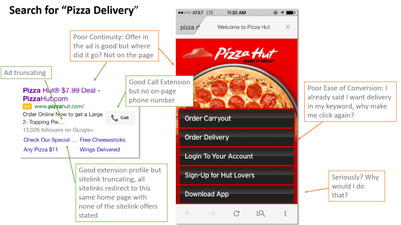
Another local search for [pizza delivery] offers a Pizza Hut ad that certainly piles on the sitelinks and has a large ad footprint.
That said, most other factors in this Pizza Hut landing page are less effective than the plumber landing page:
- With truncation in the ad text and one of the sitelinks, it doesn’t appear that mobile-preferred ads or sitelinks are being used.
- Though the image doesn’t illustrate it, clicking on any of the sitelinks redirects to the same mobile page that clicking on the headline does. Another indicator that mobile-preferred sitelinks are not being used here.
- Though offers are heavily highlighted in the ad, the landing page has no information about these offers, giving a poor sense of continuity.
- Since my keyword contains “delivery,” Pizza Hut could have saved me the extra step of again indicating that I wanted delivery by dropping me right on the delivery page — every click counts extra on mobile.
- I especially wouldn’t want to download their app when searching for a pizza delivery. Additionally, why would anyone want to “Download App” when there is no information on what it does or where the value would be for me?
- Though Pizza Hut uses a call extension, a smart addition, they do not use an on-page phone number or call button. This is missed opportunity, as calling is typically a much quicker and easier way to order a pizza then trying to do so online via a small screen. Those on-page calls can be set up as conversions and tracked to spend within your AdWords account.
Getting away from the local verticals, I performed a search for the ultra competitive “auto insurance.” In position, 1 we see State Farm with a “call only” ad.
This is a savvy choice that quickly erases the whole issue of even having a mobile landing page. That said, execution here could have been better.
- Description line 2 is truncating, indicating they haven’t used shorter mobile-preferred ads.
- There is also a missed opportunity to reiterate a call-based call-to-action in the ad text. Instead of the generic “Quote Now,” how about “Call Now”?
- With more and more people “cross screening,” State Farm should make sure that the display URL they show actually directs (or redirects) to live auto insurance content for cross-screen searchers that may not feel like calling. Not only is this simple, but any conversions gathered this way would be free.
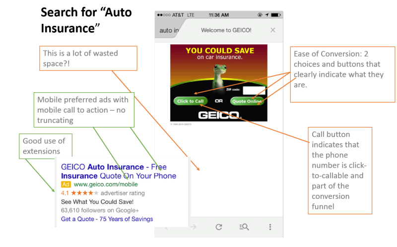
In position 2 for my auto insurance search is GEICO with an extension-packed ad.
The wasted space on the landing page hurts! That said, they are doing a lot of things right.
- GEICO is one of the only advertisers that I found using mobile-preferred ads not only to ensure no truncation via mobile character counts, but also utilizing the format for a mobile-specific messaging.
- I’m surprised to see they are not using a call extension though perhaps it’s there but just didn’t show on my impression.
The landing page is not pretty. In fact, it is essentially, if not literally, a 300×250 banner. There is a huge amount of wasted space here, and I feel let down that a company that spends millions on TV advertising can’t invest in using the rest of those pixels.
- That said, it’s a pretty effective landing page offering 2 options to convert. As your only choices — and with only half the potential space used — both are certainly above the fold.
- Another well done aspect is using a “button” for the click-to-call option. Note that Google uses a “button,” too, for its call extension and has certainly invested quite heavily in that testing. The button clearly indicates that you can click to call and also carries a call-to-action vs. just displaying the number. That said, for a local advertiser, showing the number with the area code indicating the geography could work better. It’s something advertisers should test for themselves.
- Also savvy about GEICO is that if you search a brand term, you get a “call only” option. For those that are already sold on GEICO, they’ve skipped the landing page all together.
Without going into that level of depth, let’s look at a few more best and worst practices I discovered in my searches.
GOOD
- Updating your mobile Telephone Consumer Protection Act (TCPA) compliance to include permission to text your leads.
- Using visual indicators on multi-step forms
- Using short, easy forms in the mobile funnel
BAD
- Asking all users to fill in geo data that you could automatically detect via location sensing.
- If you have to tell somebody how it works, you are not sticking to UX conventions or making your design intuitive enough:
- Ad truncations that are not only wasted opportunities but poor reflections on the brand.
- Large brands sending paid traffic to non-mobile-responsive landing pages
- Ridiculous password security constraints
- Pop-ups that don’t work properly on mobile
- Ecommerce landing pages with no product above the fold
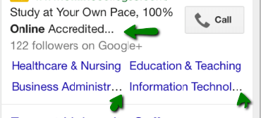
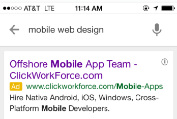
Since I started this post with an example that hopefully gave you a chuckle, I’ll end it with one also: a mobile search for [mobile web design].
The ad pictured above takes me to this landing page:
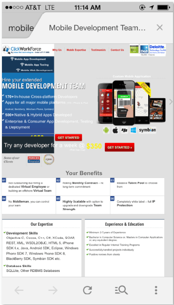
Probably not getting a lot of mobile web design jobs.
Hopefully, you’re doing a bit better than they are. If not, you should probably turn off your mobile paid traffic until you are.
If you are part of the way there, it’s time to focus more resources on elevating yourself out of the mobile web dark ages. From an SEM perspective, there is very little testing or optimization that you can execute that has as much potential reward as a focus on your mobile strategy does.
Simple changes can have huge results like doubling CTRs and conversion rates. For many small or medium size companies, this is a new opportunity to get ahead of the “big boys” in your industry and own top spots before the competition shows up in full force. The time is now!
Contributing authors are invited to create content for Search Engine Land and are chosen for their expertise and contribution to the search community. Our contributors work under the oversight of the editorial staff and contributions are checked for quality and relevance to our readers. The opinions they express are their own.
Related stories
New on Search Engine Land
