Excel pivot table best practices for search marketers
Learn how to use Excel pivot tables to QA bulk sheets, plus some tips and shortcuts to enhance your pivot table skills.
In 7 useful Excel formulas and functions for PPC, I shared tips to quickly identify high-impact PPC optimizations that will move the needle for your brand or client.
I am a firm believer in an analytical approach to search marketing. My “weapon of choice” for manipulating search data is Excel and one of my favorite features of the platform is pivot tables.
In this article, I’ll highlight a use case you might not be familiar with, along with some tips and shortcuts to enhance your pivot table skills.
Unique use case: Using pivot tables to QA bulk sheets
If you’ve come across pivot tables in your search marketing career, I’d expect it was likely in a performance report. However, they can be leveraged in creative, non-analytical ways.
One such approach I am a particularly big fan of is using pivot tables to QA bulk sheets.
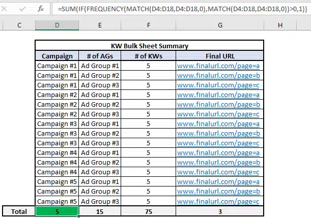
Might be a given, but you need to build your bulk sheet before you can use this technique. I won’t cover bulk sheet tips in this article (just one teaser: the concatenate function could come in handy), but one step I’ll recommend for your QA is to compile a summary of the elements you expect to be included in your bulk sheet.
I generally build a table in the first sheet of my workbook, such as the one that you see below. For the sake of this example, there are two things I want to highlight.
- First is that there will be exactly 5 keywords in each ad group.
- Secondly, Ad Group #1 across all campaigns drives to the final URL with Page=A, Ad Group #2 drives to page=B, and Ad Group #3 will click to page=C.
In the screenshot, you’ll notice I included the formula bar, which contains a formula for how to count distinct values in a data set.
Rather than discuss the nuts and bolts of how it works, just know that the referenced cells (D4:D18 in this example) need to be identical across the match functions and you should get the correct results.
Once you’ve built out your bulk sheet, it’s time to create the pivot table.
The key here is to make sure you are highlighting all rows/columns that comprise the bulk sheet before you create the pivot table.
Now that we have our pivot table created, we can use the count feature to ensure that the bulk sheet is accurately created.
When you drag non-numeric fields into the Values area, the output will automatically become a count, instead of a sum. It’s important to note that the pivot table will not reflect just the unique values.
This is illustrated in the example below, where you can see that the count of all campaign elements is 75, which reflects the total number of keywords we expect in the bulk sheet.
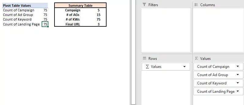
It’s important to recognize this, as it has an impact on how you should design your pivot table for accurate QA.
The best practice I recommend is to focus the count on the most granular element of the campaign. Move the campaigns and ad groups to the Rows area of the pivot table.
One final transformation to make, which is more stylistic than anything. If you right-click on the Campaigns field and navigate to field settings, you can adjust the view of your pivot table.
By making the selections highlighted in the view below, you can make the pivot table less vertical.
The screenshot below shows the differences in pivot table formats, with the corresponding field settings underneath.
Again, more of a stylistic tip than anything; however, this will format the pivot table in a way that is more friendly for copy/pasting into the Editor.
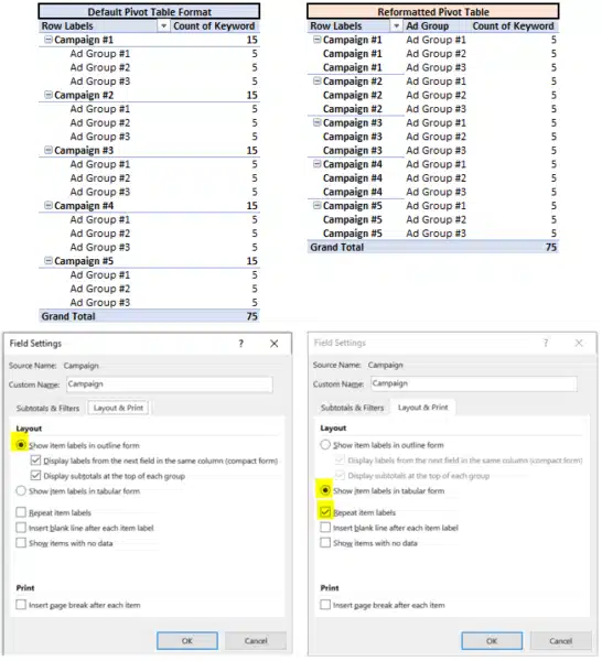
With these pivot table views, we’ve completed the first part of our QA. We’ve also confirmed that we have 5 keywords in each of the 15 ad groups.
If you wanted to audit the keyword text for accuracy, you would just move Keywords into the rows column below Campaign and Ad Group.
In the second part of our QA, we want to make sure that the ad groups in each campaign are driving to the correct landing page.
One of the beautiful things about pivot tables is that there are multiple ways to get to the same conclusion.
Below I’ve highlighted two ways you can use pivot tables to confirm we’ve trafficked the bulk sheet correctly.
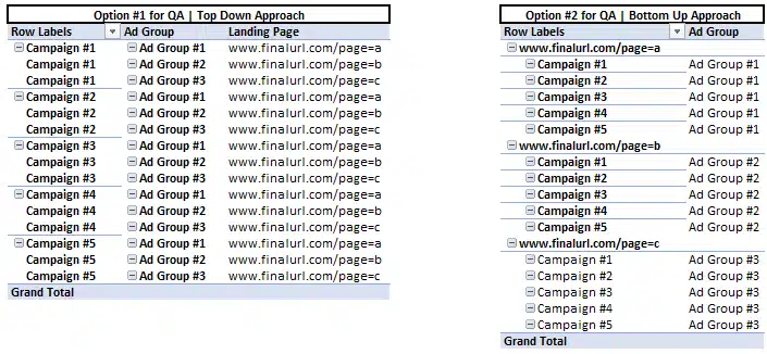
The first option is similar to how we QA’d the count of keywords in each ad group. All I did was remove Keywords from the pivot table and added Landing Page underneath Ad Groups in the row. This will create a view that’s very easy to compare to our summary table.
The second option flips things on its head a bit. Since we know that all Ad Group #1s should drive to page=a, we can put Landing Page at the top rows area in our pivot table. By doing this, we will see all the Ad Groups within the bulk sheet that are driving to Page=A. A different view, yet one I would argue is more effective for QA’ing.
I’m only highlighting a few different views that I like. I challenge you to attempt leveraging a pivot table in your next bulk sheet QA and don’t be confined to the examples I’ve included here.
One of the greatest advantages of pivot tables is their flexibility. Play around and figure out what methods/approaches make the most sense for you.
4 tips and tricks for pivot table analysis
To reiterate, the most common way that pivot tables are used in search marketing is for performance-based reporting.
In order to optimize the quality of your analysis, I want to highlight a few key tips.
1. Use custom calculations for maximum accuracy
I can’t stress this one enough. Accuracy is crucial for any analysis you are conducting.
To be honest, I don’t even export data sets with metrics such as CTR, CPC, or CVR, as I am a proponent of creating these as custom fields in the pivot table to ensure these metrics are accurately reflected.
It is surprisingly easy to create these metrics in a pivot table.
Once you’ve created your pivot table, navigate to the pivot table Analyze menu, go to Fields, Items, & Sets, and finally Calculated Field.
Here, you can name and create custom fields that will automatically update with any changes you make to the filters/contents of the pivot table.
Although it defaults to a “Sum of” label, you can see in the screenshot it is not a Sum. I typically just find and replace “Sum of” once I’ve finished creating my calculated fields to avoid any confusion.
To illustrate the difference, I’ve included the average platform CTRs in my dataset in the screenshot below. You can then see how I get to the calculated fields menu and how I create the calculated field.
Notice how the average of CTRs does not accurately represent the true CTR for this data set. However, our Custom CTR is spot on. (Feel free to check the calculation yourself!)

2. Pull data at the most granular level
The beauty of Excel and pivot tables is that it is prepared to handle relatively large data sets (about 1M rows). Pull your data at a keyword or ad level, add segments (i.e., device) and always pull by day if looking at a time period.
In doing so, you will ensure that you can drill down to the main drivers of impact. Refer to my first Excel article for tips on adding additional filters, such as transforming dates to a weekly view or how VLOOKUP can help create filters.
3. Build reports for the long term
PivotTable data can be refreshed and updated easily using the refresh feature (see screenshot below). Think about how you can design your report for the long term so that all you need to do is update the back-end data to create an updated view of performance.
This means maximizing the use of formulas in data manipulation (such as adding filters) and designing the data source in a way that those formulas won’t break when you paste in the updated data.
While this may seem like a heavy lift upfront, your end goal is a simple button click to refresh your performance report. The squeeze is worth the juice, trust me!

A quick comment on the difference between Refreshing a pivot table and Changing the Data Source. If you click Refresh, it will update the data within the originally defined data source.
When you change the data source, you are redefining what rows/columns should be included in the pivot table data.
If you expect the number of rows in the data set to vary over time, I recommend becoming familiar with the Change Data Source option, as this will ensure you have always included all rows/columns in the report. It’s an extra step, but one that ensures your data set is comprehensive.
4. Use shortcuts for pivot tables (PC users)
Last but not least, sharing a handful of shortcuts that have improved my speed when manipulating pivot tables.
These are a bit more complex, but once you get the hang of it, you’ll be flying around your workbook! For those on a Mac, #1 I’m sorry you’re missing out on Excel for a PC, but #2 your shortcuts are different!
- Alt + N + V + T: This creates a pivot table
- Alt + J + T: This opens the pivot table Analyze menu, when your cursor is on a cell within the pivot table. Adding a few keystrokes to the end gets you to commonly used features/menus
- Alt + J + T + J + F: This opens the Calculated Fields menu
- Alt + J + T + F + R: This refreshes the pivot table
- Alt + J + T + I + D: This allows you to change the data source
- Alt + J + T + C: This opens up the chart creation menu for the contents of your pivot table
- Alt + J + T + E + C: This clears the contents of your pivot table
Improving your Excel skills takes practice
Similar to the functions I covered previously, it is going to take practice and time before you see the efficiency benefits that come with these techniques. However, put in the time now and I can assure you that you will see the payoff.
In addition, I encourage you to not limit yourselves to the applications of pivot tables covered here. As shown in the Bulk Sheet QA example, there are multiple ways to get to the same output.
PivotTables are incredibly powerful tools that you can use to ensure you have both the 30,000-foot view of performance, as well as the more granular shifts that show your mastery of the funnel.
Use the Calculated Fields to create metrics specific to your business and think about how the QA techniques can be applied to other parts of your role.
The applications of these techniques are far-reaching.
Want to learn more Excel tips and tricks from me? Sign up for SMX Next. Check out my session on how to level up your analytical skills with Excel, plus you’ll hear from plenty of other amazing speakers.
Contributing authors are invited to create content for Search Engine Land and are chosen for their expertise and contribution to the search community. Our contributors work under the oversight of the editorial staff and contributions are checked for quality and relevance to our readers. Search Engine Land is owned by Semrush. Contributor was not asked to make any direct or indirect mentions of Semrush. The opinions they express are their own.