Here’s how I used Python to build a regression model using an e-commerce dataset
If you want to advance your data science skill set, Python can be a valuable tool for SEOs to generate deep data insights to help your brand.
The programming language of Python is gaining popularity among SEOs for its ease of use to automate daily, routine tasks. It can save time and generate some fancy machine learning to solve more significant problems that can ultimately help your brand and your career. Apart from automations, this article will assist those who want to learn more about data science and how Python can help.
In the example below, I use an e-commerce data set to build a regression model. I also explain how to determine if the model reveals anything statistically significant, as well as how outliers may skew your results.
I use Python 3 and Jupyter Notebooks to generate plots and equations with linear regression on Kaggle data. I checked the correlations and built a basic machine learning model with this dataset. With this setup, I now have an equation to predict my target variable.
Before building my model, I want to step back to offer an easy-to-understand definition of linear regression and why it’s vital to analyzing data.
What is linear regression?
Linear regression is a basic machine learning algorithm that is used for predicting a variable based on its linear relationship between other independent variables. Let’s see a simple linear regression graph:
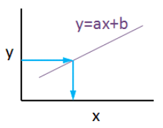
If you know the equation here, you can also know y values against x values. ‘’a’’ is coefficient of ‘’x’’ and also the slope of the line, ‘’b’’ is intercept which means when x = 0, b = y.
My e-commerce dataset
I used this dataset from Kaggle. It is not a very complicated or detailed one but enough to study linear regression concept.
If you are new and didn’t use Jupyter Notebook before, here is a quick tip for you:
- Launch the Terminal and write this command: jupyter notebook
Once entered, this command will automatically launch your default web browser with a new notebook. Click New and Python 3.
Now it is time to use some fancy Python codes.
- Importing libraries
import matplotlib.pyplot as plt
 import numpy as np
 import pandas as pd
 from sklearn.linear_model import LinearRegression
 from sklearn.model_selection import train_test_split
 from sklearn.metrics import mean_absolute_error
 import statsmodels.api as sm
 from statsmodels.tools.eval_measures import mse, rmse
 import seaborn as sns
 pd.options.display.float_format = '{:.5f}'.format
 import warnings
 import math
 import scipy.stats as stats
 import scipy
 from sklearn.preprocessing import scale
 warnings.filterwarnings('ignore')
- Reading data
df = pd.read_csv("Ecom_Customers.csv")
df.head()

My target variable will be Yearly Amount Spent and I’ll try to find its relation between other variables. It would be great if I could be able to say that users will spend this much for example, if Time on App is increased 1 minute more. This is the main purpose of the study.
- Exploratory data analysis
First let’s check the correlation heatmap:
df_kor = df.corr()
 plt.figure(figsize=(10,10))
sns.heatmap(df_kor, vmin=-1, vmax=1, cmap="viridis", annot=True, linewidth=0.1)
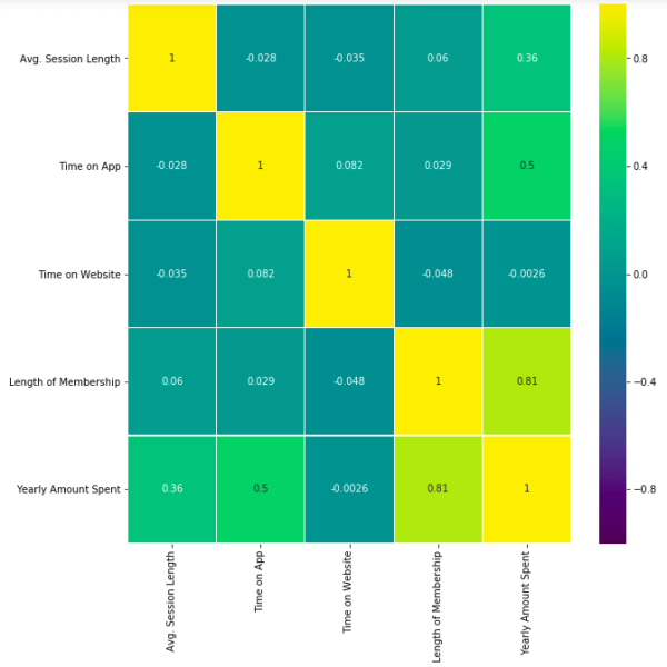
This heatmap shows correlations between each variable by giving them a weight from -1 to +1.
Purples mean negative correlation, yellows mean positive correlation and getting closer to 1 or -1 means you have something meaningful there, analyze it. For example:
- Length of Membership has positive and high correlation with Yearly Amount Spent. (81%)
- Time on App also has a correlation but not powerful like Length of Membership. (50%)
Let’s see these relations in detailed. My favorite plot is sns.pairplot. Only one line of code and you will see all distributions.
sns.pairplot(df)
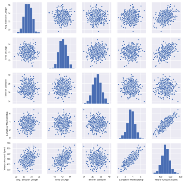
This chart shows all distributions between each variable, draws all graphs for you. In order to understand which data they include, check left and bottom axis names. (If they are the same, you will see a simple distribution bar chart.)
Look at the last line, Yearly Amount Spent (my target on the left axis) graphs against other variables.
Length of Membership has really perfect linearity, it is so obvious that if I can increase the customer loyalty, they will spend more! But how much? Is there any number or coefficient to specify it? Can we predict it? We will figure it out.
- Checking missing values
Before building any model, you should check if there are any empty cells in your dataset. It is not possible to keep on with those NaN values because many machine learning algorithms do not support data with them.
This is my code to see missing values:
df.isnull().sum()
isnull() detects NaN values and sum() counts them.
I have no NaN values which is good. If I had, I should have filled them or dropped them.
For example, to drop all NaN values use this:
df.dropna(inplace=True)
To fill, you can use fillna():
df["Time on App"].fillna(df["Time on App"].mean(), inplace=True)
My suggestion here is to read this great article on how to handle missing values in your dataset. That is another problem to solve and needs different approaches if you have them.
Building a linear regression model
So far, I have explored the dataset in detail and got familiar with it. Now it is time to create the model and see if I can predict Yearly Amount Spent.
Let’s define X and Y. First I will add all other variables to X and analyze the results later.
Y=df["Yearly Amount Spent"]

X=df[[ "Length of Membership", "Time on App", "Time on Website", 'Avg. Session Length']]
Then I will split my dataset into training and testing data which means I will select 20% of the data randomly and separate it from the training data. (test_size shows the percentage of the test data – 20%) (If you don’t specify the random_state in your code, then every time you run (execute) your code, a new random value is generated and training and test datasets would have different values each time.)
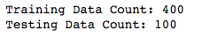
X_train, X_test, y_train, y_test = train_test_split(X, Y, test_size = 0.2, random_state = 465)

print('Training Data Count: {}'.format(X_train.shape[0]))
print('Testing Data Count: {}'.format(X_test.shape[0]))
Now, let’s build the model:
X_train = sm.add_constant(X_train)
results = sm.OLS(y_train, X_train).fit()
results.summary()
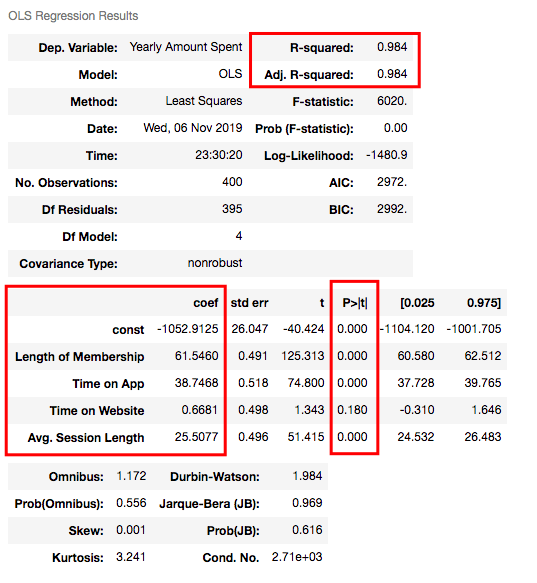
Understanding the outputs of the model: Is this statistically significant?
So what do all those numbers mean actually?
Before continuing, it will be better to explain these basic statistical terms here because I will decide if my model is sufficient or not by looking at those numbers.
- What is the p-value?
P-value or probability value shows statistical significance. Let’s say you have a hypothesis that the average CTR of your brand keywords is 70% or more and its p-value is 0.02. This means there is a 2% probability that you would see CTRs of your brand keywords below %70. Is it statistically significant? 0.05 is generally used for max limit (95% confidence level), so if you have p-value smaller than 0.05, yes! It is significant. The smaller the p-value is, the better your results!
Now let’s look at the summary table. My 4 variables have some p-values showing their relations whether significant or insignificant with Yearly Amount Spent. As you can see, Time on Website is statistically insignificant with it because its p-value is 0.180. So it will be better to drop it.
- What is R squared and Adjusted R squared?
R square is a simple but powerful metric that shows how much variance is explained by the model. It counts all variables you defined in X and gives a percentage of explanation. It is something like your model capabilities.
Adjusted R squared is also similar to R squared but it counts only statistically significant variables. That is why it is better to look at adjusted R squared all the time.
In my model, 98.4% of the variance can be explained, which is really high.
- What is Coef?
They are coefficients of the variables which give us the equation of the model.
So is it over? No! I have Time on Website variable in my model which is statistically insignificant.
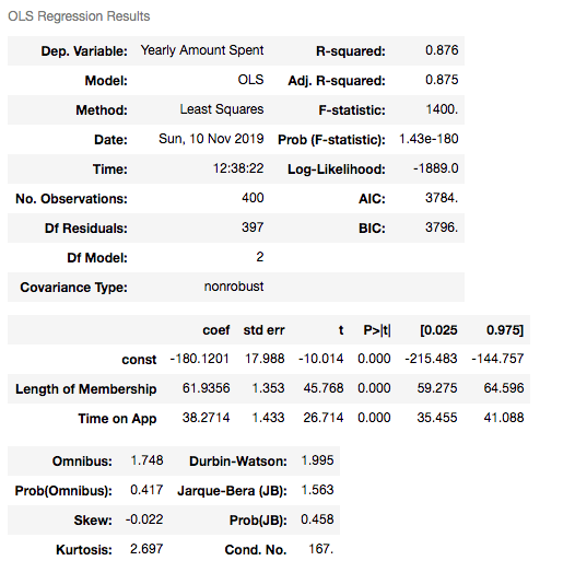
Now I will build another model and drop Time on Website variable:
X2=df[["Length of Membership", "Time on App", 'Avg. Session Length']]
X2_train, X2_test, y2_train, y2_test = train_test_split(X2, Y, test_size = 0.2, random_state = 465)

print('Training Data Count:', X2_train.shape[0])
print('Testing Data Count::', X2_test.shape[0])

X2_train = sm.add_constant(X2_train)

results2 = sm.OLS(y2_train, X2_train).fit()
results2.summary()

R squared is still good and I have no variable having p-value higher than 0.05.
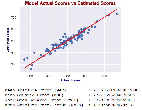
Let’s look at the model chart here:
X2_test = sm.add_constant(X2_test)

 y2_preds = results2.predict(X2_test)

 plt.figure(dpi = 75)
 plt.scatter(y2_test, y2_preds)
 plt.plot(y2_test, y2_test, color="red")
 plt.xlabel("Actual Scores", fontdict=ex_font)
 plt.ylabel("Estimated Scores", fontdict=ex_font)
 plt.title("Model: Actual vs Estimated Scores", fontdict=header_font)
 plt.show()
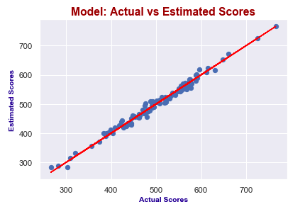
It seems like I predict values really good! Actual scores and predicted scores have almost perfect linearity.
Finally, I will check the errors.
- Errors
When building models, comparing them and deciding which one is better is a crucial step. You should test lots of things and then analyze summaries. Drop some variables, sum or multiply them and again test. After completing the series of analysis, you will check p-values, errors and R squared. The best model will have:
- P-values smaller than 0.05
- Smaller errors
- Higher adjusted R squared
Let’s look at errors now:
print("Mean Absolute Error (MAE)         : {}".format(mean_absolute_error(y2_test, y2_preds)))
 print("Mean Squared Error (MSE)          : {}".format(mse(y2_test, y2_preds)))
 print("Root Mean Squared Error (RMSE)    : {}".format(rmse(y2_test, y2_preds)))
 print("Root Mean Squared Error (RMSE)    : {}".format(rmse(y2_test, y2_preds)))
 print("Mean Absolute Perc. Error (MAPE)  : {}".format(np.mean(np.abs((y2_test - y2_preds) / y2_test)) * 100))
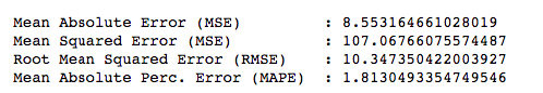
If you want to know what MSE, RMSE or MAPE is, you can read this article.
They are all different calculations of errors and now, we will just focus on smaller ones while comparing different models.
So, in order to compare my model with another one, I will create one more model including Length of Membership and Time on App only.
X3=df[['Length of Membership', 'Time on App']]

Y = df['Yearly Amount Spent']

X3_train, X3_test, y3_train, y3_test = train_test_split(X3, Y, test_size = 0.2, random_state = 465)


X3_train = sm.add_constant(X3_train)


results3 = sm.OLS(y3_train, X3_train).fit()

results3.summary()
X3_test = sm.add_constant(X3_test)
 y3_preds = results3.predict(X3_test)

 plt.figure(dpi = 75)
 plt.scatter(y3_test, y3_preds)
 plt.plot(y3_test, y3_test, color="red")
 plt.xlabel("Actual Scores", fontdict=eksen_font)
 plt.ylabel("Estimated Scores", fontdict=eksen_font)
 plt.title("Model Actual Scores vs Estimated Scores", fontdict=baslik_font)
 plt.show()

 print("Mean Absolute Error (MAE)
       : {}".format(mean_absolute_error(y3_test, y3_preds)))
 print("Mean Squared Error (MSE)          : {}".format(mse(y3_test, y3_preds)))
 print("Root Mean Squared Error (RMSE)    :
{}".format(rmse(y3_test, y3_preds))) print("Mean Absolute Perc. Error (MAPE)  :
{}".format(np.mean(np.abs((y3_test - y3_preds) / y3_test)) * 100))
Which one is best?
As you can see, errors of the last model are higher than the first one. Also adjusted R squared is decreased. If errors were smaller, then we would say the last one is better – independent of R squared. Ultimately, we choose smaller errors and higher R squared. I’ve just added this second one to show you how you can compare the models and decide which one is the best.
Now our model is this:
Yearly Amount Spent = -1027.28 + 61.49x(Length of Membership) + 38.76x(Time on App) + 25.48x(Avg. Session Length)
This means, for example, if we can increase the length of membership 1 year more and holding all other features fixed, one person will spend 61.49 dollars more!
Advanced tips: Outliers and nonlinearity
When you are dealing with the real data, generally things are not that easy. To find linearity or more accurate models, you may need to do something else. For example, if your model isn’t accurate enough, check for outliers. Sometimes outliers can mislead your results!
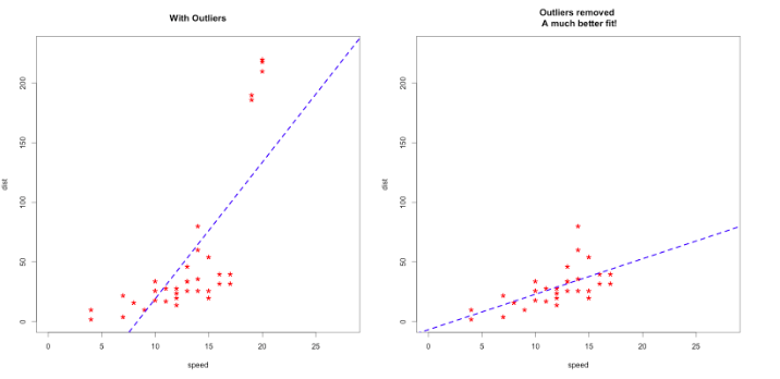
Apart from this, sometimes you will get curved lines instead of linear but you will see that there is also a relation between variables!
Then you should think of transforming your variables by using logarithms or square.
Here is a trick for you to decide which one to use:
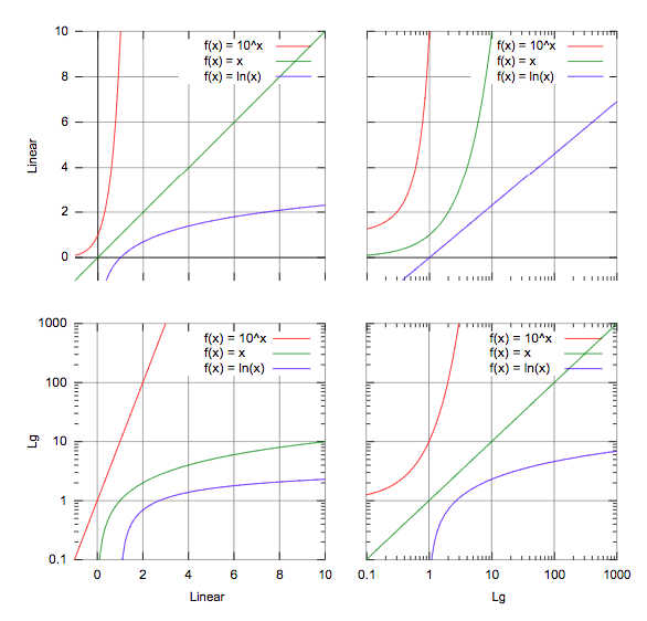
For example, in the third graph, if you have a line similar to the green one, you should consider using logarithms in order to make it linear!
There are lots of things to do so testing all of them is really important.
Conclusion
If you like to play with numbers and advance your data science skill set, learn Python. It is not a very difficult programming language to learn, and the statistics you can generate with it can make a huge difference in your daily work.
Google Analytics, Google Ads, Search Console… Using these tools already offers tons of data, and if you know the concepts of handling data accurately, you will get very valuable insights from them. You can create more accurate traffic forecasts, or analyze Analytics data such as bounce rate, time on page and their relations with the conversion rate. At the end of the day, it might be possible to predict the future of your brand. But these are only a few examples.
If you want to go further in linear regression, check my Google Page Speed Insights OLS model. I’ve built my own dataset and tried to predict the calculation based on speed metrics such as FCP (First Contentful Paint), FMP (First Meaningful Paint) and TTI (Time to Interactive).
In closing, blend your data, try to find correlations and predict your target. Hamlet Batista has a great article about practical data blending. I strongly recommend it before building any regression model.
Contributing authors are invited to create content for Search Engine Land and are chosen for their expertise and contribution to the search community. Our contributors work under the oversight of the editorial staff and contributions are checked for quality and relevance to our readers. The opinions they express are their own.
Related stories
New on Search Engine Land
About the author