Yahoo testing new search bar with logo on the right, not the left
Days after Verizon announces it will acquire Yahoo, Yahoo is testing a new search bar at the top with a missing logo at the left.
Barry Schwartz on August 1, 2016 at 9:01 am | Reading time: 1 minute

Less than a week after Verizon announced it will buy Yahoo, Yahoo is testing a new search interface.
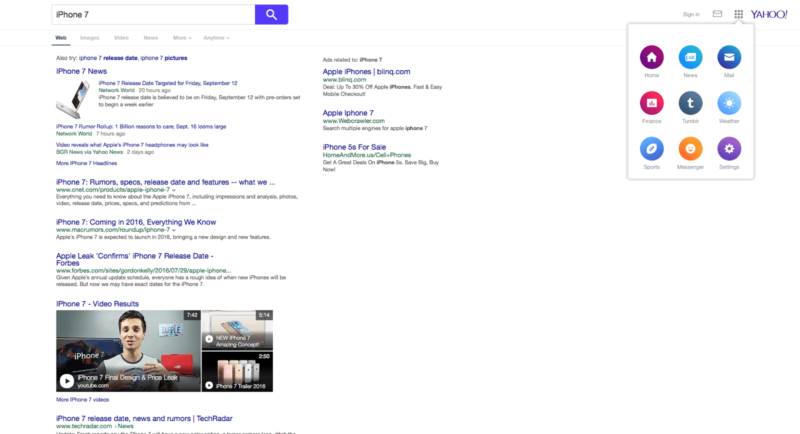
The new interface removes the Yahoo logo from the top left of the screen, makes it a bit smaller and moves it to the right side of the screen. This leaves an open white space at the top left, maybe potentially for the Verizon logo? Probably not. It would be too soon for Yahoo to test Verizon branding on their properties, I would think.
With this user interface change, you will also see a new box at the top right that opens up a Yahoo services navigator. Also, the search button is blue, instead of the Yahoo purple.
Here is a screen shot from allgoogletesting blog.
Related stories
New on Search Engine Land
