4 Areas To A/B Test For E-Commerce Websites
Out of all websites found on the Internet, online retail stores have the most potential for improvement through A/B testing. Amazon, Ebay and Etsy are just few examples of e-commerce websites that do a ton of A/B testing. The potential for A/B testing is enormous because of the sheer number of variables that these stores can […]
Out of all websites found on the Internet, online retail stores have the most potential for improvement through A/B testing. Amazon, Ebay and Etsy are just few examples of e-commerce websites that do a ton of A/B testing. The potential for A/B testing is enormous because of the sheer number of variables that these stores can experiment with: search results, product categories, pricing, product images, ratings, etc.
Another reason why A/B testing is so important for e-commerce websites is because their conversion goal is not some indirect metric such as leads or downloads but a direct sale.
They can measure impact of the changes they do directly in terms of revenue. If tweaking some element on website increases average order value or revenue per visitor, it gives a direct push to company’s bottomline.
Since there are practically infinite number of elements that e-commerce websites can test, for now, I will discuss four of the most important ones and back them with case studies found on the Internet and from my company’s customers.
If you are part of an e-commerce website and are not A/B testing, then you should start doing right away. As you will see from case studies linked below, A/B testing has a very high ROI.
Testing Area #1: Call-to-Action Buttons

Testing call-to-action buttons: this version increased sales by 6.3%
The buy now button (or call-to-action button as it is often called) is perhaps the most important element that an e-commerce website should be testing. There are various reasons why your existing buy now button may not be working well.
It may not be noticeable or it may not be very motivating or perhaps your visitors don’t even realize it is a Buy Now button (if you happen to use some uncommon terminology such as Purchase). There are various elements of the button that you can test to improve conversions:
- Button color and size: Larger and brighter generally works better. See this case study where red colored link increased conversions by 53%
- Button placement: TaylorGifts increased clicks on the button by 10% simply by bringing add-to-cart button and pricing closer
- Button text: RIPT Apparel, an online clothing store, increased sales by 6.3% simply by changing text on their buttons to convey limited time offers
Testing Area #2: Pricing, Discounts or Shipping Strategies

Testing shipping and discount strategies: first variation increased sales by 41%
Various pricing strategies can be tested to motivate the prospective window-shopper to complete a successful sale. Even though testing pricing is hard and risky, there are ways to do it right. If you setup your price test correctly, you can gain a lot of insight into your visitor behavior.
For example, you can test ideas such as:
- Ending prices with .95, .97 or .99: there are various primers on psychological testing that you can read and accordingly test on your website.
- Design of pricing box: the way you show pricing can have a lot of impact. Is it to the left of product image or is it to the right? Is it closer to add-to-cart button? Do you have money back guarantee written next to your pricing?
You can also test your discount or shipping strategies.
For example, SmileyCookie, an online cookie store, found out that their customer don’t care as much about free shipping or discounts, as they care about next-day shipping. In fact, just by changing the policy that they display on al pages, they managed to increase sales by 41%.
Testing Area #3: Product Display & Search Results
Adding a new category menu (to the left) increased conversions by 34%
Which products to show on homepage? In a particular category, do you show bestsellers or do you show newest products? Which product categories to show in the menu? These are some of the questions that you can answer via A/B testing.
Visitors respond to different products differently and as a marketer it is incredibly hard to guess which mix of products will produce maximum revenue. If you think you know it all and your e-commerce website has right product mix, read this case study on Mobal, who increased total sales by 27% just by adding a new product to the mix.
Similarly, you can test the default order of search results or number of search results to show. You can even test whether product recommendations increases revenue (by making them purchase more) or decreases revenue (by confusing them with too many choices).
Testing Area #4: Checkout Page
Reducing number of input fields on checkout page led to 25% less abandonments
Visitors are so close to making the purchase, yet they sometimes abandon their shopping on the checkout page.
It is like going to a supermarket, adding products and then dragging the cart towards the payment counter before simply running away towards the exit gate deciding not to purchase the stuff.
Nobody does that in real world, so why do visitors do this online? Well, shopping cart abandonment is real and there are various reasons for it. Perhaps visitors don’t trust you or perhaps you added a surprise cost (tax or shipping). Or simply perhaps you require your visitors to create a login before completing the checkout. (All of these reasons are not valid in offline retail world)
Various ideas that e-commerce websites can use to A/B test on checkout page are:
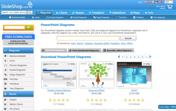
- Including or excluding a trust seal/badge. Slideshop added a trust badge and increased sales by 15%, while ICouponBlog removed a trust badge and increased conversions. This shows there is no definite answer and you must A/B test.
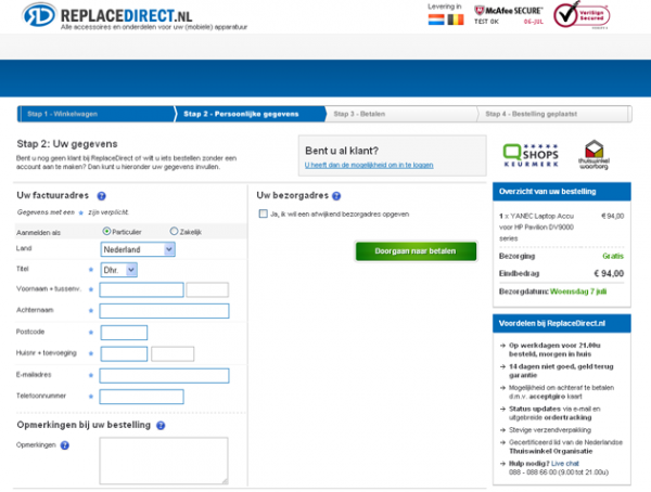
- Removing unnecessary input fields and providing overview of order. That’s exactly what ReplaceDirect tested on their checkout page and they successfully decreased cart abandonments by 25%
There are many more ideas on what you can test on checkout page. The GetElastic blog has a wonderful article on 12 checkout blunders that you must read.
Contributing authors are invited to create content for Search Engine Land and are chosen for their expertise and contribution to the search community. Our contributors work under the oversight of the editorial staff and contributions are checked for quality and relevance to our readers. The opinions they express are their own.
Related stories
New on Search Engine Land
About the author