Two New Bing UI Tests Spotted
The folks at Liveside.net, an independent blog that covers Microsoft’s online efforts, have posted screenshots of two new Bing user interfaces that some of their readers have seen recently. In my searching this morning, I wasn’t able to see either UI while doing about 5-6 different searches. Liveside calls the first one a “Metro style” […]
The folks at Liveside.net, an independent blog that covers Microsoft’s online efforts, have posted screenshots of two new Bing user interfaces that some of their readers have seen recently. In my searching this morning, I wasn’t able to see either UI while doing about 5-6 different searches.
Liveside calls the first one a “Metro style” — it takes the daily photo and, rather than show a bit of across the entire header, boxes it in the upper left behind Bing’s logo. The rest of the header looks (to my eyes) like Google’s current search bar area.
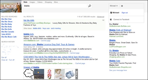
Liveside’s reader explains that the above UI was only visible on Bing’s “Web” tab, and that other tabs reverted back to the site’s current/standard look and feel.
The second new UI is much more spartan. The daily photo is gone, as are all signs of color in the header — it’s pure black-and-white.

As with any UI test at Bing (or Google or anywhere else), there’s no guarantee that either of these designs will ever advance beyond the test stage.
Contributing authors are invited to create content for Search Engine Land and are chosen for their expertise and contribution to the search community. Our contributors work under the oversight of the editorial staff and contributions are checked for quality and relevance to our readers. The opinions they express are their own.
Related stories
New on Search Engine Land
About the author