Visual analysis of AdWords data: a primer
Columnist David Fothergill shows how data visualization can unlock insights about AdWords performance you may not have gleaned otherwise.

Data visualization is one of the most powerful tools available if you want to explore and understand your data, whether it’s on a small scale or at a scale which qualifies it as “big data.”
In this post, I wanted to run through some of the fundamental elements of data visualization and illustrate why these concepts start to reveal insight once combined.
I’ll use a very simple set of data with some fairly logical conclusions in order to focus on the effect of different techniques, avoiding adding any unnecessary complexity.
A simple scatter plot example
For the purpose of this post, let’s consider a scatter plot approach for a modest set of AdWords keyword data. My fictional dataset consists of data for ~700 keywords for a period of one month, with fields reflecting cost, clicks, conversion and revenue metrics.
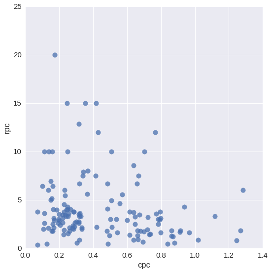
As a starting point, let’s plot the cost per click (CPC) vs. the revenue per click (RPC), represented on the x and y axis respectively:
All very nice, but doesn’t really tell us too much. What we can draw from this is that the relationship is fairly wide-ranging, with some keywords delivering much more in the way of ROI, and some keywords in the bottom-right corner which appear to be unprofitable.
Adding context using segmentation
If ever you want to try and add some useful context to a dataset, then segmentation is a really nice, elegant way to achieve this. Instantly (assuming you’ve applied a relevant segmentation), you’ll start being able to compare and assess patterns/trends across different groups, which is often the starting point heading toward the insight that will be useful.
A simple, relevant segmentation in this example could be keyword match type. Other examples (such as campaign, user type or device) might provide us more detail, but I always like match type as a training example.
Taking our above chart and applying a color scheme to the points based on the type of keyword matching gives us the chart below:
The great thing about this approach is how easily interpretable charts can be; instantly, patterns and clusters begin to reveal themselves. Those unprofitable keywords in the lower right-hand corner? Broad Match. In fact, the majority of Broad Match terms are hovering down toward the bottom and are therefore performing below par.
This gives us an actionable insight and valuable information about where to most effectively spend time and resources. Making informed decisions about where to investigate further is a great thing to be doing if you want to improve account performance
As a further example, we could apply this idea of context in a different way — splitting each segment into its own plot, for example, which reveals more about the individual patterns and dispersion:
Plotting relationships
Finally, quantifying the patterns, we can see that trend or “regression” lines add some further confirmation of the patterns. Using the alternative “split” plots shown above, let’s add the regression line and asses the relationship between RPC and CPC:
So, it turns out many of the broad match keywords have a high cost per click, which isn’t matched by an increase in revenue for each click. This issue should be addressed, and it can be done in any number of ways (funneling any spend here to new non-broad match keyword types, reducing the highest unprofitable bids and so on).
We wouldn’t expect a causal positive relationship here (i.e., pay more, get more), so the reasonably gentle downward slope in exact and phrase match terms is not a concern.
Scaling for clarity
I’ve plotted the above without any adjustment to the scale, as it wasn’t a priority, given the two metrics used. However, it’s worth talking a little about this with two examples.
1. Log transformations
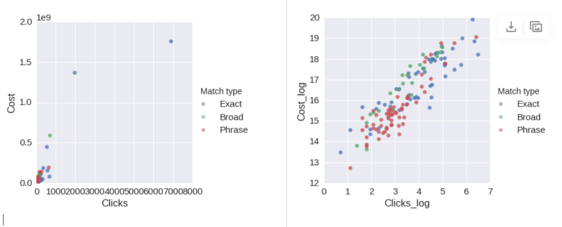
When plotting data with several orders of magnitude, the sheer scale differences can make it difficult to read the data. A good way around this is to do a log transformation of the data. This will preserve the order and relationship of the data but “squash” the more extreme end of the scale.
To show the effect of this, below is the standard plot of “clicks vs. cost” for my dataset (left), compared to the same data given a log transformation and re-plotted (right). As you can see, the outliers stretch the plot so that most of the data is undecipherable:

2. Shared axes
There is an important relationship between revenue per click and cost per click. If we are paying more than is generated in revenue (or in a truer sense, profit per keyword), then this is a threshold we are very interested in.
If I change the plot so that the x and y axis share the same scale, then we can draw a line at 45 degrees, which represents this threshold:
Summary
Hopefully, this stroll through some of the ways to build up useful charts from your data has been of interest and has helped illustrate the reasons why these simple techniques add value.
A note on tools used for the analysis: I’m a big fan of doing my analysis in Jupyter (previously iPython) notebooks due to the flexibility that Python and R provide for manipulating data and visualizing data when compared to Excel. For that reason, the examples herein are plotted in this environment.
Contributing authors are invited to create content for Search Engine Land and are chosen for their expertise and contribution to the search community. Our contributors work under the oversight of the editorial staff and contributions are checked for quality and relevance to our readers. The opinions they express are their own.
Related stories
New on Search Engine Land


