Yahoo’s “Clean” Search Design For Firefox & Yahoo Users Looks Even More Like Google
In the Yahoo blog post announcing the company’s new default search deal with Firefox there’s a small GIF preview of what the new “clean” Yahoo search results will look like. Below are some of the screens from the post: On first blush I thought these were a departure from current Yahoo results but they actually look quite similar […]
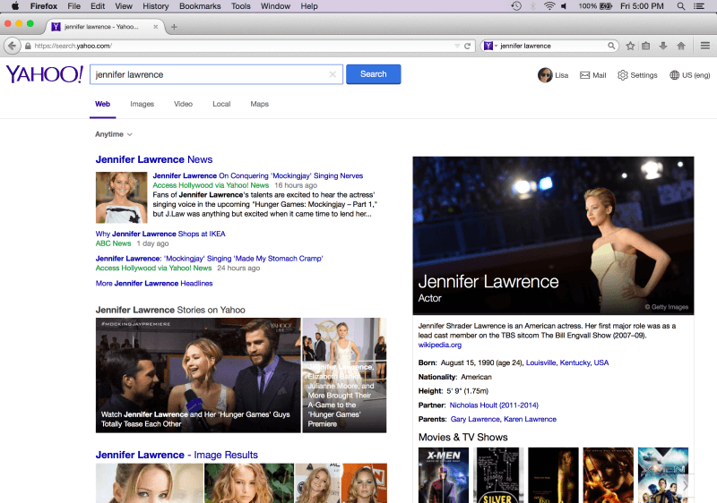
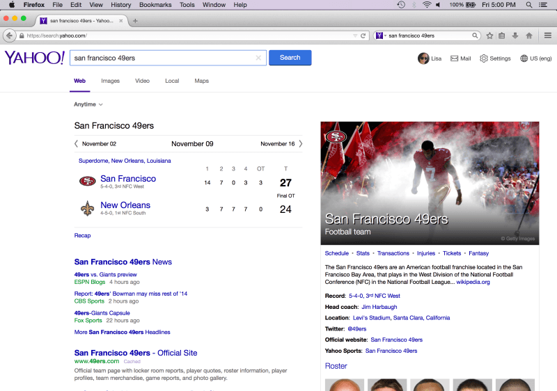
In the Yahoo blog post announcing the company’s new default search deal with Firefox there’s a small GIF preview of what the new “clean” Yahoo search results will look like. Below are some of the screens from the post:
On first blush I thought these were a departure from current Yahoo results but they actually look quite similar to current Yahoo search results, minus the left-hand navigation/filters and most of the ads. The new UI — we still need to see it in action — probably moves incrementally down the path further toward Google.
Yahoo CEO Marissa Mayer has been evolving the Yahoo UI to be more Google-like since arriving at the company. It makes sense given that for years she owned the spartan UI and user experience of the Google homepage before moving over to run local for Google.
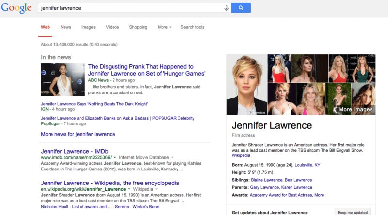
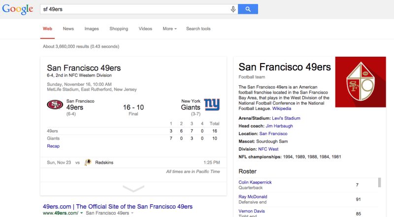
For comparison, below are Google results for the same queries:
Whatever the new-look Yahoo search UI turns out to be Firefox is the beta test for what is likely a broader rollout in the coming months.
Contributing authors are invited to create content for Search Engine Land and are chosen for their expertise and contribution to the search community. Our contributors work under the oversight of the editorial staff and contributions are checked for quality and relevance to our readers. The opinions they express are their own.
Related stories
New on Search Engine Land


