4 tips for creating visually stunning display ads
Advertisers aren’t just competing for their audience’s money, they’re also competing for their attention. At SMX Create, Rebecca Debono and Julia Thiel discussed how they create eye-catching ads that can help brands secure both.
Advertisers aren’t just competing against other brands for their audience’s attention. “Nowadays, the digital environment is so busy, we’re also competing against our best friend’s new babies and puppies and really great pictures of food,” Rebecca Debono, creative director at Jump 450 Media and formerly director of creative strategy at 3Q Digital, said at SMX Create.
With so many platforms, technologies and distractions available, it can be incredibly difficult to make ads that actually engage consumers. At SMX Create, Debono and Julia Thiel, VP executive creative director at 3Q Digital, shared their considerations for creating visually stunning ads to help brands cut through the noise and address customers’ motivators as well as barriers that may be clogging your sales funnel.
Design for the part of the funnel you’re targeting
Using different ads to address each part of the sales funnel ensures that you’ve got a pipeline that speaks to all potential audiences, regardless of whether they’re totally new to your brand or are on the tipping point of converting. Below are some goals that Debono associated with ads at different stages of the funnel.
- Top of the funnel: Introduce your brand and generate audience interest.
- Middle of the funnel: Educate audiences about your brand/product and entice them with your offerings.
- Bottom of the funnel: Encourage the audience to take action.
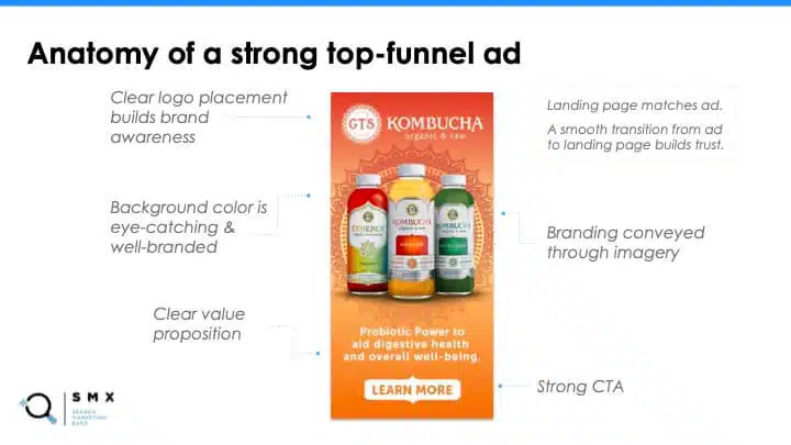
“Starting at the top, it’s got clear logo placement, that really helps to build brand awareness,” Debono said, referring to a top-of-funnel ad example (shown above). The logo is also prominent on the product itself, which is made more eye-catching by an on-brand background pattern. The background of the ad might also stand out on a white or black website background and uses the company’s brand colors.
The text elements clearly showcase the product’s value proposition and encourage potential customers to move further along the funnel with a strong CTA. Advertisers can also use movement or animation and text overlays to capture people’s attention, Debono added.
“As we start to move down from the top of the funnel and into the middle, I want to talk about how to really speak to certain audiences,” Debono said, noting that the typical creative process might involve iterating on a top-performing creative asset so that it can be used to target a broad audience.
“It’s not a wrong process, but we find that, as we start to get more mid-funnel, this process is often missing a step,” she said, “And that step is what motivates people, what is going to get them to buy or what is their barrier to entry?” Digging into customer personas can help advertisers address customers’ motivators as well as barriers, Debono said.
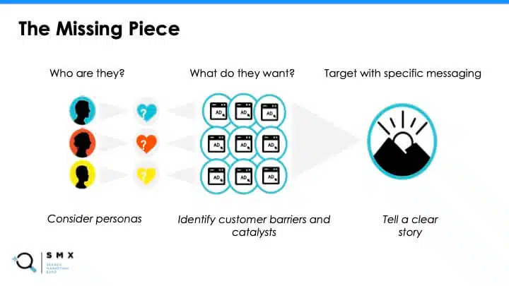
“Maybe the barrier is that there won’t be a flavor for me,” she provided as an example, “And so we could hit them with a message that there are 36 flavors that they could try.” Likewise, your messaging could help build a stronger connection with audiences by appealing to their motivators (with messaging like “freshly picked ingredients” for health-conscious consumers) or eliminating barriers (such as local availability, with incentives like free shipping).
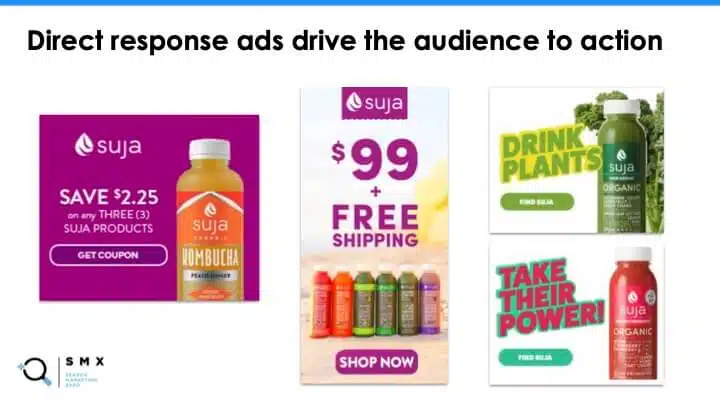
As examples of successful bottom-of-funnel ads, Debono showed a collection of assets for Kombucha brand Suja (shown above). She called out the following factors behind successful performance ads:
- The product is prominently displayed for more visual impact. This also informs audiences of what they’re potentially buying.
- Offers to save money might nudge bottom-of-the-funnel customers to convert.
- Strong CTAs give customers a clear idea of what to do next.
- The text and visuals are simple, because bottom-of-the-funnel customers are likely already familiar with your brand and products.
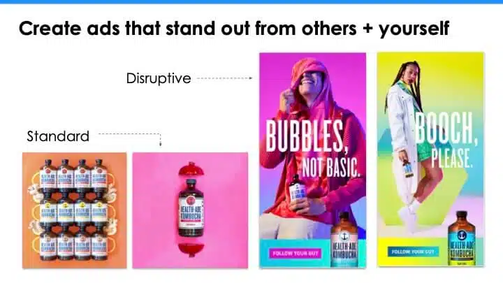
Differentiate your brand by differentiating your ads
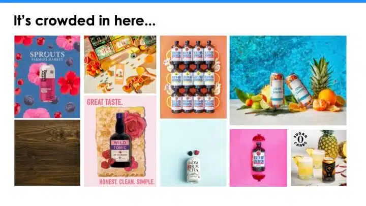
“Being different and standing out in a sea of sameness, especially if you’re in a crowded category, is super important,” Debono said, adding that customers may not understand what brand an ad is from if every brand appears visually similar, as it does in the image above.
In the example below, she highlighted an ad that disrupts the pattern: Instead of focusing on the product itself, the ad seeks to relate directly to the target audience by highlighting the lifestyle that the brand wants to associate with the product. It’s also accompanied by a unique CTA (“Follow your gut”), which also helps the ad stand out.
Although showcasing product imagery is typically best practice, distinguishing yourself from competitors may help increase conversions, so advertisers should keep an eye on the landscape they’re advertising in to know which type of creative to use.
“Being disruptive doesn’t mean you have to completely throw your brand guidelines out the window and do something that doesn’t even look like it’s from your brand,” Debono said, pointing to another example (below) in which a company used the same fonts and colors to create a sense of cohesion.

“You can tell that both of these ad themes are from the same brand, but they’re just discernibly different and that’s what makes a really great disruptive ad,” she said.
Using original graphics and photos, as opposed to stock images, can also help your brand differentiate itself. “There’s nothing wrong with the stock image . . . except that the whole world can use that same image if they want to,” Thiel said, adding that the same goes for stock video footage, stock illustrations and stock icons.
For advertisers that may be bound to using stock images (perhaps due to budget constraints, for example), “one solution could be to at least put your own spin on it and overlay your brand colors on the image, maybe you use a different crop,” or add your logo to it, she recommended.
Consider the elements of your brand kit
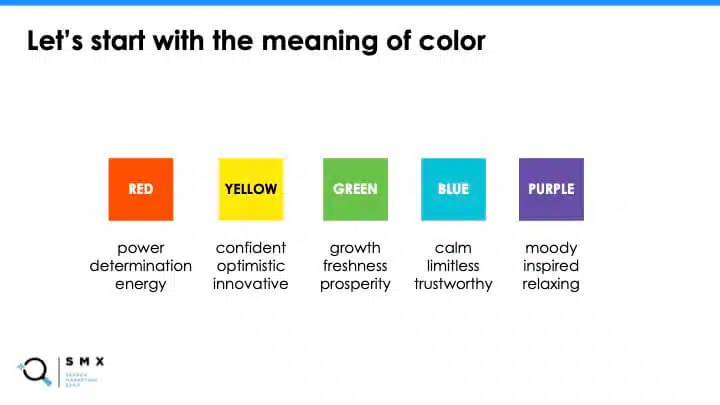
Determining the right colors to represent your brand often comes down to the psychology of each color and what you want to associate your brand with. The colors your competitors are already using and the right mixture of colors to ensure that your ads will attract your audience’s gaze (usually by including a brighter color) are also important factors.
“Your logo is your storefront — you want it to stand for everything you do,” Thiel said, “So the first step here when designing a logo is to think about what your brand should say.”
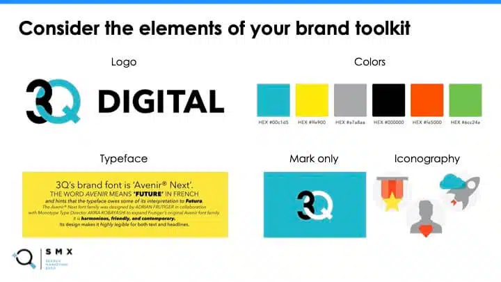
Using her agency’s logo as an example, she pointed out that the intertwining of the “3” and the “Q” are meant to convey partnership. She also pointed to the blend of strong and contrasting colors as well as unique iconography to create a visual signature on your ads. “Lastly, but not the least important, is the typeface should always compliment your logo and, in the digital ad context, it also really needs to be highly legible,” she said.
“At a minimum, in your ads, you should always use your logo, your brand font and your brand colors — not all of them at once, but some of them,” Thiel added.
Factor in the format
“There are some challenges when working with RDAs [Responsive Display Ads],” Thiel said, “For example, when it comes to the image and on-image text, some of the banners are very, very small, and they leave very little room for your image.”

Because the placement is responsive, the cropping of your banner might be out of your control as well. “In my opinion, it is not a good idea to have on-image text on RDAs, period,” she said, noting that on-image text can impede your visual branding.
“Headlines and descriptions in RDAs are mixed and matched when served,” Thiel said, “So all of the combinations have to make sense. The banner image can also be matched with all the different combinations of headlines and descriptions, so the visual has to work with all the combinations as well.” Additionally, the copy can be served without the banner image, “so it [the ad copy] really needs to speak for itself,” she emphasized.
When designing for Responsive Display Ads, Thiel recommends:
- Being concise with your copy rather than cramming all the content into the visual part of the banner.
- Keeping in mind that the copy is just as important as the banner.
- Creating strong on-brand headlines and descriptions that can be mixed and matched.
- Filling the image space with bright, eye-catching imagery that is really easy to understand at first glance and at a very small size.
Don’t overlook the creative — it’s one of your biggest levers
As the PPC industry becomes increasingly reliant on signals and automated systems, advertisers may feel like there are fewer ways to differentiate their brand or directly influence campaigns.
“It used to be that the best bidding strategy or the best targeting strategy would kind of win out, but in a world of automation, truly, creative is one of the biggest levers that we have to pull in order to stand out and make a great campaign,” Debono said.
Search Engine Land is owned by Semrush. We remain committed to providing high-quality coverage of marketing topics. Unless otherwise noted, this page’s content was written by either an employee or a paid contractor of Semrush Inc.