Google Testing Search Options Listed Above Results, Rather Than To Side
Google appears to be testing out a new navigational layout, one that takes the search options that normally show in the left-hand column of a search results page and moving them to above the search results. It seem similar to one that surfaced in June. This is how things normally look: The arrow points to […]
Google appears to be testing out a new navigational layout, one that takes the search options that normally show in the left-hand column of a search results page and moving them to above the search results. It seem similar to one that surfaced in June.
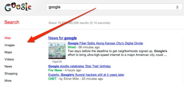
This is how things normally look:
The arrow points to how search options — the choice to select the type of search such as “web” or “shopping” — appear to the left of search results. Further down in this column is an option to select “More” search options or to make use of search tools such as limiting searches by date.
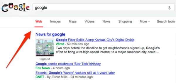
In the new layout, these all move above the search results:
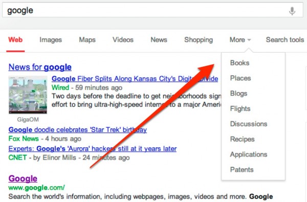
Selecting the “More” link allows for narrowing your search to Google specialized search engines such as Blogs or Flights. Nothing listed is different than what’s available in the more traditional layout. Only the location has changed:
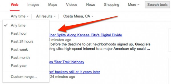
Selecting the Search Tools options brings up a pretty pleasing drop-down format. Here’s the date options, opened up:
Here are options for result types opened up:
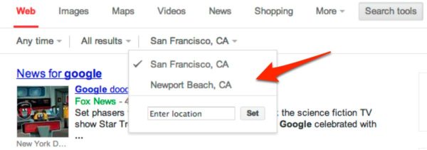
These options are all available in the current traditional layout, but they feel easier to use as drop-down choices. Most interesting is the drop-down for location:
By default, the location that Google auto-detects for you will be shown (Newport Beach, in my case). But if you manually enter a location, that location will be shown above your actual location and used to filter your results. But your actual location remains up as a choice, for easy access.
Whether these changes will go live for everyone is anyone’s guess. Google is always testing new layouts (see some past ones in our Google: User Interfaces area), and some never appear. But as this one has been tested before, I have a feeling it might stick.
Postscript: As noted below in comments, Google has used a similar horizontal layout for its tablet display for some time. The format shown above is similar to that but not exactly the same, particularly in terms of the drop-downs. But it may be that Google is looking to unified its desktop and tablet displays.
Contributing authors are invited to create content for Search Engine Land and are chosen for their expertise and contribution to the search community. Our contributors work under the oversight of the editorial staff and contributions are checked for quality and relevance to our readers. The opinions they express are their own.
Related stories
New on Search Engine Land
