Types of landing pages: Examples & when to use each
From lead gen to click-through, not all landing pages are the same. Learn the main types, see examples, and discover how to choose the right one for your goals.
When someone clicks on an ad or a link, where they land often decides whether they sign up, buy, or bounce (leave the page).
That’s why the type of landing page you choose when setting up a marketing campaign matters as much as the traffic source behind it.
In this guide, we walk through the main landing page types, show where they fit in your campaigns, and highlight the elements that make each one effective.
Why each landing page type matters
Every landing page has one job: move a visitor closer to conversion.
But not all conversions are the same.
Sometimes you want an instant sale. Other times, the goal is softer: get an email, build interest, or push potential customers toward a webinar. That’s why a single, one-size-fits-all landing page is not enough.
Each landing page type should be designed for a specific role in the funnel:
- Top of funnel (TOFU): Grab attention and capture leads
- Middle of funnel (MOFU): Nurture interest and provide proof
- Bottom of funnel (BOFU): Drive urgency and close the deal
When you choose the right type of landing page for the right stage of the funnel, visitors feel like the page was built exactly for them. And when the experience matches their intent, they’re likely to become your customers.
Types of landing pages
Now that we know why different landing page types are important, let’s understand them one by one.
Sales landing page
A sales landing page is the most direct of all landing page types. Its job is simple: to close a sale or secure a subscription. That’s why it’s perfect when you’re promoting something specific, like:
- A product launch
- A seasonal discount
- A direct-to-consumer campaign (where the brand sells straight to customers through its own website, not through Amazon or other retailers)
The SEO toolkit you know, plus the AI visibility data you need.

What sets sales landing pages apart is the way every element drives toward that specific transaction:
- Benefits-focused copy (not just a list of features) that not only explains what the product does, but why it matters to the buyer
- Trust builders like testimonials showing real-world proof that the offer delivers
- Pricing tables that make it easy to compare options at a glance
- Urgency triggers, whether that’s a countdown timer or “Only three left in stock,” to nudge visitors to act before the opportunity disappears
Take Surfshark’s sales landing page as an example.

The first bit of page content you see is the headline: “Fast VPN bundle for unlimited devices.” That line tells you the core benefit right away—you can protect every device without limits.
Just below, the price is shown with the original cost crossed out. The discount is impossible to miss and shows you’re getting a deal.
Then comes the red “Get Surfshark VPN” CTA button. It’s bold, high-contrast, and right in your line of sight. You don’t have to scroll or search to know what to do next.
As you move down the page, Surfshark gives you reasons to trust them. They provide a comparison chart against competitors, which clearly shows where their VPN has an edge.
Right after that, you see the pricing table. This breaks down the plans in a simple way so you can choose what works best for you without confusion.
Near the bottom of the page is an FAQ section to answer common questions or doubts. And just to push you over the finish line, Surfshark adds a 30-day money-back guarantee to remove risk and make saying “yes” feel safe.
Simply put, every element is there for one reason: to guide you toward clicking that “buy” button with confidence. That’s exactly how a sales landing page should work.
Squeeze page
A squeeze page has one goal: capture a visitor’s contact information, usually their email address. That’s it.
Unlike a sales page, you’re not asking them to buy something. Instead, your messaging requests that they share a detail that lets you stay in touch.
These pages are most effective for list-building campaigns where the offer is light but valuable. For example, a website could be offering a free ebook, encouraging a newsletter sign-up, or sharing a useful checklist.
Here’s what a squeeze landing page usually looks like:
- The design is stripped down, so there are no distractions
- The copy is short because you don’t need to explain everything, just enough to make the offer feel worth it
- There’s usually a single call-to-action button right where you expect it
Look at Content-as-a-Career’s squeeze page.

The headline tells you exactly what you’ll get: “Get work-from-anywhere marketing roles every Friday.” Right below, there’s a single field where you enter your email, followed by a clear “Subscribe” button. That’s all the action you need to take.
The form doesn’t ask for anything more—no name, no job title, no company. That makes it quick to complete and removes any confusion.
To cover compliance, there’s a simple consent checkbox with links to terms of use and a privacy policy. And that’s it. No scrolling required, no competing offers in the way.
The simplicity is what makes a squeeze page so effective. It’s laser-focused and tells you what you’re getting in exchange for an email or any other detail, making the next step as easy as typing your email address and hitting “Subscribe.”
Splash page
A splash page shows up before someone enters the main website. It’s like a quick message or checkpoint that appears between the click and the content. The page’s purpose isn’t to sell or capture leads directly—it’s to deliver one important piece of information before letting the visitor through.
That’s why splash pages are often used for event announcements, product reveals, or even age verification. For example:
- An age gate on a winery’s site doesn’t try to sell you wine upfront. Instead, it may ask, “Are you 21 or older?” Once you click “yes,” you move on.
- A product reveal splash page for a tech brand might only say, “New launch drops Friday. Stay tuned.” The goal here is to build hype, not collect your email or process a transaction.
- An event splash page could show a big announcement banner, like “Registration now open for our annual summit,” before you reach the homepage
Splash pages usually carry a single message backed by bold visuals that match the brand’s style. There’s little to no navigation, and many of these pages aren’t indexed in search because they’re meant to be temporary or situational.
Take Zara’s splash page as an example.

Before you can browse clothes, you’re asked to select your location and language.
The choices you make ensure that you see the right currency, stock availability, and shipping options for your region.
You can see the page isn’t trying to make a sale on its own. Instead, it’s personalizing your experience by asking where you’re located and what your language is. Once you specify this information, the page takes you to the main website adjusted to your location and language. This way, the shopping experience feels more relevant from the start.
Microsites and long-form landing pages
Sometimes, a single page isn’t enough to show all the information you want to.
Suppose you’re promoting a simple ebook download. In that case, one short page works fine. But when you’re asking your target audience to invest in a complex software platform or book a luxury product, visitors need more details before they take the desired action.
That’s where microsites and long-form landing pages are used.
Microsite
A microsite is like a mini-website built around one campaign or theme. Instead of one page, it might have a few connected pages, like “Agenda,” “Speakers,” and “Register Now” for a conference.
You can use microsites when you want to create a complete, immersive experience that stands apart from your main website and gives the campaign its own spotlight.
For example, take a look at Adobe’s Creative Types microsite.

At first, it looks like it’s just a fun personality test. But Adobe’s real goal was to engage creatives in a way that felt interactive and easy to share.
Instead of pushing its product upfront, the microsite helped people explore their creative style. And once users got their results, Adobe pointed them toward tools like Adobe Express and Firefly, making the test both entertaining and a natural entry point into their product ecosystem.
Once you access the microsite, you’re invited to take a personality test. The process feels interactive and fun: they ask you a series of questions—around 10 to 15—and for each one, you have to choose between two options.
After each choice, it shows a short, animated video clip to make the journey feel personal and engaging.
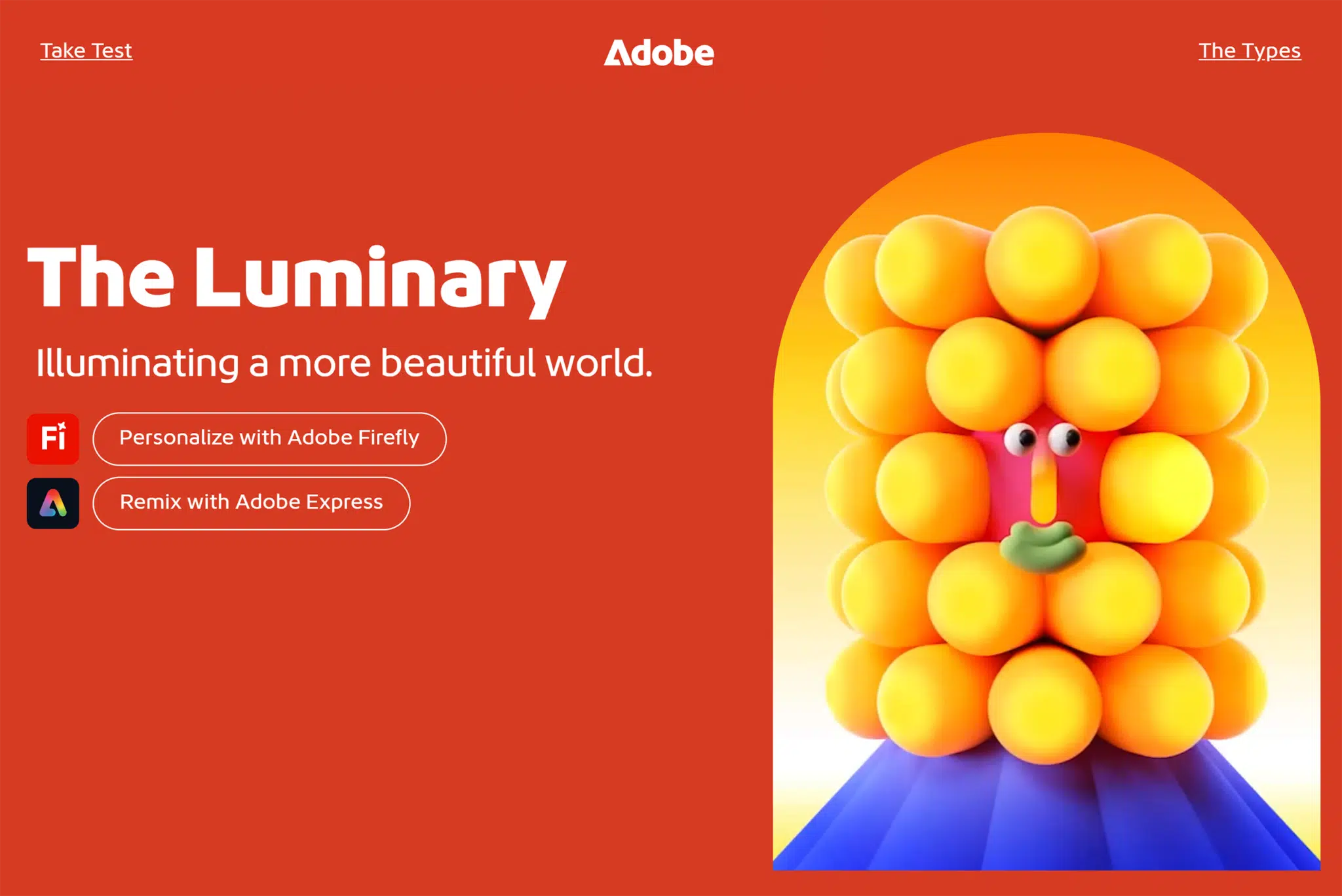
Once you finish, the microsite reveals your creative personality type with a dedicated results page (like “The Luminary”), complete with visuals, explanations, and even tools you can try based on your type.
Long-form landing pages
Long-form landing pages stick to one URL, but they scroll deep to streamline the user experience. These pages are designed for offers that require more explanation, like software as a service (SaaS) demos, luxury products, or big events.
Their goal is to guide the reader step by step through a journey that explains:
- What the offer is
- Why it matters
- How it works
- Why they should trust you
Peloton’s Bike+ page is an excellent example of a long-form landing page.

At the very top, you see the bike itself with a bold headline: “The new Cross Training Bike+” followed by a brief tease of the value prop.
And below, there’s a clear CTA to shop now—no confusion about what specific action the page wants you to take.
As you scroll, each section breaks down a different selling point:
- Hardware features
- Peloton IQ insights
- Ease of purchase
- Trainer-led classes
All of these are paired with videos and lifestyle images that show how the product fits into real life.
And the page is long for a reason: Peloton isn’t selling a simple fitness accessory. It’s asking people to invest in premium equipment and a subscription membership. That means buyers need to see more proof before they commit:
- What makes this bike better than a cheaper alternative?
- Will I actually use it consistently?
- Is the subscription worth the cost?
Peloton answers all of that with detailed feature breakdowns, trainer credibility, membership perks, and testimonials woven throughout. And just like a good long-form page should, its “Shop now” CTA follows you as you scroll down the page so that whenever you become convinced, the next step (buying the bike) is only a click away.
Microsites vs. long-form landing pages
At first glance, microsites and long-form landing pages may seem similar because both give you space to tell a fuller story and build trust with depth. But the way they deliver that depth is different:

Lead generation page
A lead generation page’s primary goal is to collect information from your visitors so you can continue the conversation later.
Instead of pushing for a sale right away, it asks for details like name, email address, or company name in exchange for something valuable (e.g., a free trial or a product demo).
The design of lead generation pages is usually simple. You may notice:
- A headline that makes the benefit clear (“Get your free social media strategy template”)
- A short description that highlights what’s inside or why it matters
- A form that asks only for the essentials (the fewer fields, the better)
For example, take a look at this free trial page by Splunk.

The headline is direct: “Try Splunk Enterprise free for 60 days. No credit card required.” That promise removes a big barrier right away: People know they can test the platform risk-free.
On the right, the form collects key details like the visitor’s business email address, their name, their job title, and the name of the company where they work. On the left, visuals show the powerful dashboards you’ll try.
Together, the value exchange is clear: you hand over your details, and in return, you get full access to the product for 60 days.
So what makes these lead generation pages effective?
It’s the exchange of value.
You aren’t “giving away” your contact info; you’re getting something useful in return.
Click-through page
A click-through page acts like a bridge.
Instead of asking visitors to buy or sign up immediately, it warms them up before sending them deeper into your funnel, usually to a pricing page or checkout.
For example, if someone clicks an ad for your SaaS tool, they may not be ready to pull out a credit card right away and purchase it.
A click-through page is what does the convincing here.
It explains the value, highlights the benefits, and makes the offer feel like the natural next step. Only then does it direct them to complete the action.
Some of its key elements are:
- Simple design
- Persuasive but focused copy, usually centered on one core benefit or promise
- Strong and clear CTA
Click-through pages are especially common in SaaS free trial funnels and webinar registrations. Take Semrush’s “Yes AI can” page as an example.

Here you see a bold headline and a strong CTA: “Try free for 7 days.”
As you scroll, the page highlights different features:
- Site audits
- Keyword research
- Competitor analysis
- Backlink tracking
All of these have short explanations and clean visuals. Each section reinforces why the product matters without overwhelming you with details.
Throughout the page, the same CTA repeats so you’re never far from the next step.
Notice what’s missing?
There’s no long form to fill out yet, no pricing table, no checkout flow.
Why?
Because the goal isn’t to close the deal right here. It’s to warm you up, build trust, offer high-quality proof points, and nudge you toward that final sign-up page where the conversion happens.
Webinar registration or product launch pages
A webinar registration page specifically aims to get people to sign up for a live or virtual event. Similarly, a product launch page drives sign-ups or pre-orders, but the focus is on a new release like a software update, gadget, new product, or feature drop.
Unlike other lead gen pages, webinar registration and product launch pages are tied to a specific time frame, which means urgency is baked in from the start.
These pages provide clear details (what’s happening, when it’s happening, why it matters) and a strong call-to-action to lock in commitment before the event or launch passes.
A webinar page usually highlights:
- Speakers
- Agenda
- Learning outcomes
A product launch page leans into:
- Features
- Visuals of the product
- Pre-order details
They’re like two sides of the same coin: one is about attending, the other is about buying. But in both cases, the goal of the page is to convert interest into action quickly.
Apple’s iPhone 17 Pro page is a great example.
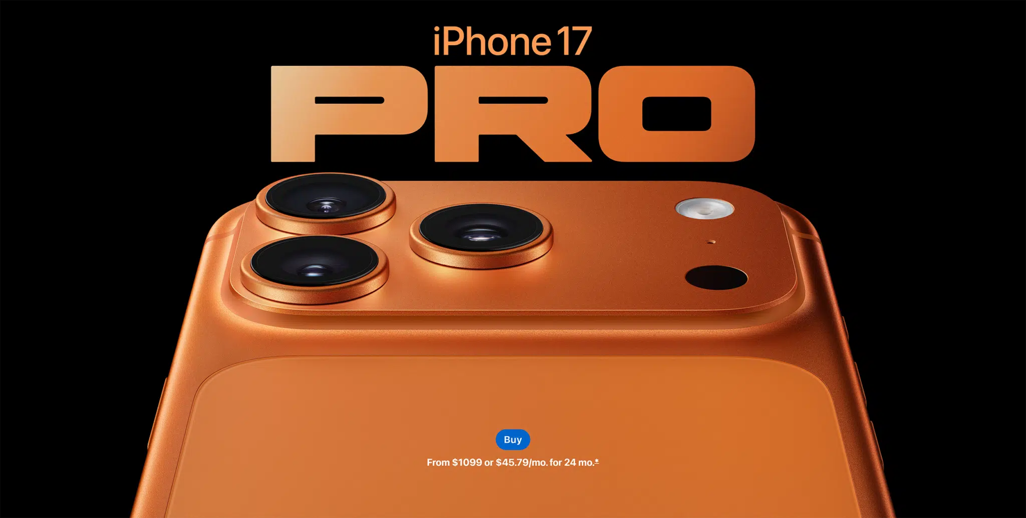
At the top, you see the bold hero section with the following:
- The product name
- A striking image
- Clear call-to-action button to pre-order
But the page doesn’t end here; it keeps unfolding as you scroll.
You’ll see sections dedicated to design, camera features, performance, battery life, and environmental impact.
Each section is polished with large visuals, simple but persuasive copy, and animations that highlight the product in action. Throughout the page, the CTA (“Pre-order”) moves along as the visitor scrolls so that no matter where you stop, you can take the next step without backtracking.
How to choose the right landing page for your campaign goals
Every landing page type has its purpose, but the key is alignment.
The page has to match both what you want to achieve and where the visitor is in the funnel. If those don’t align, you may lose visitors before they act.
Top of funnel (TOFU): Build awareness and capture leads
At this stage, people are only discovering your brand. They don’t trust you yet, and they’re not ready to buy because they just got to know you. The best move here is to make the value obvious.
To do so, you should go with the following landing page types:
- Squeeze pages make sense here because they strip away distractions and focus on one light exchange—usually an email address in return for a newsletter or freebie. The simplicity reduces friction and makes it easy to say “yes.”
- Splash pages also work at this stage when you want to make an announcement (like a new product reveal or event coming soon) without asking for too much commitment
Middle of funnel (MOFU): Nurture and educate
Visitors here know their pain points and are actively comparing solutions that can help them. They need proof and reassurance before they take the next step (e.g., make a purchase).
For this stage of the funnel, you can create the following pages depending on what you want to achieve:
- Lead generation pages fit when the offer is more substantial, like a free trial. These work because the visitor is curious enough to hand over more details (not only an email address) in exchange for something that moves them closer to a solution.
- Click-through pages are perfect bridges. Instead of overwhelming visitors with forms or pricing right away, you warm them up with benefits, visuals, and a clear CTA like “Start free trial.” This makes the eventual conversion feel like a natural next step.
- Microsites and long-form landing pages are also good for complex offers. A luxury purchase needs more than a headline—you need space to explain features, address objections, and provide proof of the quality of your product. That depth builds trust and keeps prospects engaged long enough to commit.
Bottom of funnel (BOFU): Convert with urgency
This is where you close the deals because visitors here are nearly convinced—they just need a push to act now.
You can proceed with the following landing pages in this stage:
- Sales landing pages use urgency triggers, testimonials, pricing tables, and bold CTAs to guide visitors toward the transaction.
- Product launch pages also turn excitement into action. By showcasing features, visuals, and pre-order buttons, they give buyers every reason to commit before the launch window passes.
SEO landing page vs. PPC landing page
Not all landing pages get traffic the same way.
Some are built to rank in search results and attract visitors organically over time—these are SEO landing pages.
Others are designed for paid campaigns, where every click costs money. They’re called PPC landing pages.

At first glance, both may look similar because they’re focused, conversion-driven pages. But the strategy behind them is different.
Suppose you run a local accounting firm in Chicago.
If you want people to find you through Google, you’d create an SEO landing page targeting a keyword like “accounting services in Chicago.” That page would include details about your services, location, client testimonials, and a contact form.
You built this to rank well in search engines. When someone searches for that phrase, they come directly to a page that feels tailor-made for them. That’s an organic discovery.
Now let’s flip it.
Suppose you run a Google Ads campaign for a seasonal promotion: “20% off on business tax services this month.”
You don’t want to send those ad clicks to your homepage because that would be too broad. Instead, you build a PPC landing page focused only on that promotion.
The headline would match the ad (“20% off business tax services”), the offer would be front and center, and the CTA might be “Book your consultation today.” It’s not meant to rank long-term; it’s intended to convert the paid traffic into customers while the offer is live.
Programmatic landing pages at scale
So far, we’ve talked about landing pages designed one at a time, whether it’s for SEO or PPC. But what happens when you need hundreds of landing pages?
That’s where you should consider creating programmatic landing pages.
Instead of creating each page manually, programmatic landing pages are generated automatically using templates and a database of variables. Platforms like SEOmatic, Yext, or landing page builders such as Unbounce and Instapage can do the work for you.
Track, optimize, and win in Google and AI search from one platform.
Imagine that same accounting firm in Chicago.
If you only serve one city, a single SEO landing page like “Accounting services in Chicago” works fine. But what if your firm has offices in 200 cities across the US?
Building 200 unique landing pages manually would take forever, so instead you may opt to go with programmatic landing pages.
To build them:
- Set up a template for your page
- Sync it with your CMS so that it pulls in city-specific details, such as office addresses, location-specific information, or testimonials
- Use your tool of choice to automatically generate pages, each with the correct metadata for that location, like:
- Accounting services in New York
- Accounting services in Dallas
- Accounting services in Miami

Instead of hand-coding every page, you’ve got a system creating them for you, which is fast and scalable.
Create the right landing page at the right time
Don’t try to build every type of landing page at once.
Start with one live campaign and match it to the page type that best fits the goal, whether that’s a squeeze page for email sign-ups, a sales page for a seasonal promotion, or a programmatic setup for scaling across locations.
The faster you launch and test, the quicker you’ll see which formats move the needle.
If you want to go deeper into tracking those results, read our guide on Google Analytics 4. It shows you how to see exactly which pages and campaigns drive real conversions.