5 tips for creating a high-converting PPC landing page
Achieve fast gains – think: sales, higher profitability, stronger campaign results – by increasing your landing page conversion rates.
So much time, attention, and strategy go into optimizing traffic.
Search marketers work hard on perfecting ad copy or bidding strategies to squeeze another drop of efficiency out of already fine-tuned traffic machines.
However, your ad campaigns’ landing pages have tremendous advantages and are easy to implement and optimize.
The time you spend improving your landing page conversion rates will compound into better sales, higher profitability, and stronger digital marketing campaign results.
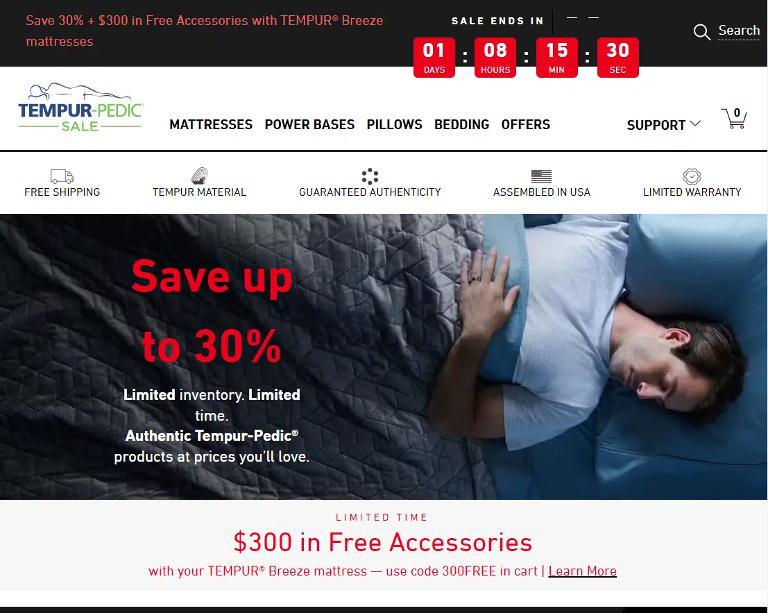
Tip 1: Create unique landing pages for unique audiences
This is not a suggestion to use a unique landing page for every keyword. However, you may consider using designated pages if you have high-performing, high-traffic keywords.
This high-relevancy tactic can improve conversion rates by providing a better scent trail for users so they understand they are in the right place.
Remarketing vs. first-time visitors
However, if you are sending your remarketing traffic to the same landing page as first-time visitors, this should be reconsidered.
What objections, obstacles, or questions did your visitors encounter the first time they visited your site? How can you address these more directly?
Can you offer a special incentive to get the person over the hump to take action?
You can address these items on your designated landing pages for retargeting audiences.
Segment by traffic source
Segmenting your landing pages by traffic source can improve your results even more.
This will allow you to tailor your page content, call to action, and even policy compliance for each medium, such as Google Ads, Google Display, Facebook, Reddit, etc.
For example, your Reddit landing page can have significantly more text than your Facebook landing page to allow this audience to learn and engage.
Depending on each audience’s funnel stage, you can then modify the call to action for the most appropriate stage.
For example, a free guide may be most appropriate for a visitor from a display ad before asking them to commit to scheduling a consultation.
Tip 2: Test smarter
With enough testing, you begin to learn that most thoughtful and researched hypotheses for improvement tend to be duds or will actually lower conversion rates.
Also, it is easy to overly focus on buttons and page colors and lose focus on the items that make big impacts.
Here are some recommendations to help you decrease your rate of failures and/or lackluster results from landing page testing.
Increase their desire to take action before anything else
When someone arrives on your page, their desire to take action is forged almost immediately.
A visitor will judge if they are at the right place and if they found what they want within the first few seconds of a page view.
When conducting a split test, isolate items such as the unique selling proposition, your elements of trust, and how both are perceived.
Focus on the page features with high visibility above the fold, such as headlines, hero images, and the call to action.
For example, we increased a client’s form submissions by over 30% by testing the page subheadline with a trust element versus focusing on relevancy to the target market.
It would be hard to achieve this performance by changing the button color.
Test layouts, not elements
Remember that if you are marketing to people in North America or similar areas, they are generally conditioned to enter from the left and exit from the right.
So, as a standard practice for these audiences, you should keep introduction elements on the left, such as your logo, and exit elements on the right, such as the phone number.
With that insight in mind, it is essential to understand that a page’s layout can significantly impact how users perceive and interact with the content.
Changing a single element may not lead to a significant improvement in conversions.
Testing drastically different designs and layouts will reap much better results and learnings that will help you further improve your performance.
In one test, we used a center-aligned form with a single field against a standard form with three fields aligned to the right. The center form produced a 105% improvement in conversion rates for initiating a multi-step form completion.
The big wins are what you are after.
Tip 3: Begin with the end in mind
If your goal is more leads, the best next step is to analyze your visitor’s goals and how you can help them achieve this on your page.
Eliminate distractions from the goal
The first thing to acknowledge is that people online can be easily distracted. This is why landing pages without navigation will usually perform better.
Typically, you want your landing pages to have one call to action and zero options for clicking away to a different webpage.
Make it easy, fast and convenient
Secondly, and most importantly for mobile users, most users scan and do not read webpage content after clicking on an ad.
Online visitors also do not typically scroll down; if they do, they don’t scroll far.
When someone does scroll, it is best to follow them with a sticky bar so that the call to action stays with them down the page. This prevents them from having to scroll even more once they are ready to act.
Rely more on bullets and pictures than descriptions and content for communicating benefits and establishing trust. Ensure these items are above the fold and little scrolling is required.
Tip 4: Less is more
Mark Twain is quoted as saying, “I didn’t have time to write you a short letter, so I wrote you a long one.”
It takes much more time and effort to write concisely. The conversion rate improvements are worth it, however.
Write clearly and concisely
High-converting landing pages are concise and communicate necessary information with brevity. Well-designed icons, images, and headlines are great at assisting with this.
The easier your content is to understand, the higher your conversion rates will be. The readability of your landing page text should be at a 3rd to 5th-grade level for most industries.
Use readability tools and improve your content so that it is easy to read and understand.
Did you know Ernest Hemingway’s writing score is at grade level 5? As such, your goal is to write intelligently and clearly simultaneously.
User experience trumps design
One major learning we experienced was after designing our best and most beautiful landing page to date.
It was exceptional, and everyone was impressed with the outcome of the design. We launched it, and the lead conversions dropped to zero shortly after.
This is an extreme case, and after we eliminated all other possible explanations, we reverted to the original website. The conversions improved.
Page speed and usability will always beat a great-looking design for conversions. It doesn’t matter how impressive you look.
If users’ needs aren’t served immediately, or they can’t load the page quickly, they won’t convert.
The same is true for legibility. Black text on a white background provides the best contrast for optimum readability.
Accommodate for impairments
It is also true that some users have vision or other impairments and require screen readers and other technology when using the internet.
There are website accessibility and compliance checkers that will scan and score your landing pages. These tools identify issues for screen readers and other assistive technologies to help ensure your content is accessible and usable for everyone.
Test your landing page with color filters to be sure those with color blindness can view and read your page elements.
There are also apps for accessibility adjustments that you can add to your pages that assist with WCAG (Web Content Accessibility Guidelines) and ADA (Americans With Disabilities Act) compliance.
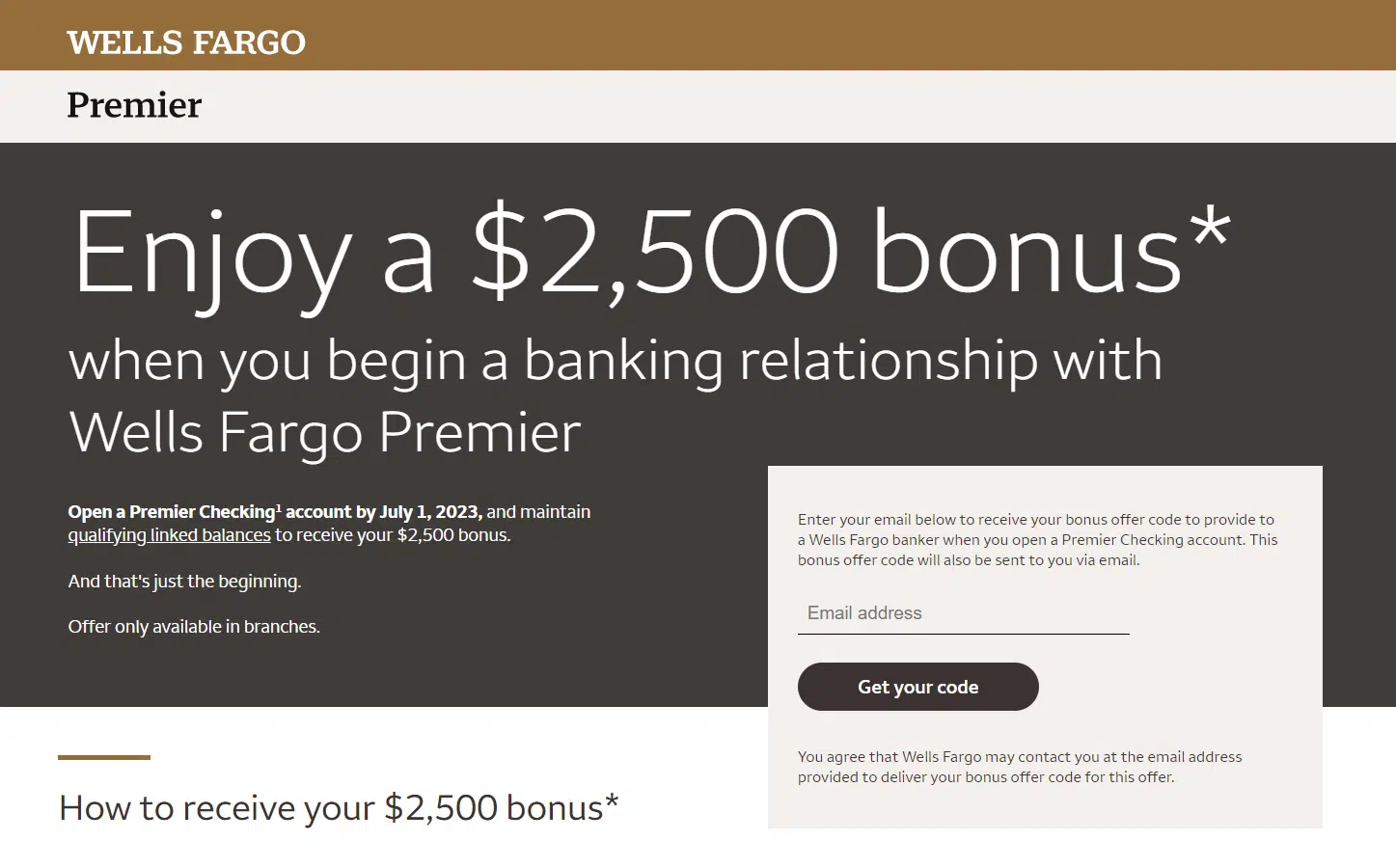
Tip 5: Nothing beats a great offer, if it’s believable
The number one way to win in the marketplace is to advertise a better offer. As long as the offer is believable.
A great offer consists of the following:
- Scarcity and urgency.
- Immediate bonus or benefit.
- Uniqueness and believability.
Providing a great offer is the best and easiest way to improve your landing page conversion rates.
Scarcity and urgency
A great offer incentivizes visitors to take action and is a reason to convert now rather than later.
Having limited availability is an effective way to get someone to act. This is also known as FOMO (fear of missing out).
Brainstorm ways to incorporate FOMO and a sense of urgency into your offer on your landing page with legitimate scarcity, such as with limited availability and countdown timers.
Scarcity and urgency can be powerful tools for improving your conversion rates. It’s essential to use them responsibly and ethically, however.
The more legitimate, the more impactful and believable it will be.
Immediate bonus or benefit
When landing page visitors are offered a free gift or bonus, the overall value of the offer is perceived to be higher.
This can make someone more likely to act and do it now, even if initially hesitant. This is true even with a small item, such as a free gift.
Additionally, providing a free gift or bonus can create a sense of reciprocity and enhance the overall customer experience. This helps to create goodwill for your brand and potentially more referrals.
Uniqueness and believability
If your offer is amazing and hits all the important points, but your competitors are using the same offer, the effectiveness of that offer is going to diminish.
The same is true for your unique selling proposition. If everyone has the same selling proposition, you are not unique.
Get a good sense of what your competitors are offering and go bigger.
Believability is another important factor. Outlandish claims and offers can appear too good to be true. If you are making an incredible offer and people reject it, it is likely not believable.
Legitimate social proof is a great way to make your offer more believable and improve conversion rates overall. Ensure your landing page includes social proof through testimonials, case studies, and reviews.
Embedded and verified reviews are recommended versus the typical website testimonials anyone can add to a webpage. This helps to add credibility and trust. Video testimonials and audio testimonials are great at achieving this, too.
Improve your PPC landing pages for compounding wins
Your landing page conversion rates directly correlate to your customer’s ability to perceive that you are the answer to their needs and desires.
The better you can accomplish this while guiding your landing page users to take action, the better your outcomes will be.
This compounding impact leads to lower acquisition costs, increased investment for more traffic, and scaled growth over time.
Contributing authors are invited to create content for Search Engine Land and are chosen for their expertise and contribution to the search community. Our contributors work under the oversight of the editorial staff and contributions are checked for quality and relevance to our readers. Search Engine Land is owned by Semrush. Contributor was not asked to make any direct or indirect mentions of Semrush. The opinions they express are their own.


