Responsive Design Alone Is Not Mobile SEO
Finally, Google and Bing have both made it official that for mobile search, it is best to have One URL to Rule Them All, something I have been advocating for over 2 years. At the recent 2012 SMX Advanced iSEO session, Cindy Krum stepped in to represent the “one URL” approach in the session’s debate vs the m. strategy. Although the […]
 Finally, Google and Bing have both made it official that for mobile search, it is best to have One URL to Rule Them All, something I have been advocating for over 2 years.
At the recent 2012 SMX Advanced iSEO session, Cindy Krum stepped in to represent the “one URL” approach in the session’s debate vs the m. strategy.
Although the one URL approach with responsive design is preferred by the search engines, that alone is not Mobile SEO.
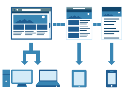
Using responsive design to render for different devices under one URL is a great first step, but that means assuming the same keyword trend and intent applies to all devices.
This article you are reading on Search Engine Land uses simple responsive design via the WP-Touch plugin for WordPress, as it simply changes the presentation for smartphone viewers while retaining the exact same content and the exact same Meta information targeted toward desktop searches…this approach works fine for news and blogs.
For products and services, the search behavior and intent changes, as a user searching for a product on a laptop is more inclined to be looking for the best price and shipping options while the same search on a mobile device has the intent of looking for the closest location and whether it is in stock there – this is when true Mobile SEO is needed.
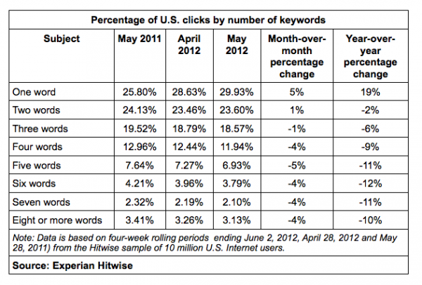
Understanding user intent on different devices is even more important now that singular keyword search terms have increased nearly 20% from last year and long tail terms are decreasing according to a recent Hitwise report.
The key to Mobile SEO is to make sure, along with adjusting the design and content to focus on each device type’s search behavior and intent, that it is further amplified in your Title Tag and Meta Description (as well triggering the proper DocType) under that one URL, using dynamic serving* rather than just a responsive design approach.
This can be accomplished by using dynamic serving on the same URL as Google details how to properly setup this approach. A developer is even trying to coin the term as the RESS method – Responsive Design plus Server Side components – with his own templates. There are plenty of open source templates that do the same thing as it would allow HEAD section flexibility with responsive design while reducing load time.
As a commentor in Tony Wright’s recent article stated, “I know people from some agencies who talk about things like Mobile SEO for instance, and have NOT implemented any of the best practices or even had good quantifiable case to prove their points – yet they are “experts” in the matter.”
So now that proper design and practice have been clarified for Mobile SEO, in my next article, let’s look into actual implementation and achieving higher rankings in smartphone vs. desktop search results.
*Editors’ Postscript: After the initial publication of this article, Google provided the following statement to clarify the difference between responsive web design and dynamic serving, which are actually two different configurations that Google supports:
Both of these configurations serve requests from smartphones and desktops on the same URLs, and the difference between them is:
1. If the site serves the exact same HTML to both smartphones and desktops and uses only CSS to change how the site looks, this is called responsive web design.
2. If the site serves different HTML to smartphones and desktops, or uses client-side Javascript to change the HTML, this is called dynamic serving.
Contributing authors are invited to create content for Search Engine Land and are chosen for their expertise and contribution to the search community. Our contributors work under the oversight of the editorial staff and contributions are checked for quality and relevance to our readers. The opinions they express are their own.
Related stories
About the author