Tips For Multinational Mobile Site Optimisation
In previous posts in this column, I’ve covered the intricacies of multinational search from a technical SEO’s standpoint. Leveraging multinational markup while clearing up in-site duplicate content and avoiding multinational homepage calamities is no easy matter to coordinate for big site SEO. Bringing all of those strategies to bear, and then also attempting to integrate […]
In previous posts in this column, I’ve covered the intricacies of multinational search from a technical SEO’s standpoint.
Leveraging multinational markup while clearing up in-site duplicate content and avoiding multinational homepage calamities is no easy matter to coordinate for big site SEO.
Bringing all of those strategies to bear, and then also attempting to integrate a mobile site strategy would seem, on the face of it, to be a difficult task.
In fact, nothing could be further from the truth.
Mobile Sites, Feature Phones & The Smartphone Revolution
We are fortunate to be living through a time of radical change for mobile website optimisation.
Every year since 2003-2004, I’ve heard well respected industry figures declaim the ‘Year of Mobile’, only to be sorely disappointed when it comes down to looking at where their client’s online revenue is being generated (with the notable exception of gaming, of course).
The last couple of years have seen mobile-derived revenue finally push on to the point where we are genuinely on the cusp of smartphones (and of course tablets) taking centre stage.
This is especially true for retailers. And you can multiply that sentiment by 10 for multinational brand retailers.
So why now?
If you’ve ever tried to make a purchase through a feature phone (AKA: a ‘dumb’ phone), then you’ll know the answer.
Smartphones and tablets provide a genuinely convenient and pleasurable shopping experience, whether via applications or HTML5, or simply thanks to clever adaptive CSS styling.
They also allow big sites to avoid the common SEO pitfalls of deploying a specially created ‘Mobile’ website intended for feature forms. To demonstrate my point, step forward UK hardware supplier B&Q, owners of the SEO friendly domain ‘diy.com’.
The Pitfalls Of Mobile Content Duplication
Using our site operators we can drill through B&Q’s domain to spot the issue created by their current mobile deployment.
We can see that for a domain with 937,000 indexed pages initially listed in Google’s cache, a chunk of 50,000 are caused by the entirely duplicate m.diy.com subdomain: their mobile website.
(Of course, a rather larger chunk of 108,000 are caused by their ‘Asset Bank’ feature: if you’re reading B&Q, please do check out the clearing up website duplication tips I linked to earlier.)
We can also see that because the mobile site is cached in Google’s main index, they will return pages like this and this for users searching on desktop computers, creating extremely bad brand experiences and the cause of massive bounce rate issues which have a knock on effect on the domain’s SEO value as a whole.
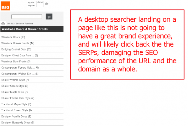
A B&Q mobile page indexed in Google's main SERPs.
Effectively, the poor performance of the mobile pages will damage the performance of the ‘main’ website pages. So rather than providing value by being useful for feature phone users (who tend not to make a purchase via their phones anyway), they in fact detract value and lower sales.
So why has this happened and what’s the solution?
B&Q have done the right thing: they are catering to their customers regardless of their browsing device. This is a good thing.
Unfortunately, they have not followed Google’s advice for registering mobile only pages in their mobile search engine. And so, they have ended up creating issues and failing to reach their intended audience.
By listing their mobile URLS in a Mobile sitemap.xml, and using (and declaring!) a mobile markup standard such as XHTML MP 1.2, cHTML or WML 1.3, B&Q could disambiguate their mobile content from their destop-intended pages and Google would reflect that in their indexing.
For a belt and braces approach (always preferred if you ask me!), using the robots.txt to restrict access to the m.diy.com subdomain to mobile user-agents only (for example Googlebot-mobile) would prevent the poor brand experience and SEO duplication issues in their tracks.
A Modern Mobile Website
However, if you are contemplating building a mobile site today, then I’d suggest you do none of these things, and instead break out a bit of CSS3.
By indicating the ‘media’ value for your stylesheets using CSS3 mediaqueries, you can pass different stylesheets based on the width of the browser used. For example, a value of “max-device-width:480px” would mean the contents are only used for the most common smartphone browser width.
You could be as granular as you like and provide small and full-size tablet width layouts, or indeed provide a unique layout for very wide monitor widths for more high value boutique brands looking to make a splash when visited by higher net worth individuals. The possibilities are extensive.
So detecting the user-agent (your browser, for example) display width is a snap, and serving different styling to a well structured XHTML (or, even better, HTML5) page means to can use exactly the same content – and therefore URLs – for your desktop or mobile devices. So, no duplication.
With HTML5’s additional strength as a surrogate phone/table app replacement, building to this specification allows extremely valuable future linkbait promotion of features without the additional expense of specific device application development.
We use that approach on QueryClick’s company website, so try it out in different devices (and of course feel free to copy out the code for your own purposes, I’d be pleased to hear what you make of it) and see how it scales from mobile, through to desktop all with just a small change in the CSS.
Contributing authors are invited to create content for Search Engine Land and are chosen for their expertise and contribution to the search community. Our contributors work under the oversight of the editorial staff and contributions are checked for quality and relevance to our readers. Search Engine Land is owned by Semrush. Contributor was not asked to make any direct or indirect mentions of Semrush. The opinions they express are their own.
About the Author


