When Responsive Web Design Is Bad For SEO
In my January column I resolved not to discuss the responsive Web design issue anymore, as the One URL versus multiple URL issue is moot now that Google has announced a way to consolidate link equity for equivalent mobile URLs. Unfortunately, the rest of the SEO community isn’t following suit, as responsive Web design still […]
In my January column I resolved not to discuss the responsive Web design issue anymore, as the One URL versus multiple URL issue is moot now that Google has announced a way to consolidate link equity for equivalent mobile URLs. Unfortunately, the rest of the SEO community isn’t following suit, as responsive Web design still seems to have the undeserved reputation for being the best option for SEO.
In reality, mobile URLs could be the best option for SEO, depending on your circumstances.
The Madness Of Crowds
For example, though I praised her in my last column for sharing her mobile SEO process, and in general, I think she provides good information on mobile SEO, Aleyda Solis also provides this flowchart in her process as a way of helping businesses understand their options for developing mobile sites based on what is preferable for SEO:
![mobile-seo-site-architecture-flowchart[1]](https://www.stateofsearch.com/wp-content/uploads/2013/01/mobile-seo-site-architecture-flowchart.jpg)
Flowchart represents the myth of responsive web design’s superiority for SEO.
In fact, Google never introduced such a hierarchy when they announced their preference for responsive Web design last June. All they said was they prefer responsive Web design, and if it’s not best for your user, then they support dynamic serving and mobile URLs. The one URL argument for dynamic serving and responsive design’s superiority is moot with the introduction of switchboard tags, as Google can now understand which site should appear when, regardless of URL structure.
Let me say that again, as those who write about these issues don’t seem to be getting it otherwise:
The one URL argument for dynamic serving and responsive design’s superiority is moot with the introduction of switchboard tags, as Google can now understand which site should appear when, regardless of URL structure.
Not just doing that for Aleyda’s benefit, as Aleyda presents mostly good information, and many others are making the same honest mistake.
In a recent poll of SEO firms and MBAs, 100% of respondents said that responsive Web design is preferable for SEO than separate mobile sites. Really? Always?
Really, it seems these days everywhere you turn there’s someone somewhere claiming that responsive Web design is preferable to separate mobile sites for SEO because all of the links go to one URL. To this I say…

For example, in the otherwise excellent new book Mobile Marketing an Hour a Day by industry veterans Noah Elkin and Rachel Pasqua, Covario’s Nick Roshon states his preference for responsive Web design for SEO, citing consolidated link equity as evidence of responsive Web design’s superiority for SEO. He even gives this curious statement: “While Responsive Web Design may be harder to implement, and there may be user experience reasons to go with alternative mobile web design standards, the benefits of going responsive are undeniable.”
Actually, they could be deniable, depending on the site that’s going responsive. In fact, the benefits of responsive Web design are often negated by the cons. If mobile URLs or dynamic serving provides a better user experience, then Google does not suggest that you make your site responsive, but instead provides options to give you the same benefits of consolidated link equity on mobile URLs.
Unfortunately, Google did not mention any of the instances when responsive Web design provides an inferior user experience, leaving it up to individual webmasters. They’re very concerned with confusing webmasters, it seems, and didn’t want to confuse the issue, I assume, by getting into those scenarios where responsive Web design would not be preferred.
When I reached out to them for this article, Google has officially declined to comment. However, based on the limited information they have provided, empirical evidence of what’s working in SERPs, and my twelve years optimizing content professionally, this is a list of five things that will make mobile URLs or dynamic serving a more attractive option for you for mobile SEO.
1. When Desktop Website Does Not Contain Categories Mobile Searchers Are Looking For
In the example I used on the Stone Temple blog in January, Mercedes has serious information architecture issues that are preventing it from connecting to searchers in general. Their content for car types is not accessible, let alone optimized, and making that site accessible to smartphones and tablets is not going to solve these serious information architecture issues. Mercedes could redesign their site, and then make it responsive, and that would solve some of their problems, but if they make their current site responsive, they will have the same issues that they do now.
Similarly, the desktop website doesn’t have information on mobile content like mobile wallpaper or apps. Why should it, in fact, when desktop searchers by and large aren’t looking for those things? Yet, mobile searchers are in droves, and if Mercedes simply makes their current site responsive, they will miss out on all that traffic.
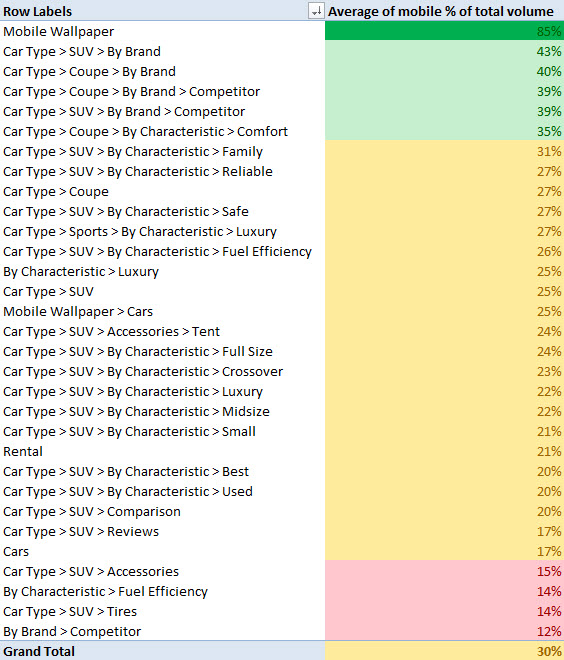
Mercedes would miss out on traffic from the categories in green if they made their current site responsive.
Responsive Web design advocates: missing out on relevant traffic is not optimization.
2. When Desktop Website Does Not Contain Keywords Mobile Searchers Are Using
As I explained in last month’s mobile keyword research guide, context can change the keywords searchers use and the frequency with which they use them.
For example [nearby] and [download apps] are two keywords that are likely used a lot more on mobile devices than they are on desktops and laptops (if they’re used on desktops and laptops at all).
Desktops and laptops lack GPS, so if a searcher asks Google for restaurants nearby on their laptop, they’re likely to get results based on IP address if they’re not logged in (which in the case of my laptop, the server in New York city, 800 miles away), and if they are logged in, results based on the city they’ve specified in their registration.
If a searcher asks her smartphone for restaurants nearby on the other hand, the results are much more accurate as they’re based on the position of her phone at the time of the query.
It’s likely because of this that many more people use the keyword nearby in mobile searches than they do in desktop searches. As you can see from this mobile % of total volume chart, most of these searches are coming from mobile phones. The two that don’t come from mobile phones specify a location, which Google desktop search needs if it’s going to provide accurate search results.
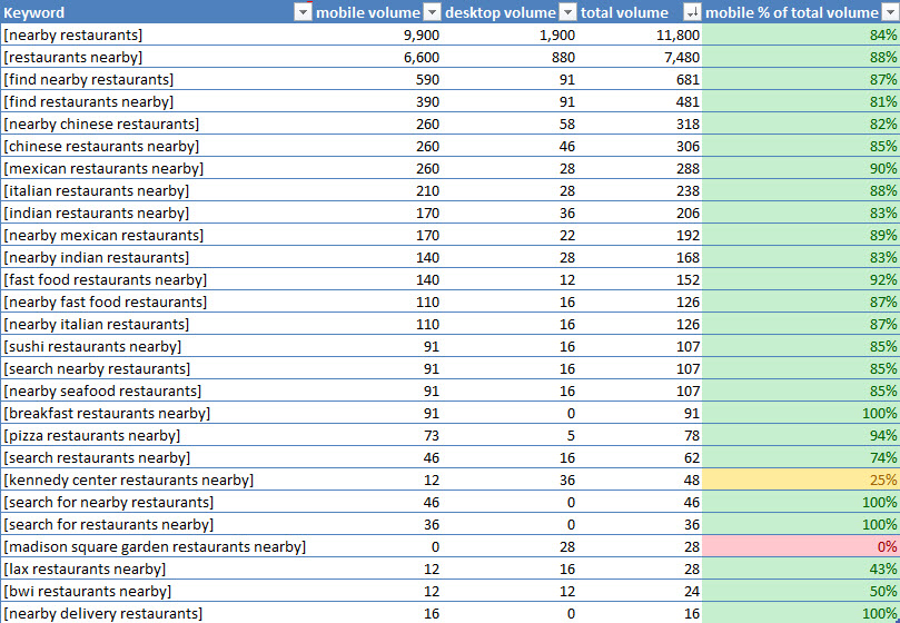
Certain keywords, like “nearby” are primarily used by mobile phone searchers, and can’t be used in a responsive design.
You can take this information into account and use these keywords in adaptive content on a responsive site, but it’s going to be more effective from an SEO standpoint to optimize both sites with different keywords depending on the platform.
Look, Google may have announced their preference for responsive Web design, but they also tell webmasters in their Webmaster Guidelines, “Think about the words users would type to find your pages, and make sure that your site actually includes those words within it.”
In cases where mobile searchers and desktop searchers are using different keywords, the best option for SEO is the option that brings more qualified traffic: separate sites with targeted keywords.
3. When Responsive Layout Increases Load Time Significantly
We already know that speed is a ranking factor for SEO, but we also know that Google wants to send searchers to the best possible experience. Sites using responsive Web design, which by nature include more code than mobile websites, generally take longer to load.
Apart from the ranking factor of page speed, this could increase your bounce rate and/or decrease your conversions. According to Google research, mobile searchers are a fickle group, and won’t stick around if you make them wait.
![SearchEngine639x338[1]](https://searchengineland.com/wp-content/seloads/2013/02/SearchEngine639x3381.jpg)
Recent research presented on https://www.howtogomo.com/en/d/why-go-mo/#reasons-mobile-matters shows the dangers of making mobile searchers wait.
Now of course, if you were just providing a desktop site that makes a user pinch and zoom to perform simple actions, providing a responsive site is a step up from that. But it’s not the ideal in this situation, which would be serving fast clean code with dynamic serving or separate mobile URLs.
Of course, there are ways, as covered by Sherwood Stranieri last year, that webmasters can speed up responsive sites, but they’re still unlikely to load as quickly as separate mobile sites.
4. When Target Audience Primarily Uses Feature Phones
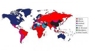
Don’t go responsive if you want to be visible to the red countries on this map, as they primarily use feature phones to access the Web.
This one, I didn’t have to speculate on, as Google has guidelines for developing for feature phones and smartphones that do not include responsive Web design. So, if you’re developing for an audience that uses feature phones (i.e., non-white, non-US-based, not affluent, and/or older), responsive Web design is not the best option for SEO.
5. When It Prevents Product Innovation That Improves The User Experience
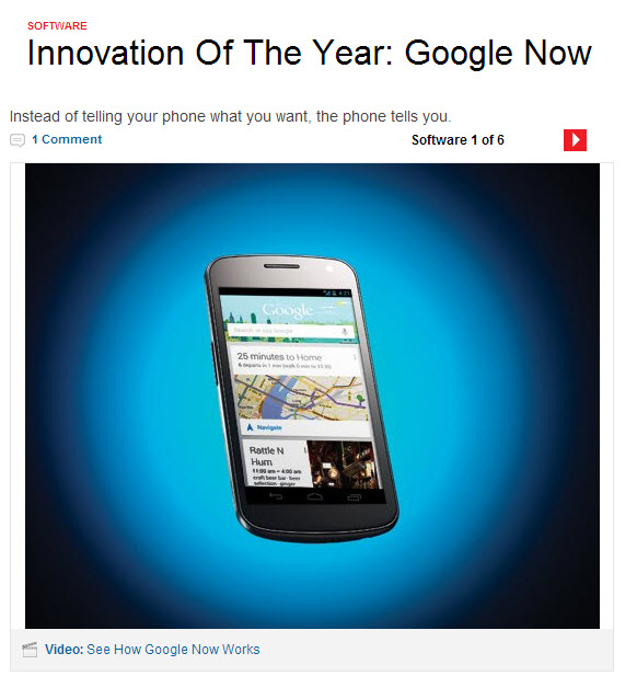
Google Now wins the Popular Science Innovation of the Year Award in 2012, as a direct result of not following Google’s own advice about responsive web design.
Yes, Google may have stated a preference for responsive Web design, but they also say this in their Quality Guidelines: “Think about what makes your website unique, valuable, or engaging. Make your website stand out from others in your field.”
Some businesses have taken this to heart with mobile, and have created products that can only be used on mobile devices that help their user do what they need to do faster.
Take banking, for example. JP Morgan Chase could have reformatted their desktop website for mobile visitors and called it a day. Instead they thought about the specific properties of mobile devices that they could use to make their customers’ lives easier. And for them it meant creating a separate mobile website, allowing for SMS banking, and creating a mobile app.
The mobile app has a feature called Quick Deposit which uses the device’s camera to allow users to take pictures of checks for deposit. It’s mobile-specific content, as it’s only available on tablet and smartphone, and it has been a huge success for Chase.
According to a recent press release, since launching Quick Deposit in 2010, consumers have used it to deposit more than $4 billion, and the number of active Chase mobile customers increased 42% between 2011 and 2012. The app now has 15 million registered users, and several awards including a 2011 Webby Award. And those 15 million registered users have expressed their gratitude with 4.2 out of five stars in Google Play with over 70k reviews as of this writing.
Had Chase not considered the unique characteristics of mobile devices and the utility that they could bring to consumers, but instead only reformatted adaptive content to appear in a mobile context, they wouldn’t have been able to have the success they’ve had, and wouldn’t have been able to serve their users as they did.
Or, take Google, for example. Their stated preference in responsive Web design hasn’t stopped them from making mobile-only content. One of these features is called Google Now. Released just seven months ago, it’s now a big differentiator for Android over iOS, with reviewers saying things like “But the jewel of Android 4.2 is absolutely Google Now, and its brilliance overshadows the still lacking aspects of the OS as a whole;” and “This latest Google Now ad has me hating Siri.”
Google Now has been such a big innovation for Google that it won them Popular Science’s Innovation of the Year, putting it in the company of such innovations as former award winners like the iPhone, the fluorescent lamp and the Mosaic Web browser.
Google could have made their content adaptive and responsive and not considered the mobile context. But they didn’t, and their business is better for it.
In fact, Google itself is an interesting organization; although they have stated a preference for responsive Web design, and the CEO has made disparaging remarks about mobile content, they also develop for mobile, tablet and desktop search separately, and on the mobile ads side, they have advocated strongly for experiences in which mobile context increases the relevance of the ad. Regardless of which side you’re on here, it’s possible to use Google viewpoints to justify your own. Think, instead, of your user, as that’s ultimately what will serve your business (and Google) best.
You may be making a responsive site because it’s easier to maintain, but is it preventing you from creating mobile-only content that your users will love, and that will differentiate your site from your competitors’ in the marketplace? If so, think twice about responsive Web design or adaptive content, as it’s not going to help your business — or your SEO — as much as mobile-specific content.
Granted, the two aren’t mutually exclusive, and the preferred method for mobile SEO that I detailed last year is still a hybrid of responsive pages and mobile-specific content.
A Revised Decision Tree
The message: if you’re thinking about mobile SEO, throw away the decision tree I mentioned earlier. Apart from the one URL fallacy, one of the decision points isn’t even SEO-specific, as it is more about the businesses’ resources than optimizing their content for search results.
Replace it with this. It’s not perfect, as deciding the proper configuration for your mobile content is a nuanced process; but it should get you closer to optimal than what’s been provided in the past.

Don’t Be A Responsive Bandwagoneer
Not everyone thinks responsive Web design is best for SEO, though it can sometimes seem that way to those of us who know better. Adam Audette and George Michie of Rimm-Kauffman Group said in their classic post on marketing as applied science, “Mobile websites: Responsive design helps, but smartphone users have fundamentally different needs and only a site designed to meet those unique needs will produce the best outcome for the user and for the business.”
This is a similar message offered by GigaOM Pro recently, which cites unique mobile use cases and speed as reasons why they advocate separate mobile sites. Likewise, when I interviewed veteran mobile SEO expert Cindy Krum for .Net Magazine, she said that she also advocates a hybrid approach: “I have been recommending a mixed solution for most of my clients – leveraging Responsive Design when it makes sense, and special mobile-only landing pages when keywords or use-cases cannot be appropriately addressed with a Responsive Design approach.”
Finally, Forrester Research, in their 2013 Mobile Trends for Marketers report, said that “Responsive design will be hyped once again in 2013.” Responsive design is not a “magic elixir” they say, because “1) The consistency of experiences across devices is only one small element of the overall picture; 2) companies will need divergent app and Web strategies as well as mobile content and service curation; 3) not every portable/mobile device will have a browser; and 4) supporting different use cases across devices requires a process to implement responsive design principles.”
If you’ve read this post and you still think responsive is best for SEO, that’s your prerogative; but your competitor who provides a better user experience with mobile landing pages might be getting more traffic from search.
TL;DR Recap
- It’s a popular myth that responsive Web design is always the best choice for SEO
- The one URL argument for dynamic serving and responsive design’s superiority is moot with the introduction of switchboard tags, as Google can now understand which site should appear when, regardless of URL structure.
- If any of these questions apply affirmatively to your business, dynamic serving or mobile URLs may be the best option for you for SEO:
- Is desktop website missing categories mobile searchers are looking for?
- Is desktop website missing keywords mobile searchers are looking for?
- Is site speed important for conversions on your site?
- Can the user experience be improved using mobile features not available on desktop (e.g. camera, scanner, GPS, etc.)?
- Are you targeting any users with feature phones (i.e., non-U.S., non-affluent, non-white, older)?
Contributing authors are invited to create content for Search Engine Land and are chosen for their expertise and contribution to the search community. Our contributors work under the oversight of the editorial staff and contributions are checked for quality and relevance to our readers. The opinions they express are their own.
Related stories
About the author