5 More Landing Pages Tests To Improve Performance
Now that you’ve had a chance to implement 7 Landing Page Tests You Can Run Tomorrow, I have a few more weapons you can add to your SEM testing arsenal to improve landing page performance. 1. Don’t Provide Too Many Options In the last 10 years, I’ve only seen a home page convert better than […]
Now that you’ve had a chance to implement 7 Landing Page Tests You Can Run Tomorrow, I have a few more weapons you can add to your SEM testing arsenal to improve landing page performance.
1. Don’t Provide Too Many Options
In the last 10 years, I’ve only seen a home page convert better than a specific landing page once. As a general rule of thumb, with PPC advertising, the best conversions come from driving people to very specific pages with limited options.
The screenshot below is an example of a page that would lead to poor conversions. This page goes on and on with t-shirt options (for the record, this screenshot shows only 1/3 of the page), and there’s a lot going on at the top of page with top picks, high-tech options and hot trends.

Too many options on a page tend to confuse people and cause visitors to bail or press the back button. The basic suggestion is to break down products into distinct product lines. If you’re interested in presenting information in a grid, a 2 x 3 grid format tends to work well.
The screenshot below is an example of a good page. There are fewer options on the page and hyperlinks to get to more info if needed.
Google Shopping Ads are also a good alternative if you have a Google Merchant Center account. Take a look at my article, Google Shopping Ads: What We’ve Learned So Far, for more tips and tricks on how to set these types of ads up.
2. Choose Your Images Wisely
Images of people looking at product, a call-to-action on a page, or a lead form tend to convert better than images of people looking directly at the camera. Here’s an example of a US senator who is the spokesperson for AAG looking directly at the camera. This type of picture tends to intimidate visitors and decrease conversions (in this case, generating a lead).
The following is a better example. Note that the man is looking at the Find out More button.
This page converted well, so let this be a lesson: Don’t get caught up on the “prettiness” of a page and focus on solid testing elements. I’ve seen some very ugly looking pages convert like crazy, and the BLR page above is a very good example of this.
3. Use Privacy Seals (But Be Careful)
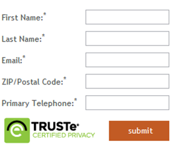
It’s always a good idea to include a privacy seal, but be careful about where you place it on a page. Conversions decrease if placed next to the call-to-action on a page.
In the example below, there was a 12.6% increase in lead form submissions with no TRUSTe sign beside the call-to-action. Generally speaking, a privacy icon located close to the call-to action-causes anxiety and places concerns in the minds of consumers. This obviously decreases overall conversions.
4. Break Down Your Sales Process
It’s not always the best strategy to go for the sale immediately; in those cases, ask yourself if there’s a way you can break down your sales process. Get a little information at the beginning and then continue the conversation. Try it — it could help with conversion rates. Here are a couple of examples:
- Get basic contact information on a lead form and then follow up by phone to get more information and “close” the sale.
- Use a two-page quote form. On the first page, get basic info (like email address); on the second page, ask for any additional information needed for you to provide a quote. If people bail after the first page, you can always reengage them via email and try to get them to provide additional information.
5. Vary Page Layouts
Try different page layouts in your conversion optimization testing. Here are several examples to consider:
- A 2-column vs. a 3-column layout
- Larger images vs. smaller images
- List view vs. grid view (category pages)
- Video vs. no video
- Bullet points within copy (instead of blocks of text)
Here’s an example of a site that I really like. It incorporates a good image of their interface at the top of the page and 2 options at the bottom of the page that utilize a two-column look. The bullet points allow you to see what Buyfolio does quickly & easily.
When you use the above testing options on your landing pages to improve performance, you will also improve the profitability of your paid search marketing campaigns. So, let’s get started!
Contributing authors are invited to create content for Search Engine Land and are chosen for their expertise and contribution to the search community. Our contributors work under the oversight of the editorial staff and contributions are checked for quality and relevance to our readers. The opinions they express are their own.
Related stories
New on Search Engine Land


