Does Mobile Search Matter In A Multiscreen World?
This is my 25th mobile search column and my 30th post for Search Engine Land in almost four years. Mobile search has evolved quite a bit since I started writing this column in 2009, and even more since the iPhone turned everything on its head in 2007. In my first column, I argued that the […]
This is my 25th mobile search column and my 30th post for Search Engine Land in almost four years. Mobile search has evolved quite a bit since I started writing this column in 2009, and even more since the iPhone turned everything on its head in 2007.
In my first column, I argued that the iPhone didn’t kill mobile SEO, saying that it instead made mobile searching mainstream, and ushered in a whole new type of searching that Google and SEOs would have to account for at some point.
I still believe this is true today, almost four years after that first article; but, there are many still who argue that mobile search doesn’t really matter—that search is search, and the devices that people use to search don’t necessarily give clues to their intent.
The Argument For Ubiquity
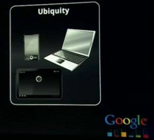
Google slide on ubiquity from their Inside Search event from June 2011
In the early days of mobile, many people thought it would create a medium completely separate from the Internet.
In early 2008, Al Ries wrote in AdAge about a phenomenon called MobileNet, which he said would be “an even bigger medium for active advertising than the Internet,” as though the Internet were one thing, and the MobileNet something different entirely.
He envisioned a time when a different kind of website would be constructed that would make use of scanners, GPS and voice recognition to provide a new kind of real-time utility to people that static information on the Internet wasn’t quite able to do.
Though he clearly got some things wrong (he called these sites dot-mobis, for example, when most of the sites made for mobile consumption today are actually dot-coms), his description of what was possible with these new devices sounds a lot like what many have done with the best mobile apps and sites today.
Yet, the mobile Web isn’t what a lot of people thought it was going to be. For one, it doesn’t always fit in your pocket. With the popularity of the iPad, consumers now have a mobile device that is technically mobile, but is large enough to be used mostly for entertainment and shopping at home.
Phablet anyone? The phone/tablet hybrid Galaxy Note is one such device that blurs the lines between mobile hardware. And, with the iPad Mini, Nexus 7 and Kindle Fire, many devices now exist that are not quite tablets, not quite smartphones, but a combination of the two.
With the looming Internet of Things, we also have Internet access in cars, picture frames, refrigerators and more that make it even more difficult to know from the hardware the intent of the target audience. Is someone looking for sports scores in his car mobile, per se? Is someone looking for recipes at his refrigerator mobile?
To further complicate matters, the mobile Web is also not always mobile. We know now that many users use their smartphones at home. According to Google research, 97% of consumers are in this category.
Google research also tells us that tasks are accomplished on multiple devices, and research started on a smartphone may lead to a conversion elsewhere. Also, that consumers expect information they put in or researched on one device to be available on another.
This is the principle of ubiquity, which Google highlighted at their Inside Search event last year, and which Google CEO Larry Page mentioned on his earnings call late last month. It has caused some to believe that the need for distinctions between mobile and desktop is as relevant today as the first Motorola Razr; but, this isn’t entirely true.
A Case For Mobile Search And Ubiquity
As regular readers of this column know, device fragmentation has led many to conclude that responsive design and adaptive content is an ideal solution for solving the problems inherent with device fragmentation and user intent.
NPR’s content strategy of Create Once Publish Everywhere (COPE) has become a model of efficiency for many in the mobile, content, design, and SEO communities.
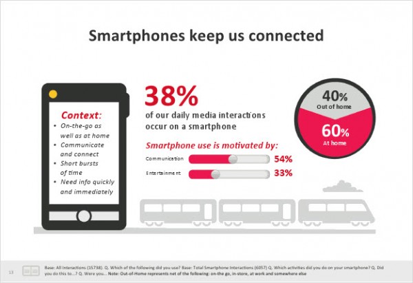
Slide from Google’s recent study “The New Multi-Screen World” that shows the unique characteristics of smartphone users.
This is in direct contrast to the MobileNet model, which demands that brands consider the mobile context and the unique use cases that it might create, and publish separate content to address those use cases, if it is beneficial to the user and the brand.
What we as marketers need to realize is that these two philosophies need not be mutually exclusive. Yes, mobile users aren’t necessarily mobile and might be looking for the same content that desktop users are looking for.
But also, yes, a person’s informational needs are likely different based on the device that they use, and optimization would entail creating native landing pages tailored to that device.
Consider the following:
- In the same research where Google examines multi-screen behavior, it concludes that “consumers shop differently across devices, so businesses should tailor the experience to each channel. It’s also important to optimize the shopping experience across all devices. For example, consumers need to find what they are looking for quickly and need a streamlined path to conversion on smartphones.”
- Google also says in the same research, “Consumers turn to their devices in various contexts. Marketing and websites should reflect the needs of a consumer on a specific screen, and conversion goals should be adjusted to account for the inherent differences in each device”
- Google recommends responsive design for smartphone experiences to most webmasters, but has separate user interfaces and algorithms for mobile and tablet search.
- In May of this year we introduced the mobile variance by category concept, which demonstrated that people search differently depending on their context. Google has since confirmed this, most recently in What Users Want from Mobile Sites Today and The Meaning of Mobile, indicating how mobile typically differs from every other channel. Microsoft has released similar research about mobile’s role in the consumer journey with similar results. It may be a myth, as Brad Frost says, that mobile users don’t want access to the same content that desktop users have; but that doesn’t mean that they wouldn’t prefer that we catered the experience to their specific device, especially if their needs are much different on mobile than they are on desktop.
It might not be the most efficient model, but if we want to continue to be relevant to our users, and ultimately monetize mobile as a channel, we need to understand how mobile search is different from desktop and tablet search, changing our websites and marketing accordingly.
Many of us may find similar behavior on desktops and mobile devices, presenting similar content. But, that doesn’t mean that multiscreen behavior and a desire for ubiquity have negated the need for platform-specific content. MobileNet, along with WAP search, dotMobis, iMode et al may be distant memories for most these days; however, mobile search and catering to a specific platform with websites and marketing matters as much (if not more, since there are more mobile users today) than it ever has.
Contributing authors are invited to create content for Search Engine Land and are chosen for their expertise and contribution to the search community. Our contributors work under the oversight of the editorial staff and contributions are checked for quality and relevance to our readers. The opinions they express are their own.
Related stories
About the author