Google Analytics Gains “Napoleon’s March” Flow Visualization Charts
Google Analytics announced a new set of reports that should help marketers and website owners to understand how users behave on their websites. The feature was presented this morning during Web 2.0 Summit, on a keynote delivered by Susan Wojcicki (SVP of Google, Advertising) & Phil Mui (Group Product Manager, Google Analytics). This feature is […]
Google Analytics announced a new set of reports that should help marketers and website owners to understand how users behave on their websites. The feature was presented this morning during Web 2.0 Summit, on a keynote delivered by Susan Wojcicki (SVP of Google, Advertising) & Phil Mui (Group Product Manager, Google Analytics). This feature is an interesting solution to an old problem: analyzing paths throughout a website in a scalable way.
Path analysis has historically been a feature that provided little insights on user behavior, mainly because visitors behave in such non linear ways that it is hard to learn something from their paths, even when looking at aggregated data. The best option to path analysis has been to analyze micro conversions, i.e. looking at each page and trying to learn if the page has fulfilled its objective. However, the visualizations below bring some interesting approaches that will be very helpful for web analysts.
Flow Map Visualization
In terms of data visualization, this feature is probably the most advanced since Motion Charts, which is a highly advanced visualization that can be used to view five dimensions in one chart.
As some might recognize, the visualization used on this feature is very similar to the one created by Charles J. Mainard shown below. This image, created in a 1869 to describe Napoleon’s disastrous Russian campaign of 1812, displays several variables in a single two-dimensional image (source: Wikipedia):
- The army’s location and direction, showing where units split off and rejoined
- The declining size of the army (note e.g. the crossing of the Berezina river on the retreat)
- The low temperatures during the retreat.
Google has used this visualization to skillfully present website usage.
Visits Flow Report
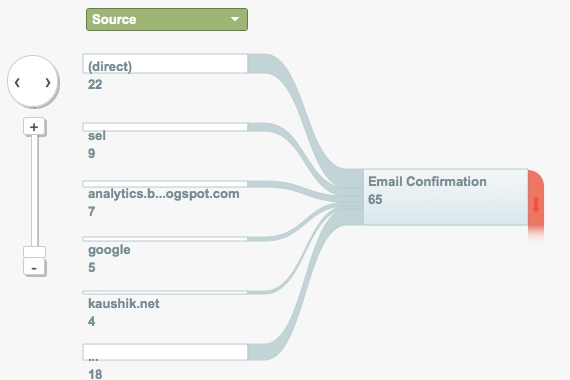
This report shows the navigation flow for a specific segment of users, either a traffic source, country, browser, or any other segment that can be chosen from the drop down on the report (green box). We will see the pages that started the section for this segment and the following interactions (1st, 2nd, 3rd, etc). Interactions can be added and removed, and the circle with the arrows on the left of the chart can be used to navigate between the interactions.
The connections between the pages represent the number of visitors who went from one node to another. Larger connections represent a larger % of visitors; red connections mean visitors left the site; looping connections mean they navigated to another page in the same node. The number of connections shown can be controlled using the slider above the chart.
Goal Flow Report
This report is a representation of goal conversion per segment of visitors (segments can be chosen as mentioned above). This visualization is welcomed as it enables analysts and managers to see goal conversion per any segment in one centralized place and with a great UI. Any goal can be seen on the chart, although as of this first release, Flow Visualizer supports only URL Destination goals. You can find the Goal Flow visualizer in the Conversions > Goals section of the “Standard Reporting Tab.”
Flow Navigation Report
This report enables Google Analytics users to divide websites into sections and learn how visitors navigate between those sections. An interesting case would be for ecommerce sites to understand how visitors navigate between search, category, product and cart pages; this would bring an important understanding that could be applied to site navigation structure. Below is an image showing the setup page:
In this interview with Phil Mui and Paul Murret (Director of Engineering, Google) talk about Google Analytics developments and future
Contributing authors are invited to create content for Search Engine Land and are chosen for their expertise and contribution to the search community. Our contributors work under the oversight of the editorial staff and contributions are checked for quality and relevance to our readers. The opinions they express are their own.
Related stories
New on Search Engine Land


