Google Instant Provides A Hint For Local & Mobile Optimization
Undoubtedly, you may have seen Google’s Instant Preview interface which provides glimpses for webpages listed in SERPs. What you may not be aware of is that they’ve added sophisticated code to make it unique on mobile devices. These Instant Previews provide compelling evidence that mobile optimization continues to be important. Google rolled out Instant Previews in November 2010, […]
Undoubtedly, you may have seen Google’s Instant Preview interface which provides glimpses for webpages listed in SERPs. What you may not be aware of is that they’ve added sophisticated code to make it unique on mobile devices. These Instant Previews provide compelling evidence that mobile optimization continues to be important.
Google rolled out Instant Previews in November 2010, and a number of marketers immediately began to try to tweak website elements to optimize the preview views and callout text.
Yet other types of sites, such as news publications, were slightly irked that Google deployed the feature without observing “noarchive” requests already programmed into sites (some sites have reason to opt out of allowing cached views of their webpages, and Instant Preview is yet another type of cached view, albeit in something of a large, graphic thumbnail format).
Still, relatively few marketers may have noticed that a discretely unique form of Instant Previews also rolled out for smartphones (supported for Apple iOS4 and Android version 2.2+ devices), and even fewer may have connected the dots to understand the implications of the mobile-only previews of webpages.
First, a few screenshots of the difference between web based Instant Previews and their mobile siblings.
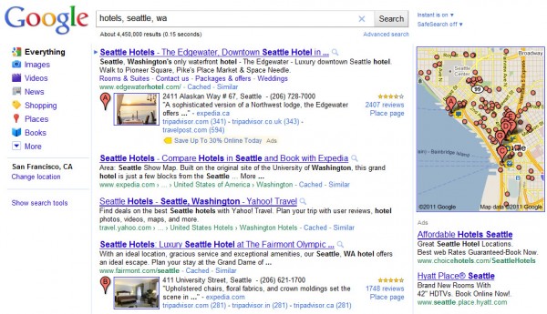
In a regular websearch for “hotels, seattle, wa” on a PC, the instant preview magnifying-glass icons appear beside webpage links listed in the search engine results page (“SERP”):
If you click on the magnifying glass beside a listing, you can see an Instant Preview of the webpage. Here’s the one for the Expedia page in the results:

Here’s the Instant Preview for the Fairmont Hotel in the same SERP:

I discovered that these two pages have been optimized for mobile.
Incidentally, a quick way to see which pages are listed in a set of Google mobile search results is to search for them on Google’s legacy XHTML search interface — the mobile optimized results will have small cellphone icons adjacent to them:
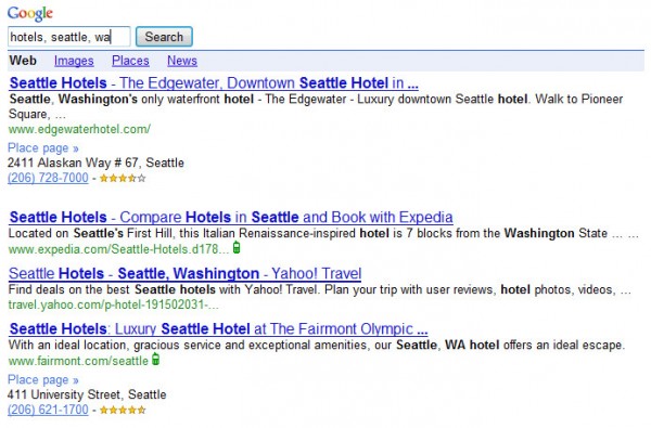
Now, if you look at the Expedia and Fairmont pages, they’re pretty large and complex in layout, so viewing them on handheld devices would not be all that great. Yet, you can see from the cellphone icons that they have been customized for mobile phone interfaces.
If we pull up Google on a smartphone such as an Android, and search again for “hotels, seattle, wa”, this is what we’ll see:
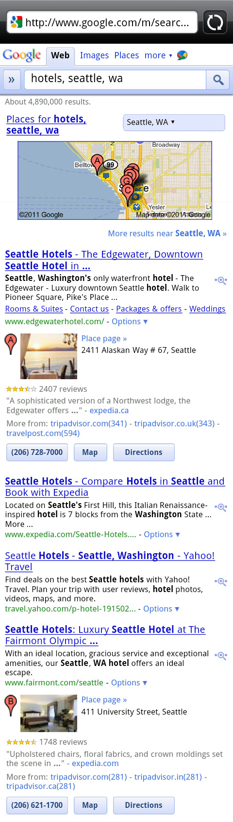
You can see that the magnifying glass icon for the Instant Previews button in Google’s search results is a little bit different, having dots to either side, indicating that the interface allows a sort of pagination for the previewing of each of the pages in the search results.
Since the interface for mobile devices is necessarily small, this pagination functionality is very helpful and allows one to browse through the previews without having to flip back and forth from the regular web search results page.
What’s interesting when viewing the search results on a smartphone with an Android operating system (like I’m using here) is that you’ll get quite a different Instant Preview for the same webpage — in fact, you get the mobile version of the page, for those which have alternate versions for mobile.
Here are the mobile Instant Previews for the Expedia and Fairmont Hotel pages:


In each case, both Expedia and the Fairmont Hotel have optimized for mobile devices, paring down the pages and simplifying to fit a smaller interface.
The implication of Google’s differential Instant Previews for mobile versus regular version webpages is this: Google is still paying attention to whether a webpage has mobile-friendly alternative versions, and they may prefer that version of a webpage for users who conduct searches on mobile devices.
As cellphones have become more sophisticated, and they’ve grown better at interpreting regular webpages for viewing on handhelds, one could make the argument that the need for creating mobile-friendly websites has reduced. The advent of iPhones and Androids has certainly removed some of the pressure on companies to produce mobile friendly sites.
Yet, large/complex pages remain more difficult to use on cellphones, and they don’t look good in Instant Previews in some cases. An example of this is the site for the Edgewater Hotel, which is listed at the top of my search results for the “hotels, seattle, wa” search.
They apparently don’t offer Google a mobile optimized version of their homepage, because their Instant Preview on Android leaves a big blank area at the top of the image where their page has Flash content, which Instant Previews do not yet interpret:

Google’s attention to these details indicates that they have the perspective that optimization for mobile devices is important. The device view screens remain small, and the ways in which people use the devices are different — you’re less able and less willing to consume larger, more-complex media on your cellphones.
You’re less patient with navigating bigger webpages (zooming in and out and having to pan around overmuch), and you typically may not be looking to read lengthy amounts of text when viewing through cellphones.
The fact that there are still a number of different search interfaces for Google on various mobile devices shows that Google believes that user-experience and usability differ for mobile users. And, frequently in Google’s eyes, a more identifiably usable website is a better result for a searcher. Thus, mobile optimization may still lend some small advantage, at least in Google’s mobile search results.
A few years ago, I saw clear cases where mobile-optimized pages outranked non-mobile pages in Google mobile SERPs. The difference now is negligible.
However, I think the advantage to mobile optimized pages will likely be more in terms of ability to connect and convert consumers on wireless devices. This may give only marginal ranking benefit — or none at all compared with regular search on PCs — but it could help you to get someone to choose to click and then to buy.
This Isn’t Rocket Science!
Optimizing for mobile is fairly simple. In fact, it’s so simple that it’s surprising that more companies are not delivering mobile-friendly versions of their pages.
To optimize for mobile search, try the following:
- Perform content negotiation when a user lands on your site — if their accept-header indicates a preference for a mobile flavor webpage, deliver the mobile version of your page to them.
- Google has a separate bot for crawling/indexing mobile versions of pages. So, you can deliver both a mobile version page up on the very same URL you’re using for the regular, full-blown HTML page, as long as you’re performing the content negotiation check on the backend.
- Google has identified a few different mobile-friendly languages which they support, so you’ll want to use one of them: XHTML Basic 1.1, XHTML MP 1.2, cHTML, or WML 1.3.
- Disclose that you have mobile-friendly pages outright. Googlebot-mobile will eventually discover them, but it could happen quicker if you generate a mobile sitemap and then notify Google through your Webmaster Tools account.
- Let smartphone users choose formats manually, if they wish. Provide a link from the regular page to the mobile version, and vice-versa so users can choose to switch.
- WordPress has some plugins that may handle delivering up mobile-friendly versions of blogs.
- Similar to WordPress and depending on your content management system, or the programming language used to develop your site, there could also be freeware programs, modules or libraries that would make it easiest to get your mobile version set up. Using off-the-shelf code may get you up and running quicker, and save you time.
So, let Google’s distinct Instant Previews serve to encourage you to optimize specifically for mobile users. It’s simple enough to add to sites, so there’s really no excuse for neglecting it.
Contributing authors are invited to create content for Search Engine Land and are chosen for their expertise and contribution to the search community. Our contributors work under the oversight of the editorial staff and contributions are checked for quality and relevance to our readers. The opinions they express are their own.
Related stories
New on Search Engine Land
About the author